Multi-Timeframe Analysis Explained for Traders
On this page
What Multi-Timeframe Analysis Actually Means
Most losing trades aren’t caused by bad entries. They’re caused by taking a good entry in the wrong context, like buying a clean 5-minute breakout directly into daily resistance.
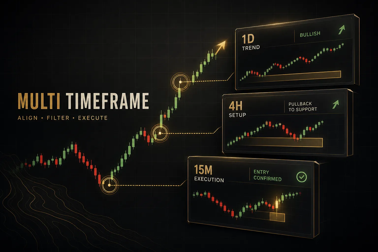
Multi-timeframe analysis (MTF) is the practice of viewing the same instrument across two or more timeframes so that each chart answers a different question. One chart sets your trend bias, another shows the setup, and a third times the entry trigger.
Instead of asking one chart to do everything, you split the job.
One clarification up front, because it trips up a lot of TradingView users. Opening three chart windows side by side is one form of MTF trading. Calculating an indicator from a higher timeframe and plotting it on a lower chart (say, a daily RSI displayed on a 15-minute chart) is a different technique entirely, with its own pitfalls around repainting.
We’ll cover both.
Here’s what this article will not promise: that timeframe alignment guarantees profit.
It doesn’t.
Alignment is a filter. It changes the quality of the trades you take and the risk you’re exposed to, but it can’t manufacture edge where none exists.
And we’re going to skip the myth that “all timeframes must agree” before you can trade.
They rarely do.
Markets spend most of their time in partial disagreement, which is exactly why you need a rules-based process for handling conflict rather than waiting for a perfect stack of green arrows that almost never appears.
How Multi-Timeframe Analysis Works
Ask a struggling trader why they exited a winning trade early, and you’ll often hear something like: “The 5-minute looked weak.” The daily trend was intact. The 1-hour setup was intact.
But the smallest chart flickered, and they bailed.
That’s the core problem MTF analysis solves.
When every chart is used for the same purpose, every chart gets a vote on every decision, and the votes contradict each other constantly. A 15-minute pullback looks like a crash if you treat it as trend information.
Zoom out to the 4-hour and it’s barely a wick.
The fix is role separation.
Each timeframe gets one job, and only one. This is the backbone of classic top-down analysis: start high, work down, and never let a lower chart overrule a decision that belongs to a higher one.
Context, Setup, and Execution Charts
Three roles cover almost every MTF trading system worth using. You can run them on two charts by merging roles, but the roles themselves don’t change.
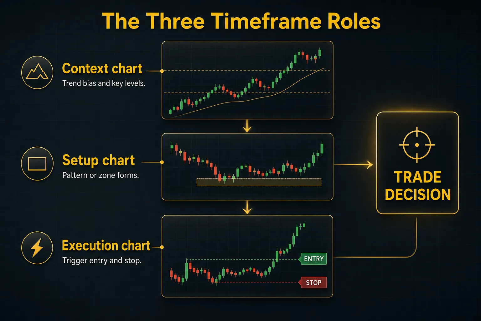
Context Timeframe (Bias)
The context chart, often the daily or 4-hour, is where market structure lives. This is where you map the trend using swing highs and swing lows, mark major support and resistance, and decide whether you’re a buyer, a seller, or flat.
You make this decision before looking for trades, and you don’t revisit it mid-session because a lower chart wobbled. If the daily shows higher highs and higher lows above a rising 50-period moving average, your bias is long.
Full stop.
Setup Timeframe (Trade Idea)
The setup chart, commonly the 1-hour for day traders or the daily for swing traders, is where the specific trade idea forms.
A pullback to a demand zone.
A flag consolidating under resistance.
A retest of a broken level.
This chart answers one question: is there a pattern here that aligns with my higher timeframe bias?
If the answer is no, you stop.
No setup means no trade, regardless of how tempting the lower timeframe looks.
Execution Timeframe (Entry and Exit)
The execution chart, typically 15-minute or 5-minute for intraday work, exists for precision. Here you wait for the trigger: a confirmation candle at your zone, a break of a micro swing high, an engulfing bar off support.
Its job is to shrink your stop distance and improve your risk-to-reward ratio, not to generate ideas. A tighter entry on the 5-minute can turn a 1.5R trade into a 3R trade with the same target.
One critical rule ties the three roles together: size your stops and targets to the setup thesis, not the entry chart. If your trade idea is a 4-hour reversal, a 5-minute stop-loss placement will get you wicked out by normal noise long before the thesis is proven wrong.
Your trade invalidation level belongs to the timeframe that created the idea.
Use ATR volatility on the setup chart, not the execution chart, when sizing the stop.
Choosing Your Timeframe Combination
There is no magic pair of chart intervals, but there are combinations that thousands of traders have converged on for good reason. They keep enough distance between charts that each one adds new information instead of echoing the last.
Day Trading Pairs
For intraday work, two combinations dominate.
The 4H/15M pairing suits traders who want fewer, cleaner trades: the 4-hour sets bias and levels, the 15-minute times entries. The 1H/5M pairing is faster, better suited to scalp-style execution during high-liquidity sessions like the London-New York overlap.
Add a middle setup chart if you want three roles fully separated: 4H/1H/15M is a popular full stack for forex and index futures.
Swing Trading Pairs
Swing traders shift everything up one gear.
The classic stack is Weekly/Daily/4H: weekly for structural bias, daily for the setup, 4-hour for a refined entry. Position traders sometimes go Monthly/Weekly/Daily, though at that scale entry precision matters less than thesis quality.
| Trading Style | Context (Bias) | Setup (Idea) | Execution (Entry) | Typical Hold Time |
|---|---|---|---|---|
| Scalping | 1-Hour | 15-Minute | 1-5 Minute | Minutes to 1 hour |
| Day trading (fast) | 1-Hour | 15-Minute | 5-Minute | Minutes to hours |
| Day trading (slow) | 4-Hour | 1-Hour | 15-Minute | Hours to 1 day |
| Swing trading | Weekly | Daily | 4-Hour | Days to weeks |
| Position trading | Monthly | Weekly | Daily | Weeks to months |
The 1:4 to 1:6 Ratio (and Its Limits)
Notice a pattern in those combinations?
Each timeframe is roughly four to six times larger than the one below it.
Daily to 4-hour is 1:6.
1-hour to 15-minute is 1:4.
This 1:4 to 1:6 ratio is a useful starting heuristic because it keeps charts far enough apart to be independent, but close enough that they describe the same move.
Go tighter than 1:4 (say, 15-minute and 10-minute) and the two charts are nearly identical. You get zero new information and a false sense of confirmation.
Go wider than roughly 1:8 and the charts stop talking to each other; a 5-minute entry has almost no meaningful relationship to a weekly thesis without a bridge chart in between.
But the ratio is a heuristic, not a law.
It breaks down in predictable places:
Low-liquidity instruments. On a thin small-cap stock, a 5-minute chart is mostly random prints and spread noise. The lowest usable execution chart moves up, compressing your usable ratio.
Gappy overnight sessions. Stocks that gap 2-3% at the open regularly will invalidate intraday structure between sessions. A 4H/15M plan built on continuous price action assumptions falls apart when a third of the move happens while the market is closed.
High-volatility news events. Around CPI releases or earnings, ATR volatility can triple within minutes.
A 15-minute chart temporarily behaves like a 1-hour chart, and fixed ratios stop mapping to real market behavior.
Crypto’s 24/7 structure. With no session opens or closes, daily candle boundaries are somewhat arbitrary, and weekend liquidity droughts distort lower timeframe signals. Many crypto traders lean on 4H and 12H charts precisely because they smooth over these dead zones.
So, two timeframes or three?
Two is enough for a simple system, and it’s where beginners should start: one chart for bias, one for entry. Three adds precision by separating setup from execution, but every added chart roughly doubles your analysis time and adds another opportunity to second-guess yourself.
Add the third chart only when your two-chart process is already consistent.
When Timeframes Disagree
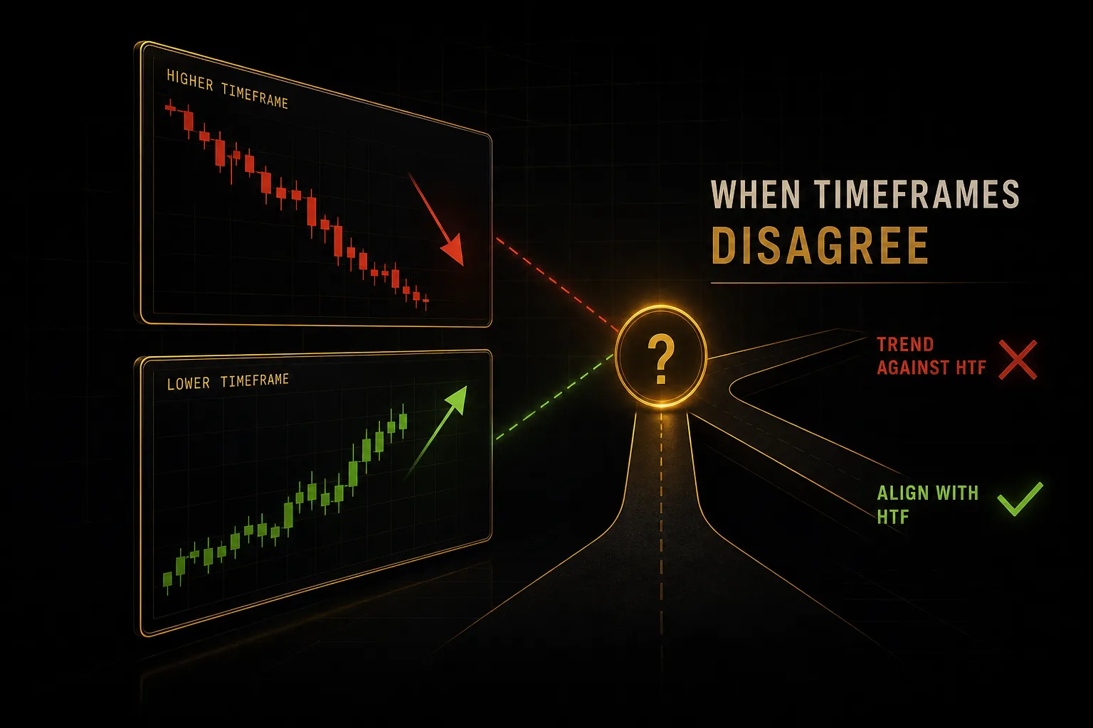
Here’s the scenario every MTF trader faces weekly. The daily chart is in a clear downtrend, price approaching a resistance zone from below. Meanwhile, the 15-minute chart prints a clean bullish breakout with strong momentum.
The lower timeframe screams buy.
The higher timeframe says this is exactly where sellers step in.
What do you do?
You need a decision path written down before this moment, because in the moment, the chart that’s moving fastest always feels the most convincing.
A Decision Tree for Conflicting Signals
Work through the conflict in order. Each question narrows your options until only one action remains.
- 1. Where is price relative to the higher timeframe level? If the bullish LTF breakout is happening directly into HTF resistance, treat it as a potential exhaustion move, not a trend change. If the breakout has already cleared the level with room above, the conflict is weaker than it looks.
- 2. Is the higher timeframe structure actually intact? Check the swing highs and swing lows. A downtrend that has already printed a higher low is a downtrend in transition. In that case, the LTF breakout may be the early evidence of a reversal, and standing aside or taking a reduced-size long becomes defensible.
- 3. Has the relevant candle closed? A 15-minute bar poking above resistance mid-bar means nothing. Wait for the confirmed bar close beyond the level. Intrabar breakouts that fail before the close are among the most common trap patterns in MTF trading.
- 4. Choose one of three actions. Fade the move (short into HTF resistance, stop above the level) if HTF structure is fully intact and the LTF push looks climactic. Wait for the close and retest if you suspect a genuine reversal but lack confirmation. Stand aside if neither side has a clear edge. Standing aside is a position. Most traders forget that.
- 5. Log the outcome either way. Conflicting-timeframe situations are exactly where your journal earns its keep, because they reveal whether your conflict rules actually work or just feel sensible.
Does the Higher Timeframe Always Win?
No, and this is where the standard advice oversimplifies.
The higher timeframe carries more weight for bias because it aggregates more volume, more participants, and more information per candle. Institutional flows are far more visible on a daily chart than a 5-minute one.
But weight is not veto power.
Every major trend reversal begins as a lower timeframe pattern that contradicted the higher timeframe trend. A valid LTF reversal structure forming at a significant HTF level (a weekly support zone, a prior daily swing low) is not noise.
It’s the earliest visible evidence that the higher timeframe itself may be turning.
The higher timeframe tells you which side has controlled the market. The lower timeframe tells you, earliest, when that control is being challenged. You need both signals, weighted, not one overriding the other.
The practical rule: trade against the HTF trend only at pre-marked HTF levels, only with LTF structural confirmation, and typically at reduced size. Everywhere else, the higher timeframe bias wins by default.
Candle Close and Indicator Lag
A forming 4-hour candle is a moving target.
Two hours into the bar, price might be above your moving average, MACD might have crossed bullish, RSI might read 62. Two hours later at the close, all three could say the opposite.
Any decision made on an unclosed higher timeframe bar is a decision made on data that can still change.
This is why disciplined MTF traders wait for the confirmed close on whichever timeframe is making the decision. Yes, you’ll enter slightly later.
That’s the price of acting on information that’s actually final.
The problem compounds with MTF indicators on TradingView. When you pull a higher timeframe value onto a lower chart (a daily RSI on a 15-minute chart, for example), the indicator can behave in two problematic ways:
- Repainting in real time. The displayed HTF value updates with every tick of the unclosed HTF bar. A signal that appears at 10am can vanish by 2pm. Nothing “broke”; the bar simply hadn’t closed.
- Look-ahead bias in history. If the script is coded carelessly, historical bars can reference the HTF close before it would have been known in real time. Backtests look brilliant. Live results don’t match. Data from countless published strategy audits shows this is one of the most common reasons backtested MTF systems fail forward.
The fix: use indicators explicitly built to reference only confirmed HTF closes, and verify by watching whether historical signals ever shift after a refresh. A repainting indicator is worse than no indicator, because it teaches you patterns that never existed.
One last factor in timeframe conflicts is you.
Lower timeframes generate more signals, faster feedback, and dramatically more emotional pressure. A 5-minute chart produces 78 bars in a US equity session; the daily produces one.
More bars means more apparent opportunities, more noise mistaken for signal, and more chances to abandon your plan.
If you consistently break rules on lower timeframes, the solution isn’t more discipline… it’s a higher execution timeframe.
Testing, Risk, and Tools for MTF Trading
Adding a higher timeframe filter feels like it should improve results.
Sometimes it does.
Sometimes it just removes half your trades, including half your winners.
The only way to know is to test it, and MTF strategies are uniquely easy to test wrong.
Backtesting a Multi-Timeframe Strategy
Test each timeframe’s role separately before testing the combination. First, verify your context rule alone: over your sample, did the HTF bias actually identify direction better than a coin flip?
Then test the setup pattern within that bias.
Then, and only then, test entry triggers.
Why this order?
If you test the full stack at once and it fails, you won’t know which layer broke. Layer-by-layer testing isolates the weak link.
Two non-negotiables while testing.
First, verify there’s no forward-looking data: at every simulated decision point, confirm you’re only using HTF bars that had fully closed by that moment. Look-ahead bias quietly inflates MTF backtests more than any other error.
Second, demand sample size.
Fifty trades is a bare minimum before any statistic means anything; 100+ is better.
Twenty trades tells you about luck, not edge.
When you evaluate results, resist the pull of win rate. A filter that lifts win rate from 45% to 55% but cuts average winner size in half made your system worse.
The numbers that matter are expectancy (average profit per trade including losers), maximum drawdown, and risk-adjusted return.
If adding timeframe confluence improved expectancy or reduced drawdown over 50+ trades, keep it.
If it only made the equity curve smoother in your imagination, cut it.
Confluence Isn’t Automatic Edge
Here’s a trap that catches experienced traders: stacking a 50 EMA, a 200 EMA, MACD, and a supertrend across three timeframes and calling twelve agreeing signals “strong confluence.”
Those aren’t twelve signals.
They’re one signal (trend-following momentum) measured twelve slightly different ways. Correlated indicators agreeing is mathematically inevitable, not confirmation.
Real timeframe confluence comes from independent evidence: HTF structure, plus a setup-level supply or demand zone, plus an LTF price action trigger.
Three independent inputs beat twelve correlated ones every time.
If two indicators always agree, you only have one indicator. You just pay attention twice.
Using One Consistent Indicator Across Timeframes
Manually flipping between six chart tabs to check alignment is slow, and worse, it’s inconsistent. You’ll read the 4-hour optimistically when you want a trade and pessimistically when you’re scared.
Same chart, different mood.
This is where a structured MTF dashboard earns its place. PipTrend’s 12-timeframe confirmation table is a practical example: it displays the state of one consistent, non-repainting signal engine across every interval from 1-Minute to Monthly in a single view.
Instead of flipping charts and re-interpreting each one, you see at a glance where the higher timeframes and lower timeframes agree, where they conflict, and how deep the alignment runs.
The key detail is one engine, evaluated identically everywhere, on confirmed closes only. That removes both the repainting problem and the mood-dependent reading problem in a single move.
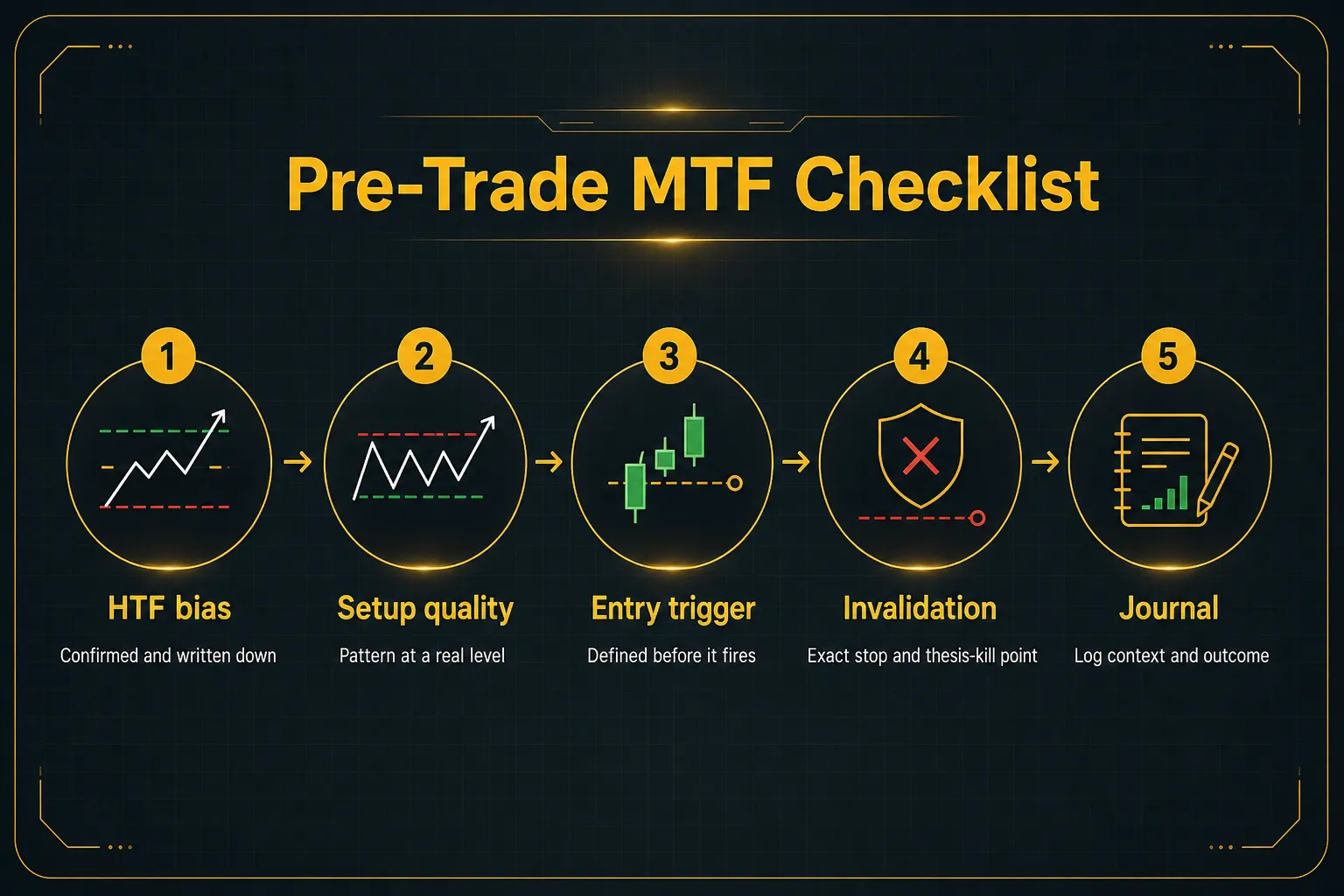
Before any trade, run a short checklist. It takes 60 seconds and catches most avoidable losses:
Frequently Asked Questions
What is the best multi-timeframe strategy?
The most reliable multi-timeframe strategy is a top-down approach: establish trend bias on a higher timeframe, find a setup one level down, and time the entry on a lower timeframe, with each chart roughly 4-6x apart. No single combination is universally best because the right intervals depend on your instrument, session liquidity, and holding period.
What matters more than the specific charts is that each timeframe has one defined role and the rules are written down.
What are the best timeframes for day trading?
The most widely used day trading combinations are 4-hour/15-minute for slower intraday trades and 1-hour/5-minute for faster execution. The 4H/15M pairing suits traders taking one to three trades per session, while 1H/5M works better for active sessions like the London-New York overlap.
Thinly traded instruments usually need higher execution timeframes because 5-minute bars become mostly noise.
How many timeframes should I use in trading?
Two timeframes are enough for a complete trading system, and three is the practical maximum for most traders. Two charts separate bias from entry; a third separates the setup from the execution trigger for added precision.
Beyond three, additional charts mostly duplicate information, slow down decisions, and invite second-guessing.
Should I trade with the higher timeframe trend?
Yes, by default, because higher timeframes aggregate more volume and participants and therefore carry more reliable trend information. Trading with the higher timeframe bias means normal lower timeframe noise works in your favor rather than against you.
The exception is a confirmed lower timeframe reversal structure at a major higher timeframe level, which can justify a counter-trend trade at reduced size.
What is the 4-hour and 15-minute trading strategy?
The 4H/15M strategy uses the 4-hour chart to define trend bias and key support and resistance, then uses the 15-minute chart to time precise entries within that context. A typical trade waits for price to reach a 4-hour level, then enters on a 15-minute confirmation candle with the stop placed beyond the 15-minute structure.
The 1:16 interval ratio is wider than the classic 1:4-1:6 heuristic, which is why many traders add a 1-hour setup chart between them.
What does MTF mean in TradingView?
In TradingView, MTF (multi-timeframe) refers to an indicator that calculates its values from a different chart interval than the one displayed, such as showing a daily moving average on a 15-minute chart. This is powerful but carries repainting risk: if the script references an unclosed higher timeframe bar, signals can change or disappear in real time, and poorly coded scripts can introduce look-ahead bias into backtests.
Always use MTF indicators that reference confirmed bar closes only.
Putting It Into Practice
Before your next trade, do one thing: write down which timeframe owns each role.
Context chart for bias.
Setup chart for the idea.
Execution chart for the trigger.
Three lines in a note, decided while the market is closed and your judgment is clean.
That single document does more for consistency than any indicator, because it removes the mid-trade renegotiation that destroys most MTF traders.
The daily can’t suddenly become your exit chart. The 5-minute can’t suddenly veto your bias.
Every chart stays in its lane.
And remember the honest version of the promise here: a documented, repeatable process beats chasing perfect alignment.
Full timeframe agreement is rare, and waiting for it means missing most of the tradeable opportunities in 2026’s markets.
The next step is measurement.
Journal every trade with its HTF context noted, and use structured confirmation, whether that’s a written checklist or an MTF dashboard like PipTrend’s 12-timeframe table, so alignment is something you read, not something you feel.
Consistency comes from process.
The process starts today, in writing.
Risk Disclaimer: Trading involves risk. Past performance doesn't guarantee future results. Only trade with money you can afford to lose. PipTrend is a tool to assist your trading decisions, not financial advice.