
Most traders lose money because they either ignore indicators completely or drown in so many conflicting signals they freeze at decision time. The share market doesn't reward hesitation. Every indicator in share market analysis exists to solve one specific problem, but you need to know which problem you're solving before you add another line to your chart. This isn't about collecting tools. It's about building a system that gives you conviction when price reaches your level.
Understanding What Market Indicators Actually Measure
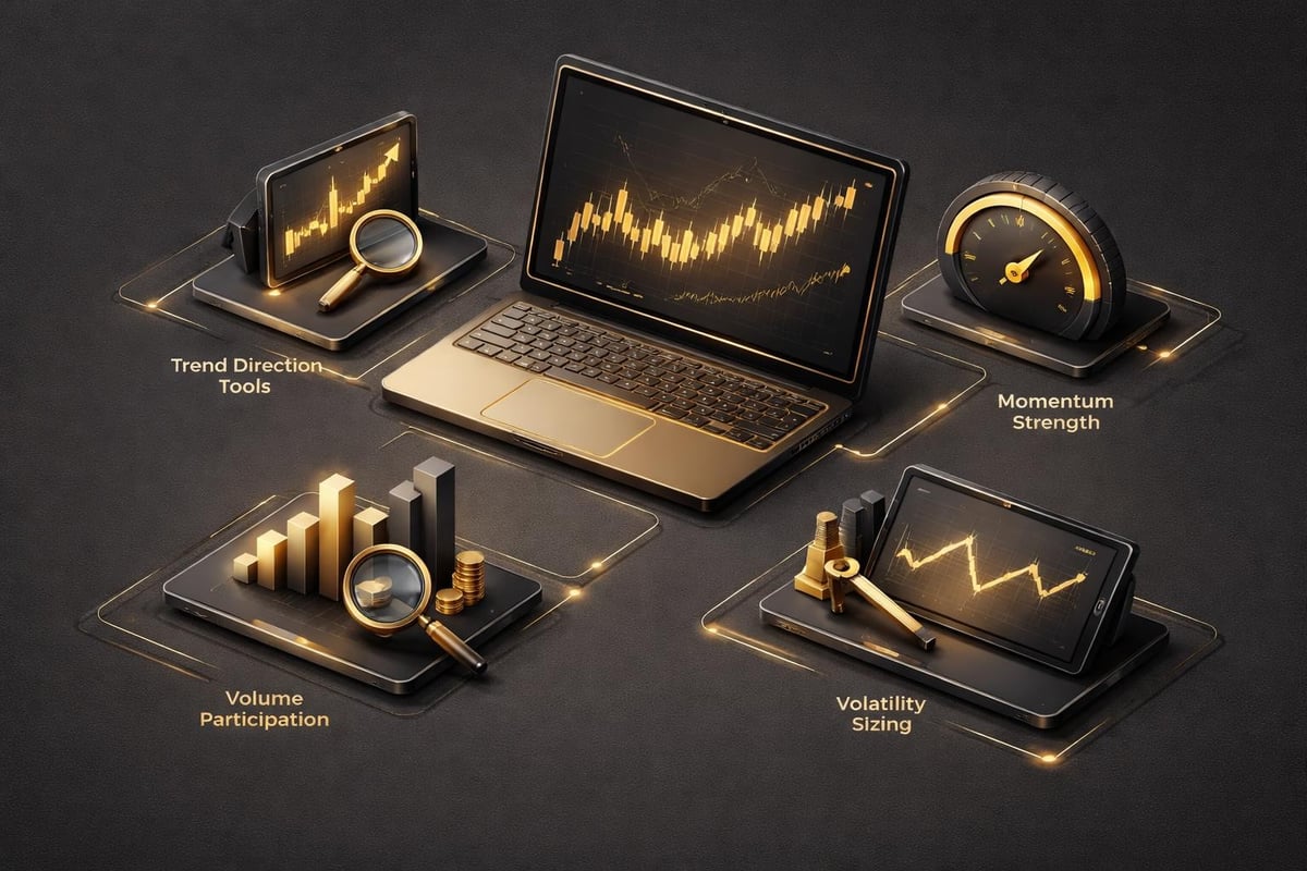
Every indicator in share market trading falls into one of four categories. You have trend indicators that tell you direction, momentum indicators that measure the strength behind moves, volume indicators that confirm participation, and volatility indicators that help you size positions and set stops. The mistake most traders make is stacking three trend indicators on the same chart and wondering why they all say the same thing. You're not diversifying your analysis. You're creating an echo chamber.
When you look at a 15-minute chart during New York session open, a trend indicator like a moving average only tells you what already happened. It's lagging by design because it uses historical price data to smooth out noise. That's useful for identifying the established direction, but it won't catch the turn. Momentum indicators like RSI or stochastic oscillators give you earlier warnings because they measure the rate of price change, not just the change itself. Volume-based tools like the Accumulation/Distribution Index add another layer by showing whether institutions are stepping in or stepping out during those price moves.
 technical indicators">
The real edge comes from combining indicators across different categories. If your 50-period exponential moving average slopes upward on the 1-hour chart, RSI on the same timeframe sits at 58, and you see volume expanding on the recent higher highs, you have confirmation from three independent data sources. That's a tradable setup. If you just had the moving average, you'd be guessing about strength and participation.
Choosing the Right Indicator for Your Trading Style
Day traders and swing traders need completely different indicator configurations. A day trader working the first two hours of the New York session needs fast, responsive indicators that don't lag price by more than a few bars. Settings like 9-period or 12-period EMAs catch moves quickly but generate more false signals during choppy price action. You're accepting that tradeoff because your holding period is measured in minutes or hours, not days. Your profit target might be 1.5R to 2R, and you need to know within three candles if your thesis is invalidated.
Swing traders holding positions for three to ten days can afford slower settings. A 50-period EMA or 200-period SMA becomes more reliable because short-term noise gets filtered out. You're looking for sustained directional moves, not scalps. Your risk-reward ratio shifts to 3R or higher, which means you need fewer winners to stay profitable. The indicator in share market analysis you choose should match your timeframe and holding period, not the other way around.
Position traders using weekly charts might look at long-term sentiment indicators like the Coppock Curve to identify major market bottoms or the Buffett Indicator for valuation context. These aren't tools for timing entries on Tuesday morning. They tell you whether deploying capital right now makes sense from a macro perspective. You're trading less frequently but with larger position sizes, so getting the big picture right matters more than catching every short-term pullback.
Multi-Timeframe Analysis Creates Conviction
You can't trade a 5-minute chart in isolation and expect consistent results. The share market operates on nested timeframes where the larger period always exerts more influence than the smaller one. If the daily chart shows a strong downtrend with price below all major moving averages, your 15-minute long setup is fighting the dominant force. You might catch a bounce, but probability isn't on your side. Every indicator in share market technical analysis becomes more powerful when you verify it across at least three timeframes.
Start with your trading timeframe, then check one higher and one lower. If you're entering trades on the 1-hour chart, verify conditions on the 4-hour and 15-minute charts. The 4-hour gives you directional context. If it shows an uptrend with momentum building, your 1-hour pullback becomes a buying opportunity instead of a potential reversal. The 15-minute chart helps with precise entry timing. You wait for the smaller timeframe to show its own reversal signal, giving you a tight stop and better risk-reward.
| Timeframe | Primary Use | Typical Holding Period | Indicator Settings |
|---|---|---|---|
| 5-minute | Entry timing | Minutes to hours | 9 EMA, 20 SMA, Fast RSI (7-period) |
| 15-minute | Scalping and day trades | Hours to one day | 12 EMA, 50 SMA, Standard RSI (14-period) |
| 1-hour | Day and swing trades | One to five days | 21 EMA, 50 SMA, 200 SMA, Standard RSI |
| 4-hour | Swing direction | Three to ten days | 50 SMA, 200 SMA, MACD (12,26,9) |
| Daily | Position bias | Weeks to months | 50 SMA, 200 SMA, Weekly momentum |
This approach filters out 70% of marginal setups where timeframes conflict. You only take trades where all three levels agree on direction and momentum phase. That's fewer signals but higher win rates. Unlike tools that generate alerts on every crossover regardless of context, a multi-timeframe framework forces you to wait for alignment. Most losing trades happen when traders ignore this discipline and chase isolated signals.
How Institutional Traders Use Indicators Differently
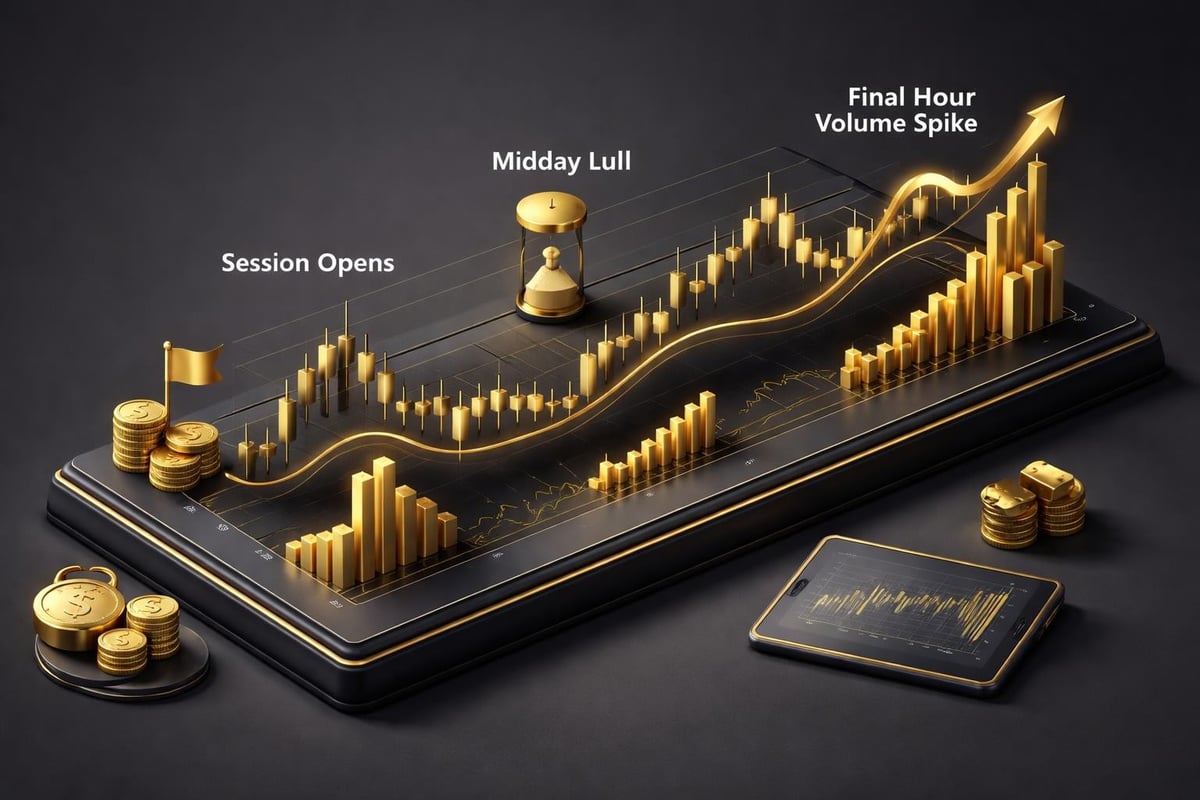
Retail traders obsess over indicator settings and perfect entry points. Institutional desks focus on liquidity zones and session timing because they're moving size that needs counterparties. The Smart Money Index tracks this institutional behavior by measuring what happens during the first 30 minutes versus the last hour of trading. Big money often trades against early retail enthusiasm, then pushes price during the final hour when liquidity returns.
You can apply this concept without the same capital by watching where volume spikes occur relative to key price levels. An indicator in share market trading like VWAP (volume-weighted average price) shows you the average price institutions paid during the session. When price pulls back to VWAP and you see volume dry up, that's often where smart money adds to positions. They're not using complex signals. They're buying value and selling excess within the day's range.
The Advance-Decline Line gives you another institutional perspective by measuring market breadth. When major indices make new highs but the advance-decline line diverges downward, fewer stocks are participating in the rally. Institutions are rotating out of weak names while index funds mechanically buy the largest components. That divergence often precedes corrections by two to six weeks. You won't catch the exact top, but you'll avoid initiating new long positions when risk is elevated.
Combining Indicators Without Creating Conflicts
The biggest mistake intermediate traders make is adding another indicator every time they take a loss. You think more information equals better decisions, but you're actually creating analysis paralysis. Three indicators from different categories give you enough confirmation without contradiction. Add a fourth or fifth, and you'll find situations where two say buy, two say sell, and you're back to guessing.
Build your setup with one trend filter, one momentum gauge, and one volume or volatility component. On the daily chart, you might use the 200-period SMA for trend, RSI for momentum, and ATR (average true range) for volatility context. That's it. If price is above the 200 SMA, RSI is between 40 and 70 (neither oversold nor overbought), and ATR shows normal volatility, you have a clean environment for trend-following trades. When ATR spikes above its 20-day average, you know volatility expanded and you should reduce position size by 30% to 50% to account for wider stop distances.
Your entries come from price action at that point, not from waiting for a specific indicator crossover. You're using indicators to define the context, then trading what price does at key levels within that context. A bullish engulfing candle at a previous high with volume expansion becomes a valid long entry when your three indicators confirm supportive conditions. Without that confirmation, the same candle pattern gets ignored because you're trading against the dominant forces.
The tools available through PipTrend solve the alignment problem by showing you multi-timeframe conditions in one view. You don't need to flip between charts or mentally track whether the 4-hour and 1-hour agree. When all timeframes show the same directional bias and momentum phase, you get visual confirmation that reduces hesitation at decision time. That's the difference between taking every marginal setup and waiting for the ones where probability stacks heavily in your favor.
Reading Sentiment Indicators for Market Extremes
Market sentiment indicators work differently than technical tools because they measure emotion and positioning rather than price or volume. The Acertus Market Sentiment Indicator quantifies sentiment on a scale from extreme fear to extreme greed. When readings hit the fear extreme, contrarian traders start looking for long entries because markets often bottom when panic peaks. When greed dominates and everyone feels invincible, that's when risk is actually highest.
You can track sentiment through several proxies even without paid data services. The VIX, which measures implied volatility on S&P 500 options, spikes during fear and collapses during complacency. VIX readings above 30 suggest elevated fear, while readings below 12 indicate complacency. As a swing trader, you want to establish positions when VIX is elevated and take profits when it's suppressed. This doesn't give you exact entries, but it tells you when the market is pricing in too much or too little risk.
Put-call ratios show similar sentiment extremes. When put volume significantly exceeds call volume, traders are hedging or betting on declines. Extreme readings above 1.15 often mark short-term bottoms because everyone who wanted to sell already did. Conversely, when call volume dominates and the ratio drops below 0.70, speculation is running hot and pullbacks become more likely. Each indicator in share market sentiment analysis adds context that pure price-based tools miss.
Common Indicator Mistakes That Destroy Accounts
Using default settings without understanding what they measure is the first trap. A 14-period RSI works fine for daily charts but generates useless noise on a 1-minute chart during high-volatility sessions. You need to adjust the period to match your timeframe and the asset's typical volatility profile. Forex pairs with tight ranges need different sensitivity than tech stocks that regularly swing 3% to 5% per day.

Ignoring divergences is the second critical error. When price makes a new high but RSI or MACD makes a lower high, momentum is weakening even though price hasn't turned yet. That divergence often gives you two to five days of warning before the reversal. Traders who only watch price miss this advance signal and end up chasing the last 10% of a move right before it collapses. The same applies in reverse at bottoms where price makes new lows but oscillators show hidden strength through higher lows.
Over-optimization kills more trading accounts than bad indicators. You backtest until you find settings that would have caught every major move in the past three years, then those settings fail completely in live trading because markets change. A 23-period EMA might have been perfect in 2024's trending market but generates constant whipsaws in 2026's choppy conditions. The indicator in share market applications that works best is the one that performs reasonably well across different market regimes, not perfectly in one specific period.
Using Economic Indicators to Frame Technical Setups
Technical indicators tell you what price is doing. Economic indicators tell you why it might continue or reverse. When the Federal Reserve signals rate changes, bond yields shift, and equity markets reprice based on new discount rates. You can track these macro shifts through resources like the Library of Congress economic indicators guide to understand which data releases move markets.
GDP growth, inflation readings, and employment reports create the fundamental backdrop for your technical trades. If GDP contracts for two consecutive quarters while you're trying to trade bullish setups on small-cap stocks, you're fighting a recessionary tide. Your technical indicators might show oversold conditions, but catching a falling knife in a deteriorating economy means you're early or wrong. Better to wait until economic data stabilizes and your technical tools confirm a bottoming process.
Interest rate decisions affect different sectors unevenly. Rising rates typically pressure growth stocks and benefit financial stocks. Your indicator-based system should account for these sector rotations by focusing on where capital is flowing rather than fighting the macro current. When common market indicators show defensive sectors outperforming while tech lags, that's your signal to adjust which stocks you screen for setups.
Building Your Indicator Workflow for Consistency
You need a repeatable process that takes the same steps in the same order every time you evaluate a setup. Start with the macro context using weekly or monthly charts to establish the primary trend. If you're bullish on technology stocks for the next quarter, that's your directional bias. Move to the daily chart and identify your indicator in share market analysis that confirms whether the trend is intact, pausing, or reversing. Look for price above key moving averages with momentum indicators in bullish zones.
Drop to your trading timeframe and wait for pullbacks that hold structural support. This is where your entry indicators activate. You might use a 15-minute chart with a fast EMA crossover combined with a candlestick pattern at a Fibonacci retracement level. Volume should confirm the reversal with expansion on the first impulse wave back in the trend direction. This layered approach means you're never relying on a single signal. Every component has to confirm before you risk capital.
| Analysis Step | Timeframe | Tools Used | Decision Point |
|---|---|---|---|
| Macro context | Weekly/Monthly | 200 SMA, sector rotation | Directional bias |
| Trend confirmation | Daily | 50/200 SMA, RSI, MACD | Trend phase identification |
| Entry zone | 4-hour | Fibonacci, support/resistance | Potential reversal areas |
| Entry trigger | 1-hour or 15-minute | EMA crossover, candlestick pattern, volume | Execute trade |
| Risk management | Same as entry | ATR for stop distance | Position size calculation |
Document every trade with screenshots showing what each indicator displayed at entry time. After 50 trades, review which combinations produced the highest win rates and best risk-reward outcomes. You'll find certain patterns repeat where all your indicators align and those trades produce outsized winners. Those are your A+ setups. Everything else is noise or B-grade trades you should probably skip. Most traders never do this analysis and wonder why they can't achieve consistency despite using the "right" indicators.
How Data Quality Affects Indicator Reliability
Your indicators are only as good as the data feeding them. Free data sources often have gaps, delayed updates, or missing volume information that throws off calculations. When your indicator in share market trading relies on accurate volume data but your feed excludes pre-market or after-hours activity, you're making decisions on incomplete information. Institutional traders see the full picture while you're working with a partial dataset.
Using reliable market data sources becomes critical when you're trading around earnings releases or economic events. A five-minute delay in your data means you're reacting to price action that already moved while other traders with real-time feeds positioned ahead of you. This gap explains why your backtest looked perfect but live trading produces worse results. The edge you thought you had evaporates when you're consistently the last person to see the signal.
Verify your data provider includes adjustment for splits, dividends, and corporate actions. An indicator showing a false breakdown might just be displaying unadjusted data after a stock split. Spend the $50 to $100 per month on quality data if you're serious about trading with size. The cost is negligible compared to one or two losing trades caused by bad information. Professional traders don't cheap out on data, and neither should you once you're past the initial learning phase.
Adapting Indicators to Current Market Conditions
Markets cycle through trending, ranging, and volatile regimes. The indicator in share market environments that works in strong trends fails miserably during sideways consolidation. Moving average crossovers generate profitable signals when price trends for weeks but produce constant whipsaws when range-bound. You need to identify which regime you're in before selecting your tools, not after you've taken three losing trades.
ATR helps classify market conditions. When ATR expands above its 20-day average, volatility increased and you're likely in a trending or breakdown phase. Tighten your stops and use momentum indicators to ride the move. When ATR contracts below average, the market is consolidating and mean-reversion strategies work better. Oscillators like stochastic or RSI become more reliable because price keeps bouncing between defined levels instead of breaking out.
Volume patterns shift between regimes too. Trending markets show volume expansion on impulse moves and contraction on pullbacks. Ranging markets display erratic volume with no clear pattern. Breakdown phases see volume spikes on fear-driven selling, often climaxing at the bottom. Your trading plan should specify which indicators you emphasize based on current conditions. Don't force trend-following signals when the market clearly isn't trending. Wait for the environment that matches your edge.
Mastering indicators means understanding which market problem each tool solves and building a system that combines them without creating conflicts. The real edge comes from multi-timeframe alignment and adapting your approach to current market conditions rather than forcing the same signals in every environment. PipTrend eliminates the guesswork by showing you when all your timeframes agree and momentum supports the move, giving you the conviction to take high-probability setups while avoiding the noise that drains accounts.