Price Action Patterns: A Beginner's Complete Guide
On this page
Why Most Pattern Cheat Sheets Fail You
You have probably seen the poster. Forty candlestick shapes arranged in a grid, each one stamped bullish or bearish, colour-coded green and red.
It looks like a decoder ring for the market.
It isn’t.
Not even close.
The problem with those cheat sheets is that they teach shapes without teaching pressure.
A hammer is not bullish because it has a long lower wick. It is potentially bullish because sellers pushed price down, failed to hold it there, and buyers closed the candle back near the top.
That story only matters if it happens somewhere the story makes sense.
Price action patterns are contextual signals, not standalone instructions. The same formation that marks a clean reversal at a tested support level means almost nothing when it prints in the middle of a choppy range with thin volume behind it.
This guide takes a different angle.
Instead of adding another shape list to the pile, it works through the four things that actually determine whether a pattern is worth acting on: market structure, location, volatility, and confirmation.
The shape is the last input, not the first.
By the end you will have three concrete things.
Precise, objective rules for what qualifies as a valid formation, so you stop arguing with yourself about whether a candle “counts.”
A complete workflow that runs from spotting a setup through candle close, entry trigger, invalidation-based stop, target selection, and post-trade review.
And a testing template so you can measure whether a pattern works in your market on your timeframe, rather than trusting someone else’s screenshot.
Reading a candlestick chart well is a skill you build. Memorising shapes is a shortcut that leads somewhere expensive.
Price Action Fundamentals Before Patterns
Here is a test.
Cover up every indicator on your chart. Can you still tell whether buyers or sellers are in control?
If the answer is no, patterns will not help you. They will just give you more things to misread.
Price Action vs. Technical Indicators
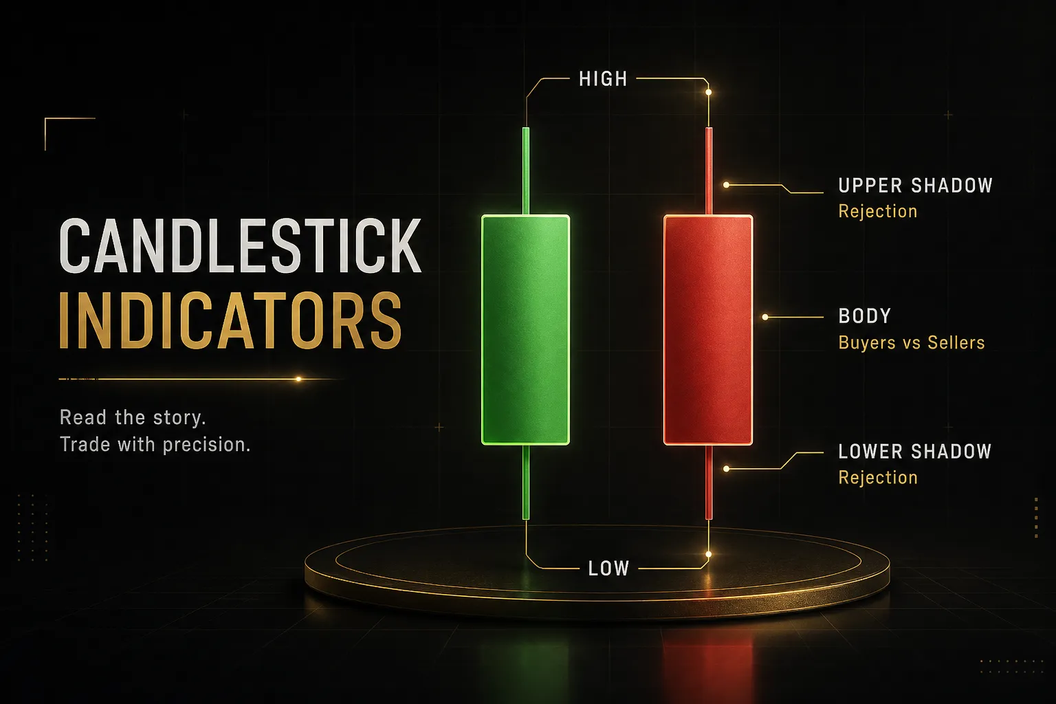
Price action is the practice of reading raw price data directly: the open high low close of each candle, the size of the body relative to the wick, where the candle closes within its own range, and whether the next candle follows through or rejects.
Every candle is a completed negotiation.
The body tells you where the fight ended. The wicks tell you where it was rejected.
A long upper wick with a small body near the low means buyers tried, sellers won, and the attempt failed inside a single period.
Indicators work differently.
An RSI, a MACD, a moving average, all of them are mathematical transformations of price data that already happened. That is not a criticism, it is just their nature.
A 20-period moving average cannot tell you anything until 20 periods have passed, which means it is structurally late by design.
Indicators answer questions about price. Price answers questions about participants. When they disagree, the participants usually win.
So is price action better than indicators? The honest answer: they solve different problems, and treating it as a competition is how traders end up with eight oscillators saying the same lagging thing.
Use price action as your primary read. Use indicators as optional confirmation for questions the chart does not answer cleanly, like relative volume or whether the current move is stretched versus its own average.
Never let an indicator override what the candles are plainly showing you.
Four Prerequisites: Trend, Swings, Support/Resistance, Volatility
Four things need to be on your chart before a single pattern matters.
Trend direction. An uptrend is a sequence of higher highs and higher lows. A downtrend is a sequence of lower highs and lower lows.
When that sequence breaks, the trend is in question.
This is the whole definition, and it is objective enough that two traders should agree on it.
Swing points. Mark the pivot highs and lows that created the trend.
A swing high is a candle whose high is higher than the candles either side of it, and the reverse for a swing low.
These marked points become your reference for whether structure holds or breaks.
Support and resistance. Draw these as zones, not lines.
Price reacts to areas where orders cluster, not to a single decimal.
Look for levels that price has tested more than once, previous swing highs and lows, and obvious supply and demand zones where a strong move originated.
A level nobody has tested is a guess.
Volatility. Know the average range of your instrument on your timeframe.
A 40-pip move means something entirely different when the daily average range is 60 pips versus 200.
Volatility sets your expectation for how far a move can travel, how wide your stop needs to be, and whether today’s candle is genuinely expanding or just normal.
Skip these four and you will misread the same candle shape over and over.
The pattern was never the problem.
The missing context was.
The Four Types of Price Action Patterns
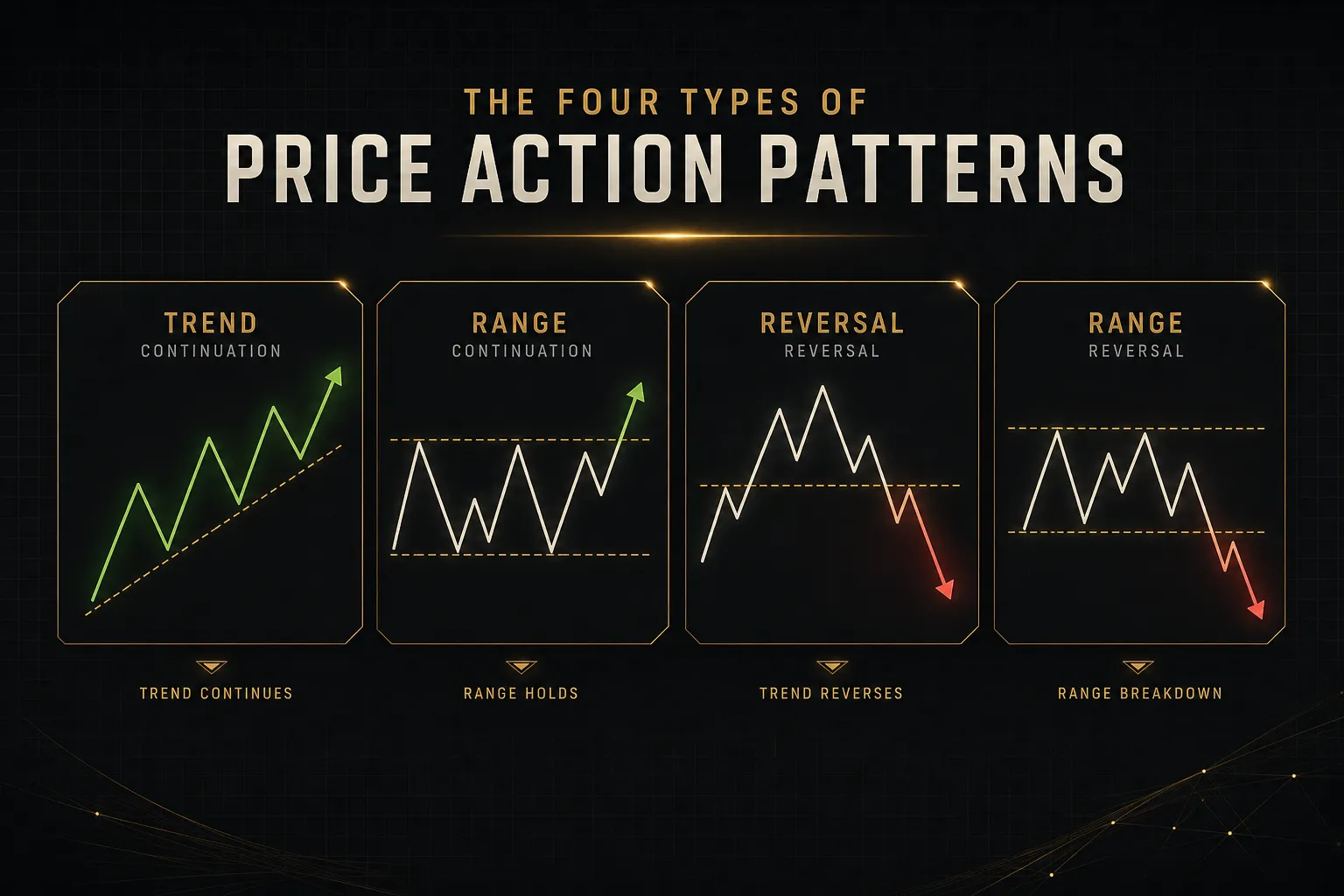
Patterns fall into four families, and mixing them up is a common source of confusion. A single candle and a multi-week triangle are not the same tool, do not carry the same weight, and should not be traded the same way.
Single-Candle Patterns
These are the fastest signals and the least reliable in isolation. One candle is one period of information.
Treat it as a hint, not a conclusion.
- Hammer. A small body near the top of the range with a lower wick at least twice the body length. It says sellers pushed down and were rejected. Only meaningful after a genuine downswing into a level.
- Shooting star. The mirror image. Small body near the low, long upper wick. It marks failed buying pressure, and it matters most at resistance after an extended push higher.
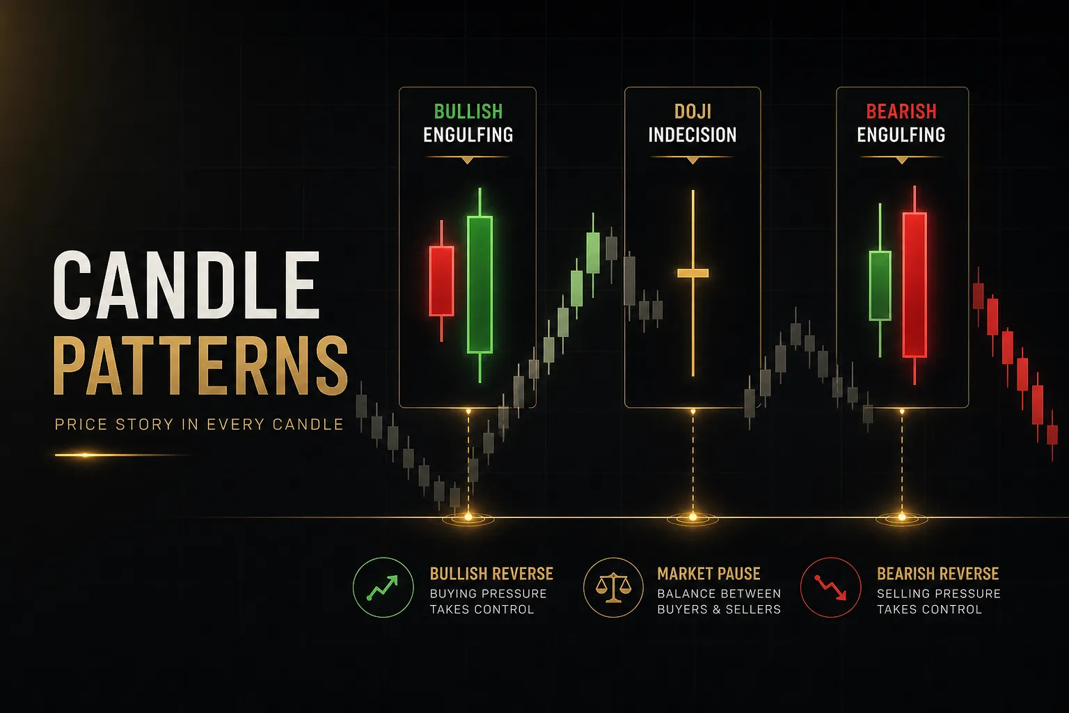
- Doji. Open and close at effectively the same price, producing a cross shape. It signals indecision, nothing more. A doji at a tested level is information. A doji in the middle of a range is noise.
- Pin bar. A broad category covering any candle with a dominant wick and a small body at the opposite end. The wick should account for roughly two thirds or more of the total candle range for it to qualify.
Multi-Candle Patterns
Two or three candles give you a sequence, and sequences are harder to fake. These carry more weight than single candles for exactly that reason.
- Bullish engulfing. A down candle followed by an up candle whose candle body and wick structure fully covers the prior body. Specific rules below, because this one gets misidentified constantly.
- Bearish engulfing. The inverse, appearing after an upswing into resistance. The second candle opens at or above the prior close and closes below the prior open.
- Morning star. Three candles: a strong down candle, a small indecision candle that gaps or stalls, then a strong up candle closing well into the first candle’s body. It is a slower, more convincing reversal signal.
- Evening star. The bearish version at a swing high, with the third candle closing deep into the body of the first.
- Inside bar. A candle whose entire range sits within the previous candle’s range. It signals compression and often precedes an expansion move. Inside bars are most useful as breakout setups, not reversal signals.
What actually qualifies as a bullish engulfing candle:
- The second candle’s body must fully engulf the prior candle’s body, open below the prior close and close above the prior open. Wick overlap alone does not count.
- It must form after a genuine pullback or downswing, not sideways drift. Something needs to be reversed.
- The candle should close in the upper third of its own range, showing buyers held control into the close.
- Range or volume should be above the recent average. An engulfing candle on thin participation is a technicality, not a signal.
And the timing rule that matters more than any of them: the candle must be fully closed.
An engulfing candle that looks perfect with 40 minutes left on the hourly can close as a doji, or a rejection, or nothing at all.
Acting on an unfinished candle is the single most common beginner mistake, and it converts a decent strategy into a coin flip.
Chart Formations and Market Structure
These play out over many candles and describe the shape of the move rather than the shape of a candle.
- Flags and pennants. A sharp move followed by a tight consolidation against the trend. Classic trend continuation patterns, and the tighter the consolidation, the cleaner the eventual break tends to be.
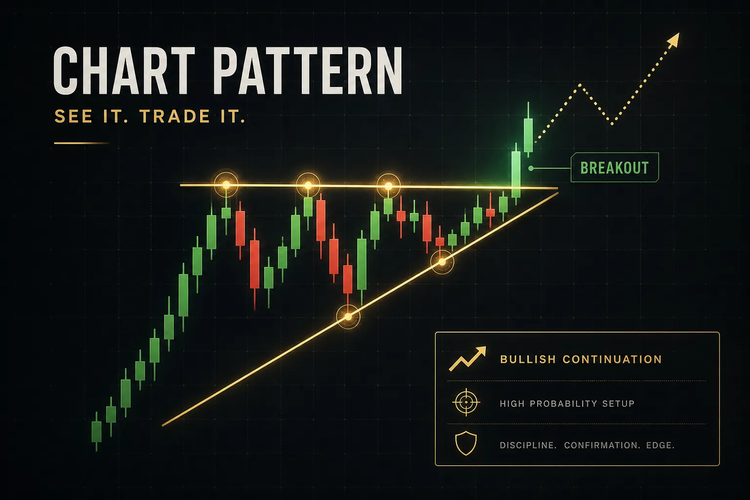
- Triangles. Ascending, descending, or symmetrical compression between converging boundaries. Volatility contracts, then expands. Direction is decided by which boundary breaks with conviction.
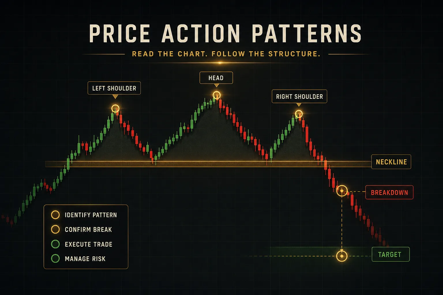
- Double tops and bottoms. Two failed attempts at the same level, confirmed only when price breaks the intervening swing point. Without that break, it is just a level being tested twice.
- Break of structure. Price closes beyond a marked swing point, ending the prior sequence of higher lows or lower highs. This is the cleanest objective signal that the market structure has shifted.
- Higher-timeframe swing failure. Price sweeps beyond a significant daily or weekly swing point and closes back inside. These traps often precede the largest moves because they clear out a full side of the order book.
Here is the thread connecting all four families.
A hammer forming at resistance during a strong downtrend and a hammer forming at a twice-tested support level in an uptrend are the same shape and completely different trades.
One is a counter-trend hope. The other is a trend continuation entry with structure behind it.
Which brings us to the part most guides skip entirely.
Context Changes What a Pattern Means
Take a single doji. Copy it.
Paste one at the top of a three-day rally into a weekly resistance zone, and paste the other into the third hour of a quiet Tuesday range.
Same candle.
Two entirely different messages.
Same Pattern, Different Meaning
The doji at resistance says buyers ran out of fuel exactly where sellers were expected to defend. That is a legitimate trend reversal warning, and the next candle will tell you whether it holds.
The mid-range doji says nothing.
Indecision inside indecision.
Price had no reason to move and did not move, which is not a signal, it is a description of the afternoon.
Now do it with a bullish engulfing candle.
Print one at the low of a pullback in a clean uptrend, right where the previous swing high became support.
That candle is a trend continuation entry with structure, location, and momentum agreeing.
Print the identical candle halfway through a sustained downtrend, with no level nearby and lower highs still intact. Now it is most likely a pause before the next leg down, and traders who bought it become fuel for that leg.
The rule: location relative to structure determines meaning. The shape only determines the label.
Trending vs Ranging Markets
Market condition changes which patterns deserve your attention.
In a trending market, patterns that align with the dominant direction at pullback zones carry substantially more weight than counter-trend signals.
A bullish pin bar at a rising trendline in an uptrend has the whole move behind it.
A bearish engulfing candle in that same uptrend is fighting everything, and even if it works, it usually works for two candles.
In a ranging market, the priority flips.
Patterns near range boundaries matter, patterns in the middle do not.
Range boundaries are where opposing orders sit and where reversals genuinely happen. The middle is where price wanders while participants wait.
A practical filter: before evaluating any pattern, ask whether the market is trending or ranging on the timeframe above yours. That single question eliminates a large share of low-quality setups before you even look at candles.
Real Breakouts vs Liquidity Sweeps
This distinction costs beginners more money than any other, so it is worth being precise.
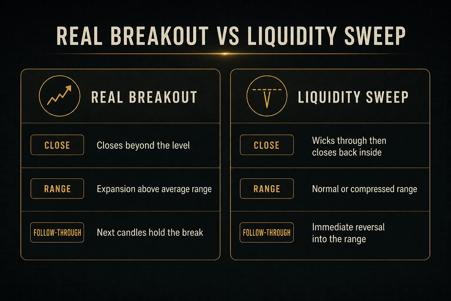
A genuine breakout has three components.
Price closes beyond the structural level, not just wicks through it.
The breakout candle shows range expansion above the recent average, ideally with volume confirmation.
And the following one or two candles hold above the level rather than immediately closing back inside.
A false breakout or liquidity sweep looks like this instead.
Price pokes beyond the level, often on a fast wick, triggers stop orders sitting just past it, then reverses and closes back inside the range.
No expansion, no follow-through, just a raid on resting orders.
The tell is usually the close.
Wicks through a level are common. Closes through a level with expansion are not.
If you make yourself wait for the close before calling anything a breakout, you will avoid most sweeps automatically.
One more warning.
Even a valid breakout stops being tradeable once it has run.
If price has already travelled several candles past the breakout point, your stop is now far from invalidation and your target is closer than it was.
The pattern still looks textbook, but the risk-to-reward has quietly collapsed.
Missing a move costs nothing.
Chasing one costs money.
From Pattern to Trade: A Complete Workflow
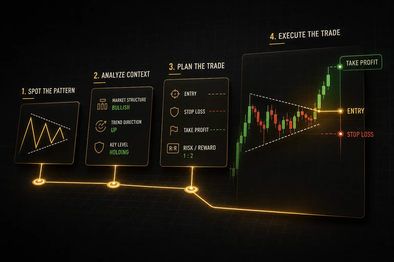
Recognising a pattern is maybe 20% of the job. The rest is process, and process is what separates a trader from someone who spots shapes.
Here is the full sequence, in order, every time.
- Identify the pattern in context. Before naming the candle, confirm what the market structure is doing and whether the formation sits at a meaningful location: a tested support or resistance zone, a supply or demand zone, or a prior swing point. No location, no trade.
- Wait for the candle to close. Non-negotiable. An unclosed candle is a live negotiation, not a result. Set an alert instead of watching, because watching creates pressure to act early.
- Check confirmation. Three questions: does this align with structure on my timeframe, does the range or volume support it, and does the higher timeframe agree with the direction? Two out of three is a weak setup. Zero out of three is not a setup at all.
- Define the entry trigger. Decide in advance what price does next before you enter. Common triggers include a break of the pattern candle’s high or low, a retest of the broken level, or a market entry on the open of the next candle. Write it down before it happens.
- Set the stop at invalidation, not at a round number. Your stop belongs just beyond the point where the pattern’s story stops being true: beyond the wick of a hammer, beyond the low of a bullish engulfing candle, beyond the swept high of a failed breakout. If price trades there, your reason for the trade is gone.
- Size the position from the stop distance. Fix your risk per trade as a percentage of account, then calculate position size from the distance to invalidation. This is why invalidation-based stops matter so much. An arbitrary 20-pip stop forces the market to fit your risk, which it will not do.
- Choose a target from the next structural level. The prior swing high or low, the opposite range boundary, the next untested supply or demand zone. Targets come from the chart, not from a fixed reward multiple you invented.
- Log the trade and review it. Screenshot the setup, record the reason, the entry, the stop, the exit, and the outcome. Review weekly. This log becomes the only honest feedback you will ever get.
Confirmation and Signal Tools
The most common mistake with confirmation tools is redundancy. Three oscillators on one chart do not triple your confidence, they just repeat the same lagging calculation in three colours.
Pick tools that answer different questions:
- Direction: what is the dominant bias on the higher timeframes?
- Entry: where exactly is the level worth engaging with?
- Timing: has the signal actually completed, or is it still forming?
Multi-timeframe analysis is the highest-value filter available to a beginner and it costs nothing.
If your 15-minute bullish pattern is forming inside a clear 4-hour downtrend into resistance, you now know it is a counter-trend scalp rather than a continuation trade.
Same candle, different expectations, different size.
Tools built around this discipline separate the three functions deliberately.
PipTrend, for example, keeps signal (direction only) apart from entry (marked price levels such as session highs and lows, VWAP, and supply and demand zones), so the trader still decides where to engage rather than being handed a blind instruction.
Its 12-timeframe confirmation table shows alignment from the 1-minute up to the Monthly in one view, which is the same question you would answer manually by flipping charts, just faster.
And its signals only print on candle close, which enforces the timing rule that most traders break under pressure.
The principle matters more than any specific platform: separate direction, location, and timing, and never let one tool pretend to answer all three.
Testing Before You Trade Real Money
Nobody knows whether a pattern works on their instrument until they count. Assumption is not evidence, and someone else’s win rate on a different market and timeframe is not yours.
A basic backtesting template:
- Write the rules down first. Define the pattern objectively enough that you could hand the rules to a stranger and they would mark the same candles. If your rules require judgement, your results will require faith.
- Gather 50 to 100 occurrences minimum. Below 50, random variance dominates and you will draw confident conclusions from noise. More is better, especially across different market conditions.
- Record entry, stop, and exit for every occurrence. Including the ones you would rather skip. Cherry-picking is the fastest way to build a strategy that only works in hindsight.
- Calculate win rate and expectancy. Expectancy, average win times win rate minus average loss times loss rate, is the number that matters. A 40% win rate with 3:1 winners beats a 70% win rate with 0.3:1 winners.
- Account for real-world costs. Spread, slippage, commission, overnight gaps, and scheduled news events. A strategy that is profitable before costs and unprofitable after is not a strategy.
- Test out-of-sample. Build on one period, validate on a period you never looked at. If performance collapses, you curve-fitted.
One habit separates traders who improve from traders who plateau: reviewing losses with the same attention as wins.
Failed patterns are the richest data you have.
They show you where your rules were too loose, which locations produce false signals, and how a setup behaves when it goes wrong, which is the only thing that determines how much you lose.
A folder of winning screenshots teaches you almost nothing about risk.
Price Action Questions Traders Ask
What are the most accurate price action patterns?
No single pattern is inherently the most accurate, and any source claiming a specific percentage without stating sample size, market, and timeframe should be treated with heavy scepticism. Reliability comes from the combination of location, trend alignment, and confirmation, not from the shape.
The same engulfing candle can be a high-probability continuation entry or a trap depending entirely on where it prints. Accuracy is a property of the setup, not the pattern.
What are the three best price action patterns?
For beginners, three formations offer the best balance of frequency and clarity: engulfing candles, pin bars or hammers at tested levels, and inside bar breakouts.
Engulfing candles give you a clear momentum shift with an obvious invalidation point.
Pin bars mark rejection at a specific price, which makes stop placement simple.
Inside bars signal compression before expansion, which suits breakout traders.
All three still require context. Traded blindly, all three lose money.
Is price action better than indicators?
Price action and indicators are complementary rather than competing, and framing it as a rivalry is a beginner trap. Price action should be your primary read because it reflects what participants actually did, while indicators are mathematical derivatives of that same data with built-in lag.
Use indicators to answer questions the raw chart handles poorly, such as relative volume or how stretched a move is versus its own average. Never use them to override a clear structural read.
How do you read price action for beginners?
Follow a fixed four-step sequence on every chart.
First, identify trend direction using higher highs and higher lows versus lower highs and lower lows.
Second, mark swing points and draw support and resistance zones where price has reacted more than once.
Third, wait for a valid, fully closed pattern at one of those meaningful locations. Fourth, check confirmation through higher-timeframe alignment and range or volume expansion before considering entry.
Do this consistently for a few weeks and the chart starts reading like a sequence of decisions rather than a mess of candles.
Do candlestick patterns really work in trading?
Candlestick patterns show measurable edge in specific contexts and sufficient sample sizes, but not as standalone guaranteed signals. Academic and practitioner testing consistently finds that raw pattern signals perform close to random when stripped of context, and improve meaningfully when filtered by trend, location, and confirmation.
The pattern is a filter, not a prediction. It narrows where to look and defines where you are wrong, which is genuinely valuable and considerably less exciting than a cheat sheet suggests.
What is the strongest bullish candlestick pattern?
A bullish engulfing candle forming at a well-tested support level within an established uptrend is frequently cited as one of the stronger multi-candle bullish signals. It combines three things: a clear momentum shift within the candle sequence, a location where buyers have previously defended, and alignment with the dominant trend.
The strength comes from that combination, not the shape. The identical candle at a random price in a downtrend is one of the weaker signals on the chart.
Read the Chart, Not the Cheat Sheet
If you take one thing from this guide, take this: before your next trade, check the pattern’s location and the higher-timeframe context before you evaluate the shape.
That order matters.
Shape first leads to forcing setups.
Context first leads to skipping them.
The decision rule is simple enough to apply in ten seconds.
If a pattern lacks structural context or confirmation, skip it, no matter how textbook it looks.
If it aligns with trend and location, closes fully, and shows follow-through, it is worth planning a risk-defined entry with the stop placed at invalidation.
And the mindset shift underneath all of it: patterns are where analysis starts, not where decision-making ends.
A hammer is an observation about what happened in one period of trading.
What you do with that observation depends on everything around it.
Read the pressure.
The shapes will make sense after that.
Sources
Risk Disclaimer: Trading involves risk. Past performance doesn't guarantee future results. Only trade with money you can afford to lose. PipTrend is a tool to assist your trading decisions, not financial advice.