Crypto Chart Patterns: A Trader's Guide to Real Setups
On this page
Why Chart Patterns Get Traders Into Trouble
Most traders can spot a head-and-shoulders in three seconds. Very few can tell you whether that particular one is worth risking capital on.
That gap is where accounts get drained.
Pattern recognition is pattern-matching, and the human brain is exceptional at it, including when the pattern isn’t really there. What separates a profitable setup from an expensive one isn’t the shape. It’s the context around it: where the structure sits in the larger trend, whether the breakout closed with conviction, what volume did on the move, and how much you stand to lose if the level fails.
This guide takes a probability-first approach. Identifying a crypto chart pattern is step one of maybe five, and the remaining four are where the edge lives.
By the end you’ll know how to draw pattern boundaries with objective rules instead of wishful thinking, what a confirmed breakout actually requires, how to separate a real retest from a failed move, and how to size a position so that being wrong costs you a defined, survivable amount.
One warning before we go further.
Classical chart pattern theory was built on stock and futures markets that trade during set hours with regulated participants. Crypto runs 24/7, settles on multiple venues at once, and lets retail traders take 50x leverage on perpetual futures.
Liquidation cascades punch wicks through support levels that would never break on a spot-only chart.
The patterns still work.
The tolerances just have to widen, and the confirmation rules have to get stricter.
Chart Patterns 101
Here’s a useful test: if you can see the whole structure on your screen without scrolling, and it took at least 20 candles to build, you’re probably looking at a chart pattern.
If it formed in the last two candles, you’re looking at something else entirely.
A chart pattern is a price structure built from multiple swing highs and swing lows across dozens of candles, reflecting a measurable shift in supply and demand.
Sellers absorb every rally at a declining price. Buyers step in higher each time.
That tug-of-war leaves a geometric footprint, and that footprint is the pattern.
The point isn’t the geometry.
The point is what the geometry tells you about who is running out of ammunition.
What Makes a Pattern Valid
Validity needs objective criteria, otherwise every chart contains every pattern. Three rules do most of the work.
First, each trendline needs at least two touches, and three is meaningfully better. A line drawn through two points is a line.
A line respected at three points is market structure, meaning participants are actually transacting there.
Second, the structure needs enough bars to be statistically distinguishable from noise. As a working minimum, 15 to 20 candles for triangles and rectangles, 30 or more for head-and-shoulders formations.
A “triangle” spanning six candles on a 5-minute chart is just random compression.
Third, the boundaries need to contain price.
If half the candles poke outside your lines, the lines are decoration.
A pattern you have to squint at is a pattern you shouldn’t trade. If you need to explain it to yourself, the market never saw it.
Chart Patterns vs Candlestick Patterns
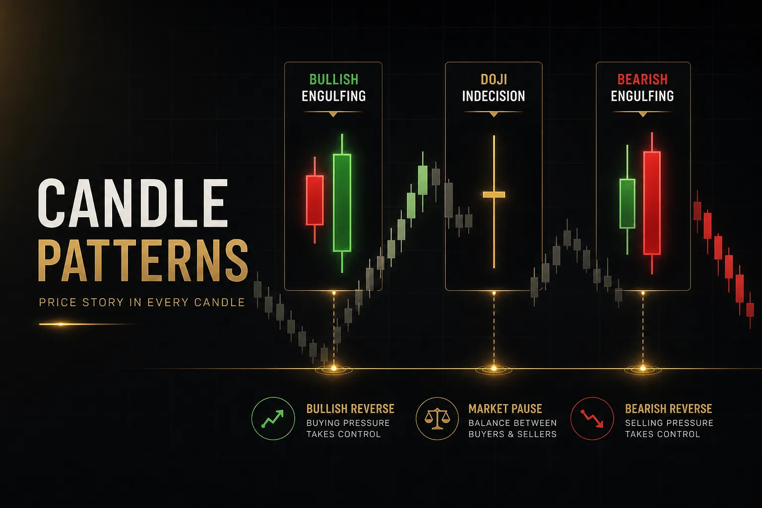
Candlestick patterns form in one to three candles and signal short-term momentum, not structural bias.
A doji shows indecision in a single session. An engulfing candle shows one side overwhelming the other for a few hours. A hammer shows rejection of lower prices.
Useful information.
But it operates on a completely different time horizon than a multi-week descending triangle.
Conflating the two is one of the fastest ways to lose money in technical analysis. A single bullish engulfing candle inside a bearish chart pattern is not a reversal.
It’s one green candle inside a structure that took six weeks to build and hasn’t broken anything yet.
The correct relationship is hierarchical. The chart pattern sets the directional thesis and defines your invalidation level.
The candlestick pattern refines your entry timing once the chart pattern has already confirmed. A bullish engulfing candle at the retest of a broken triangle resistance is a fine entry trigger.
The same candle in the middle of the triangle is noise.
Read the structure first on your candlestick chart.
Then read the candles.
The Pattern Library
Every pattern below carries a “textbook” bias, and every one of those biases can flip depending on where the structure sits in the broader trend.
That caveat column is the most valuable part of this table.
Labeling a formation bullish or bearish without checking trend location and timeframe is the single most common mistake beginners make. A descending triangle is bearish in a downtrend and frequently bullish as a continuation pause inside a strong uptrend.
Same shape. Opposite outcome.
| Pattern | Typical Bias | Type | Context Caveat That Can Flip It |
|---|---|---|---|
| Symmetrical triangle | Neutral, breaks in direction of prior trend | Continuation (usually) | Has no inherent bias at all. The trend entering the triangle is the only directional clue. Trading it before the breakout close is guessing. |
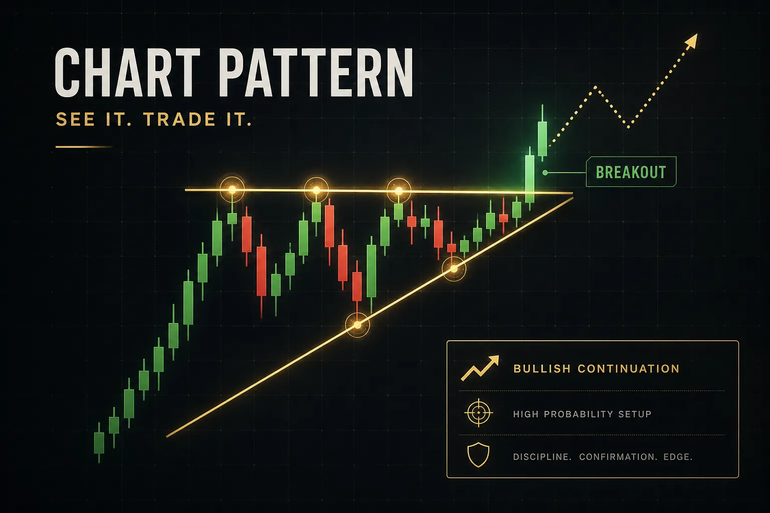
| Ascending triangle | Bullish | Continuation | Forming at the top of an extended uptrend after a parabolic run, it often becomes distribution. Repeated failures to clear flat resistance mean supply, not accumulation. |
| Descending triangle | Bearish | Continuation | Inside a strong uptrend it commonly breaks upward as a consolidation pause. Check the higher timeframe trend before shorting it. |
| Rising wedge | Bearish | Reversal | In an early-stage bull trend, a rising wedge often resolves upward as a steep continuation channel. Bearish reliability improves sharply near a prior all-time-high region. |
| Falling wedge | Bullish | Reversal | During a confirmed bear market it frequently continues lower. Falling wedges only reliably reverse when volume contracts through the structure and expands on the break. |
| Bull or bear flag | Direction of the flagpole | Continuation | If the flag retraces more than roughly 50% of the flagpole, it stops being a flag and becomes a reversal in progress. Depth matters more than shape. |
| Pennant | Direction of the flagpole | Continuation | Needs a sharp impulsive move before it. Compression after slow grinding sideways price action is a range, not a pennant, and has no directional edge. |
| Rectangle (range) | Neutral | Either | Highest-probability trades are the fades at range extremes, not the breakout. Most rectangle breakouts on crypto intraday charts fail back inside within a few candles. |
| Double top | Bearish | Reversal | Invalid until the neckline breaks with a close. A second peak marginally above the first is often a liquidity sweep, and those frequently precede the strongest reversals. |
| Double bottom | Bullish | Reversal | In a violent downtrend with rising open interest, the second low is often a stop-run before another leg down. Wait for the neckline close. |
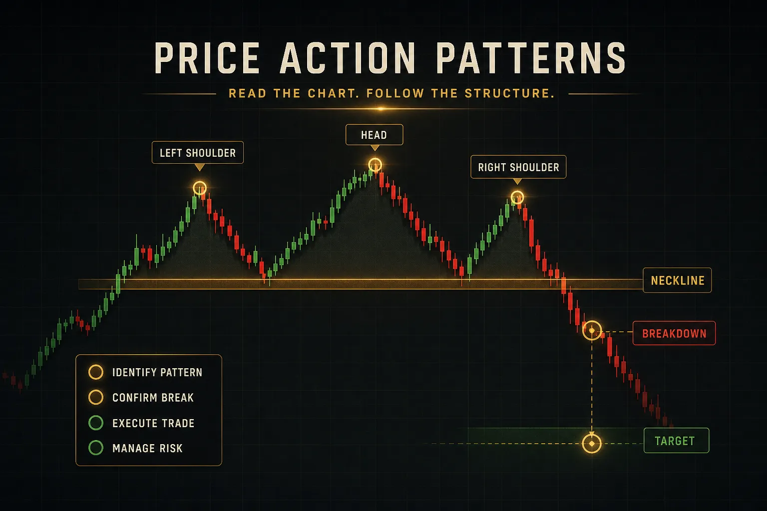
| Head-and-shoulders | Bearish | Reversal | Reliability drops hard on timeframes under 4 hours. Intraday crypto produces dozens of these daily and most are meaningless. |
| Inverse head-and-shoulders | Bullish | Reversal | Strongest when the right shoulder forms on visibly lower trading volume and the neckline aligns with a horizontal support and resistance level from earlier price history. |
Notice how many caveats reference the same two variables: where the pattern sits in the trend, and which timeframe it lives on. Those two questions answer most pattern disputes before you ever look at an indicator.
Confirming Entries and Setting Targets
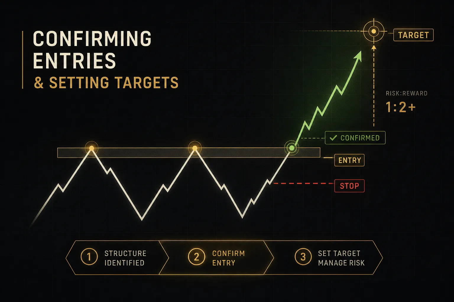
A pattern without an entry rule, a stop, and a target isn’t a trade.
It’s an opinion with a chart attached.
This is the part of the process that converts a shape into something with defined risk.
Drawing Objective Trendlines
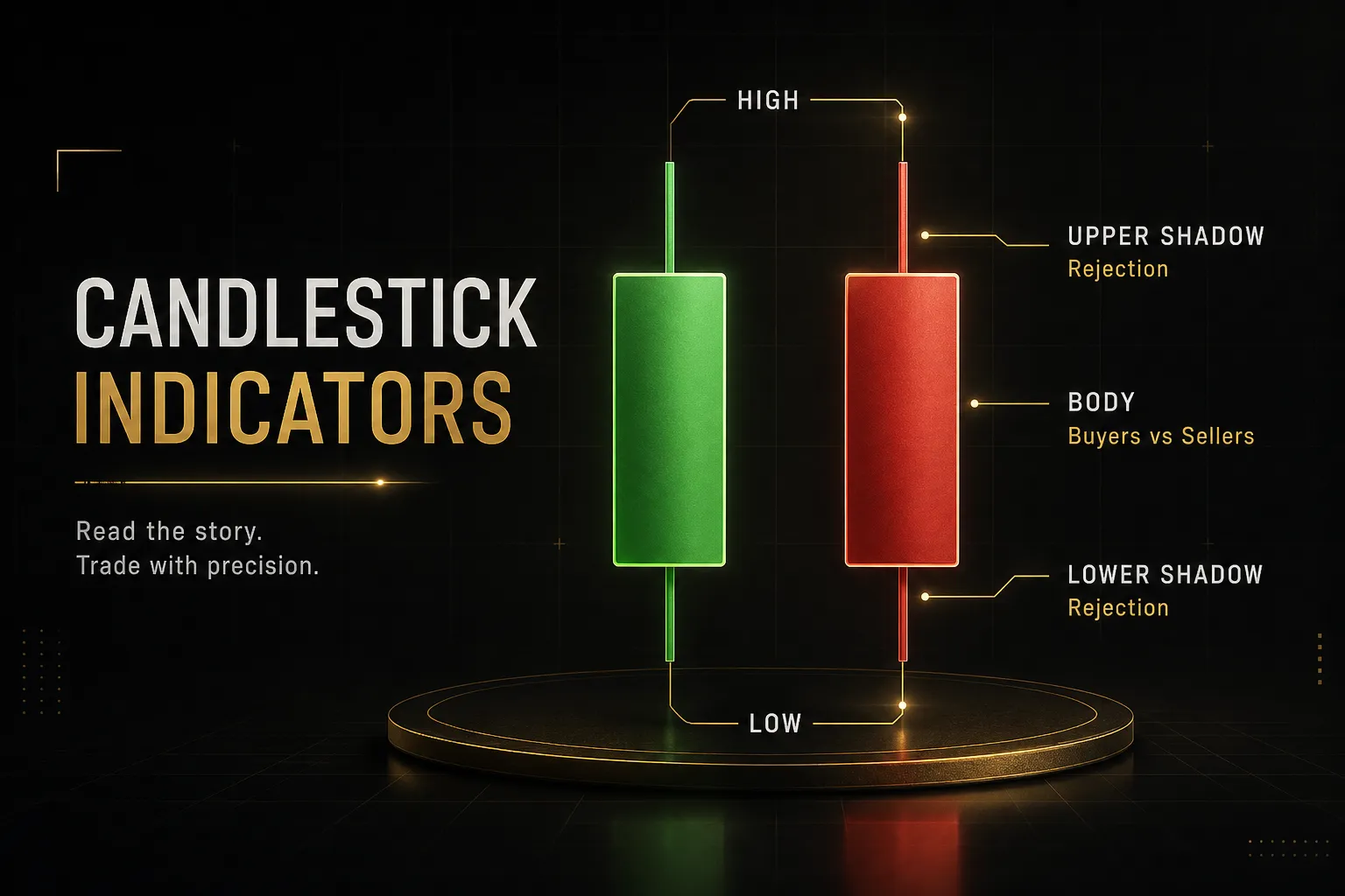
- Commit to wicks or closes before you draw. Pick one convention and apply it to every pattern on every chart. Switching between them mid-analysis lets you draw whatever line supports the story you already believe. Wicks are the stricter, more common choice in crypto because they capture where liquidity actually got taken.
- Require two touches minimum per boundary, three preferred. Anchor the line to significant swing points, not to minor intrabar noise. If your third touch requires moving the line, the line was wrong.
- Count the bars before you name the pattern. Fewer than 15 candles and you’re labeling noise. This one rule eliminates the majority of low-quality setups traders talk themselves into.
- Zoom out and check that the structure survives. Drop to a chart three times wider than the pattern. If it disappears into a larger range or sits mid-consolidation, the higher timeframe structure governs, not your pattern.
- Mark the invalidation point now, before entering. This is the price at which the pattern’s premise is objectively dead, usually the opposite boundary or the last protected swing. Deciding this after entry never goes well.
Breakout Confirmation Rules
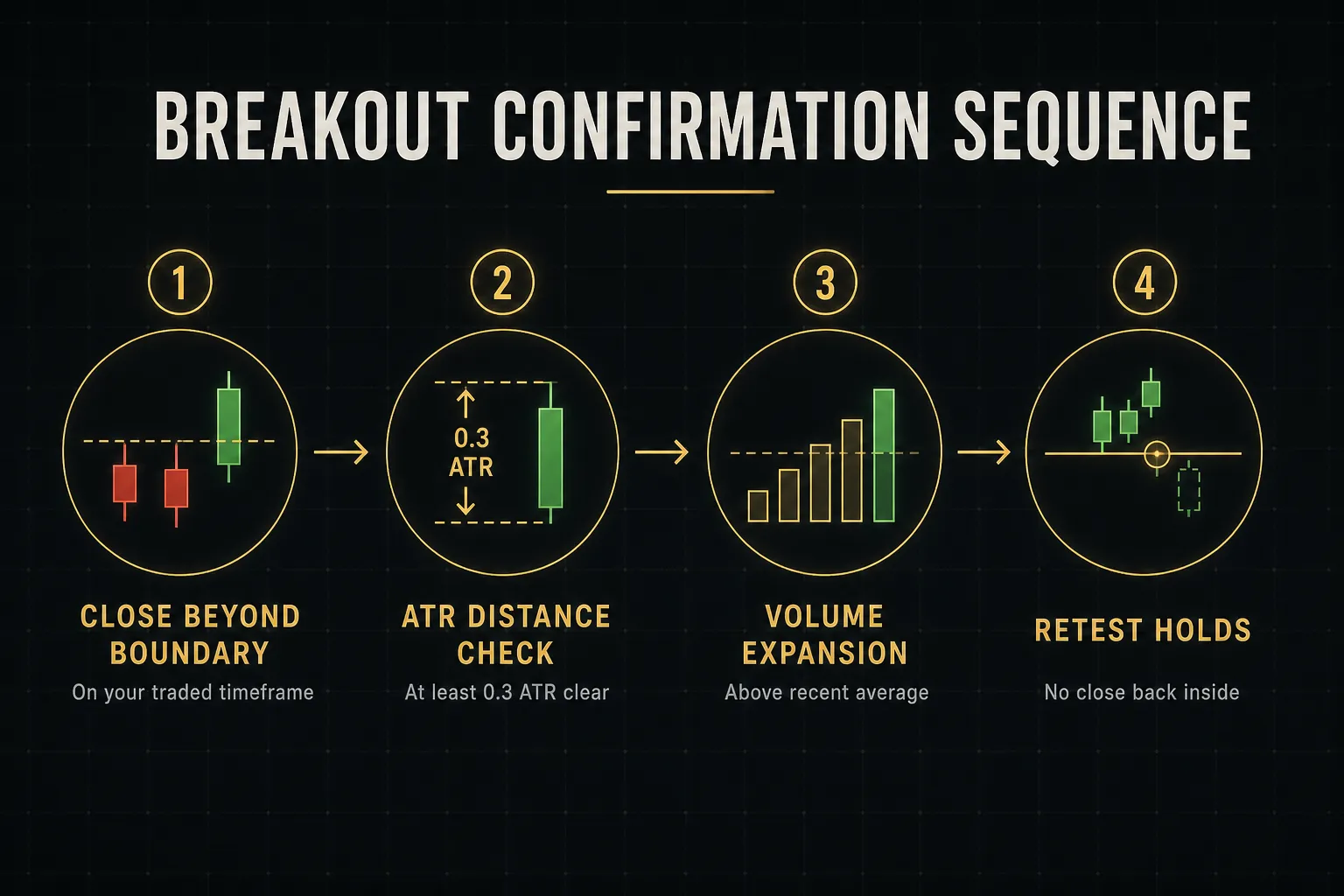
- Demand a candle close beyond the boundary on your trading timeframe. An intrabar spike is not a breakout. For BTC and ETH, most desks and data providers use the UTC daily close as the reference, so know which close your platform is using before you build daily rules on it.
- Apply a minimum breakout distance relative to ATR. A close 0.2% beyond resistance on an asset with a 3% daily average true range means nothing. A reasonable filter: the close must sit at least 0.3 to 0.5 ATR beyond the boundary. This one adjustment kills a large share of fakeout entries.
- Check volume on the breakout candle. Expansion above the recent average supports the move. A breakout on trading volume below the pattern’s own average is suspect, particularly on altcoins where thin books make price moves cheap to manufacture.
- Understand what a real retest looks like. Price breaks out, pulls back to the broken boundary, and holds it as new support or resistance with a rejection candle. That is a retest, and it’s often the better entry.
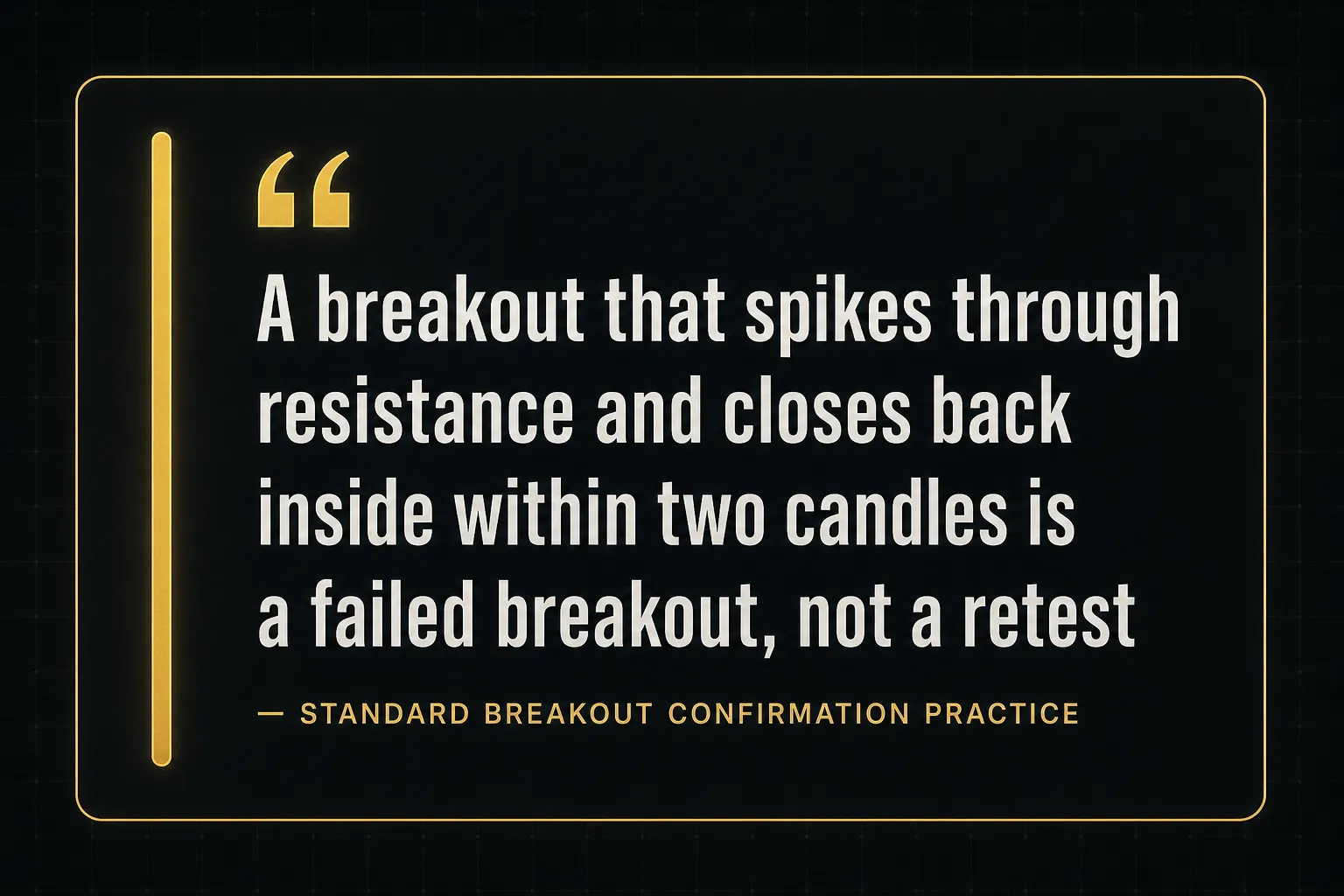
- Recognise the failed breakout immediately. If price closes back inside the pattern within one to two candles of breaking out, that is not a retest. That is a failed breakout, and the strongest moves often run hard in the opposite direction as trapped positions get flushed.
- Choose your entry style and stick to it. Breakout-close entry gives you more fills and more fakeouts. Retest entry gives you better prices and tighter stops but misses the moves that never look back. Both work. Mixing them impulsively does not.
Targets, Stops and Position Size
- Measure the pattern height. Take the vertical distance at the widest point of the structure. For a triangle, that’s the first swing high to the first swing low. For a head-and-shoulders, it’s the head to the neckline.
- Project that height from the breakout point. This is the measured move target, the standard objective for classical patterns. It’s a reference, not a guarantee, and taking partial profit at 70 to 80% of it is a reasonable habit.
- Place the stop at structural invalidation. For a triangle breakout, that’s below the opposite trendline or the last swing low inside the pattern. Not at a round number, not at whatever distance feels comfortable.
- Calculate risk-reward before sizing. Worked example: BTC breaks a symmetrical triangle with a close at $92,400. The pattern height is $5,600, giving a target of $98,000. The last swing low sits at $90,300, so the stop goes there. Risk is $2,100, reward is $5,600, a ratio of 1:2.67.
- Reject anything under 1:2. If the nearest logical target sits closer than twice your risk, the setup fails on arithmetic regardless of how clean the pattern looks. Skip it.
- Size from your risk, not your conviction. Risking 1% of a $20,000 account is $200. With $2,100 of risk per coin, position size is roughly 0.095 BTC. The pattern never determines size. The stop distance does.
Why Crypto Breakouts Fail
Messy Real-World Charts
Open any live BTC chart and try to find a textbook triangle.
You won’t.
Real structures overshoot their boundaries, touch unevenly, and overlap with two or three other patterns at the same time.
That’s normal.
Textbook diagrams are idealised averages, roughly the way a physics problem ignores air resistance.
The practical fix is a tolerance band instead of a hard line. Draw your trendline, then accept overshoots up to about 0.5 ATR on either side as still respecting the structure.
On a 4-hour BTC chart with a 1.2% ATR, that’s a band roughly 0.6% wide, which comfortably absorbs the wick noise that would otherwise invalidate every line you draw.
What should genuinely invalidate a pattern is a close well outside the band, not a wick.
Wicks are liquidity hunting. Closes are consensus.
And when two patterns overlap, default to the larger one.
A bearish flag nested inside a bullish ascending triangle resolves according to the triangle far more often than the flag.
Leverage, Perps and Multi-Timeframe Traps
Crypto has a structural distortion that equity chartists never deal with: perpetual futures markets that dwarf spot volume and mechanically hunt stop clusters.
When open interest builds rapidly while price compresses inside a pattern, leveraged positions are stacking up with stops just beyond the boundaries.
Market makers know exactly where those liquidation levels sit. A relatively small push through resistance triggers forced buying, price spikes, then reverses once the cascade exhausts.
The result is a violent wick straight through your pattern boundary that closes back inside. On spot-only charts, that move frequently doesn’t exist at all, or appears at half the size.
Two data points act as an early warning.
A sharply positive funding rate means longs are paying shorts heavily, crowding is extreme, and upside breakouts become fragile. Rising open interest into a compression zone means the fuel for a liquidation cascade is already loaded.
Then there’s the timeframe trap. Picture a clean 15-minute ascending triangle on ETH that breaks upward with strong volume.
Textbook entry.
What the trader didn’t check: on the daily chart, ETH is completing the right shoulder of a head-and-shoulders that has been building for eleven weeks, with the neckline sitting 3% below.
The 15-minute breakout runs about 1.2% and stalls exactly at the daily neckline resistance. The higher timeframe usually wins, because more capital, longer holding periods, and larger institutional orders sit behind it.
The rule that follows is simple.
Trade patterns that point the same direction as the timeframe above yours. Against the higher timeframe, cut targets and expect the move to die early.
Confluence Over a Single Signal
Volume is the most misread element of a breakout, so be specific about what each behaviour means.
Rising volume on the breakout candle confirms real participation, ideally 1.5 to 2 times the 20-period average.
Flat volume means the move happened because nobody was defending the level, not because buyers arrived, and those breakouts fail at a noticeably higher rate.
Declining volume during the retest is exactly what you want, because it shows sellers have no interest in pushing price back inside.
Divergently weak volume, where price makes a new high inside the pattern on visibly lower volume than the previous high, is a warning that the structure is running on fumes. Pair that with a relative strength index divergence or a flattening MACD histogram and the case weakens further.
No single input carries a trade.
What you’re building is confluence: pattern structure, higher timeframe trend, volume behaviour, momentum, and position relative to key moving averages all pointing the same way.
This is where PipTrend’s multi-timeframe confluence table earns its keep. Instead of manually flipping between the 15-minute, 4-hour and daily charts and losing track of what agreed with what, you get trend alignment across timeframes in one view.
If the daily is bearish while your 1-hour pattern is bullish, the table shows the conflict before you enter.
PipTrend also separates signals from entries deliberately. A signal says conditions are forming. An entry says confirmation criteria have been met.
That separation is the practical antidote to the core mistake this whole guide is about: treating one pattern on one timeframe as a guaranteed outcome.
Chart Pattern FAQs
What is the most accurate crypto chart pattern?
No pattern is universally most accurate, and any source claiming a specific win rate for a specific shape is oversimplifying. Accuracy depends on trend context, timeframe, and whether confirmation rules are applied consistently.
That said, patterns aligned with the prevailing higher timeframe trend outperform counter-trend reversals across almost every study of classical technical analysis. Bull flags in confirmed uptrends and ascending triangles at the top of a healthy trend tend to be more dependable than head-and-shoulders reversals, simply because continuation requires less to go right.
The variable that moves your results most isn’t which pattern you pick.
It’s whether you take the trade only when the breakout confirms and the risk-reward clears 1:2.
What are the 5 major chart patterns in crypto?
The five most cited formations are triangles, head-and-shoulders, double tops and bottoms, flags and pennants, and wedges.
- Triangles signal compression before an expansion move, with ascending leaning bullish, descending leaning bearish, and symmetrical taking the direction of the prior trend.
- Head-and-shoulders marks a trend exhaustion reversal, confirmed only on a neckline close, with the inverse version signalling the same at market bottoms.
- Double tops and bottoms show a level rejected twice, bearish at highs and bullish at lows, though second touches in crypto are often liquidity sweeps.
- Flags and pennants are short consolidations after a sharp impulse and resolve in the direction of the flagpole roughly two-thirds of the time when the retracement stays shallow.
- Wedges are converging structures where rising wedges typically break down and falling wedges typically break up, both requiring volume contraction inside the structure.
How do you read patterns in crypto?
Reading a pattern means answering three questions in order: where does this sit in the trend, has it confirmed, and what is volume saying?
Start with trend location on a timeframe at least four times higher than the one you’re trading. A bullish structure inside a daily downtrend is a lower-probability trade regardless of how clean it looks.
Then wait for a candle close beyond the pattern boundary with enough distance to clear ATR noise.
Only then check volume, momentum, and moving average positioning. Shape alone tells you almost nothing about direction, which is why identical formations produce opposite outcomes in different market conditions.
Do chart patterns work in crypto?
Chart patterns show measurable statistical edges in several academic and practitioner studies, but the edge is modest and disappears without disciplined execution.
Three things break them in practice.
Poor risk management turns a 55% win rate into a losing system when losers run larger than winners.
Small sample sizes create false confidence, because judging a pattern on twelve trades tells you nothing statistically meaningful.
And hindsight bias makes historical charts look far more tradable than they were in real time, since the outcome is already visible when you scroll back.
Patterns work as a framework for locating trades and defining invalidation.
They do not work as prediction machines.
What is the best indicator for crypto chart patterns?
No single indicator confirms a pattern on its own, and traders who search for one usually end up stacking six oscillators that all measure the same thing.
Volume is the most directly relevant companion, since it validates whether a breakout had genuine participation behind it. Beyond that, combining a trend filter such as the 50 and 200 period moving averages with a momentum reading from the relative strength index or MACD gives you independent inputs rather than redundant ones.
The more reliable approach is confluence across timeframes, which is exactly what PipTrend’s multi-timeframe table is built to surface.
Alignment between structure, trend direction, and momentum beats any individual tool.
How do you know if a crypto breakout is real?
A real breakout meets four conditions, and missing any one of them puts the trade in fakeout territory.
- A confirmed candle close beyond the pattern boundary on your trading timeframe, not an intrabar wick.
- Adequate breakout distance, generally at least 0.3 to 0.5 ATR past the level, so the move clears normal volatility noise.
- Supportive volume on the breakout candle, ideally well above the recent average, with volume then contracting on any pullback.
- No immediate re-entry into the pattern. A close back inside within one to two candles signals failure, and those failures often reverse hard.
Checking funding rates and open interest adds a useful layer on perpetual futures. Extreme positive funding into an upside breakout means the move is crowded and vulnerable.
Trade the Structure, Not the Shape
The checklist is short enough to keep on a sticky note.
Objective boundaries with at least two clean touches. A confirmed close beyond the level with ATR-adjusted distance. Supportive volume. Risk-reward of 1:2 or better measured from a structural stop.
All four present, the setup is tradable.
Any one missing, you wait. There will be another pattern in a few hours.
A chart pattern is a probability tool for direction and trade location.
Nothing more.
It tells you where buyers and sellers have been fighting and roughly where the winner is likely to push next, and it tells you precisely where your idea is wrong.
That last part is arguably the most valuable output.
Discipline around invalidation matters more than pattern selection. A trader with mediocre pattern recognition and rigid stops will outperform a brilliant chartist who moves stops out of the way.
Consistency is what compounds.
Apply the same drawing rules, the same confirmation standards, and the same risk limits across every coin and every timeframe, and you build a sample size you can actually learn from. Chase the perfect textbook setup instead and you’ll spend most of your time waiting for a chart that never quite arrives.
Sources
Risk Disclaimer: Trading involves risk. Past performance doesn't guarantee future results. Only trade with money you can afford to lose. PipTrend is a tool to assist your trading decisions, not financial advice.