Reading MACD Signals Without Getting Fooled
On this page
Why MACD Confuses So Many Traders
Ask ten traders what a MACD crossover means and you’ll get ten different answers.
That’s the problem.
The MACD indicator (Moving Average Convergence Divergence) sits on more charts than almost any other tool. Stocks, forex pairs, crypto, futures contracts, it shows up on all of them, usually in a panel below price with two wiggling lines and a bar chart.
Most tutorials stop there.
Line crosses up, buy. Line crosses down, sell.
Simple, clean, and responsible for an enormous amount of lost money.
The issue isn’t the indicator.
It’s the framing.
MACD is a lagging indicator built entirely from past prices, its scale changes depending on what you’re charting, and in sideways conditions it will fire crossover after crossover until your account bleeds out from commissions alone.
MACD doesn’t tell you what price will do. It tells you what momentum has been doing, and how that’s changing.
This guide breaks down what each component actually measures, why the famous 12-26-9 settings are a historical accident rather than an optimum, and how to fold MACD into a conditional trade plan.
Not a signal generator.
An input.
By the end you should be able to look at a MACD panel and know when it’s worth acting on and, more importantly, when it’s noise.
How MACD Is Built
Gerald Appel built MACD in the late 1970s with a pocket calculator and a slide rule mentality. The math is deliberately simple, which is exactly why it survived.
The Three Core Components
MACD has three moving parts, and confusing them is where most misreads begin.
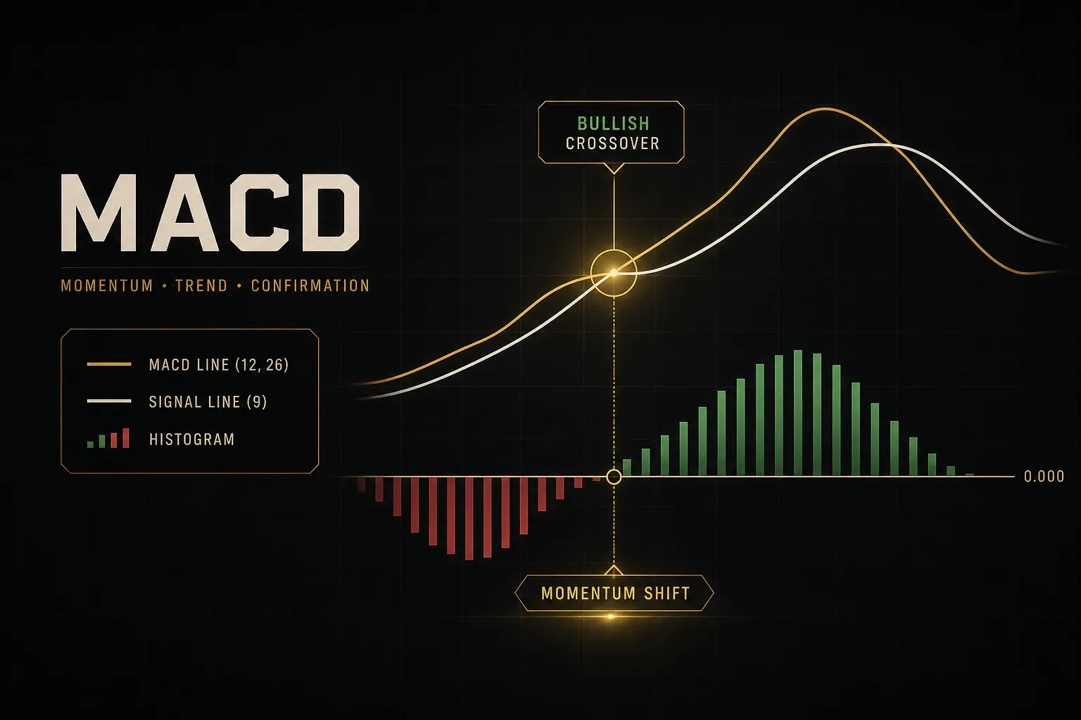
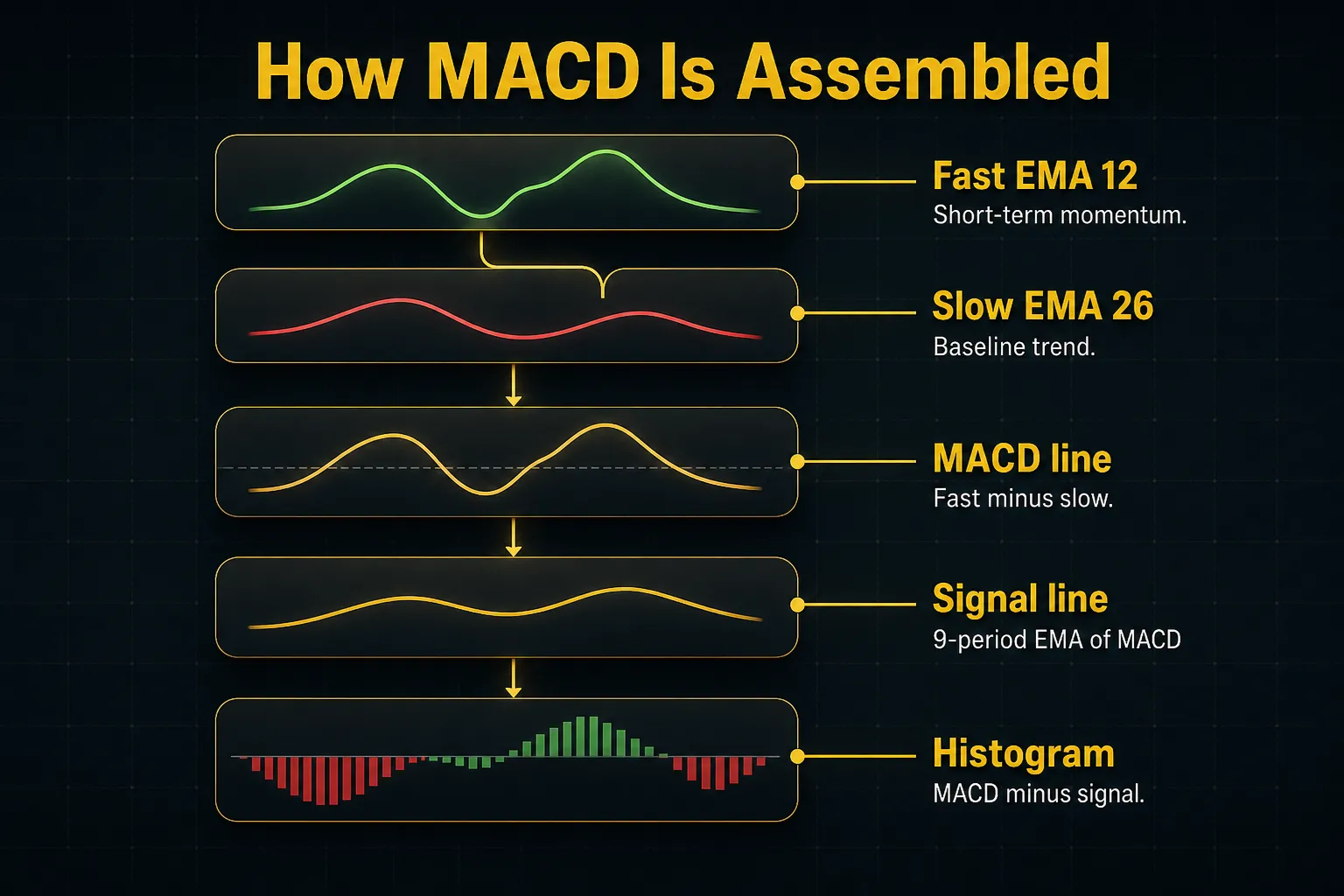
The MACD line is the difference between a 12-period exponential moving average and a 26-period EMA.
Fast EMA minus slow EMA.
That’s it.
When the fast EMA pulls away above the slow EMA, the MACD line rises, meaning short-term momentum is outpacing longer-term momentum. When the fast EMA falls below, the MACD line goes negative.
The signal line is a 9-period EMA of the MACD line itself. It’s a smoothed version of the MACD line, which is why it always lags behind it.
The MACD histogram is the third piece: MACD line minus signal line, plotted as bars around a zero line.
Tall bars mean the two lines are far apart. Shrinking bars mean they’re converging.
Here’s a worked example.
Say a stock’s 12-period EMA sits at $52.40 and its 26-period EMA sits at $51.10. MACD line equals $1.30.
If the 9-period EMA of that MACD line currently reads $0.95, the histogram bar prints at +0.35. Momentum is positive and the MACD line is still above its own average, so the recent push is stronger than the recent average push.
Now price stalls.
Next session the 12-period EMA edges to $52.55 while the 26-period EMA catches up to $51.60. MACD line drops to $0.95, the signal line ticks up to $0.98, and the histogram flips to -0.03.
A signal-line crossover just happened, without price falling a single cent.
Why 12-26-9 Isn’t Universal
Those three numbers come from a six-day trading week and a monthly cycle roughly two weeks long. Markets in 2026 trade five days a week, 24 hours in some cases, and in fractions of a second.
The settings persist because everyone uses them, which creates a weak self-fulfilling effect around widely watched crossovers. That’s a reason to know the defaults, not a reason to worship them.
Shorten the periods to something like 5-13-5 and the indicator reacts faster. You’ll catch momentum shifts earlier and eat far more whipsaw in the process.
Lengthen them to 19-39-9 and the noise drops away. You’ll also arrive late to every move, sometimes too late for the risk-reward to make sense.
The right choice depends on two things: how volatile the asset is, and how long you intend to hold.
A crypto pair with 6% daily ranges and a blue-chip utility stock do not deserve identical smoothing.
Test settings against your actual holding period.
If your average trade lasts three days, a 26-period slow EMA on a daily chart is measuring a cycle you’ll never participate in.
Reading Crossovers and the Histogram
Two lines cross.
Everyone gets excited.
But which cross, and where on the chart it happened, changes the meaning entirely.
Signal Line vs Zero Line
A signal-line crossover occurs when the MACD line crosses its own 9-period average.
This is a short-term momentum shift, nothing more.
A centerline crossover occurs when the MACD line crosses zero, which means the 12-period EMA has crossed the 26-period EMA.
That’s a genuine change in the relationship between short and long-term trend.
These are not the same event, and treating them interchangeably is the single most common MACD error.
Context multiplies the meaning.
A bullish signal-line crossover that happens well above the zero line is a pullback ending inside an established uptrend. The same crossover happening deep below zero is a bounce inside a downtrend, statistically a much weaker setup.
Think of the zero line as the tide and the signal line as the waves. You can surf a wave against the tide.
You just shouldn’t be surprised when it doesn’t carry you far.
What the Histogram Really Shows
The MACD histogram gets misread constantly. Those bars have nothing to do with volume, buying pressure, or how many shares changed hands.
They measure one thing: the gap between the MACD line and the signal line.
Nothing else.
What makes them useful is timing.
Because a crossover happens when the histogram touches zero, shrinking bars are visible before the crossover arrives.
Four consecutive bars getting shorter while price still pushes higher tells you the rate of acceleration is fading.
The move isn’t dead.
It’s decelerating.
That distinction matters for trade management.
Fading histogram bars are a reason to tighten a stop or scale out, rarely a reason to reverse position outright.
The Scale Problem
MACD is unbounded, and this trips up traders who came from the relative strength index.
RSI runs 0 to 100 on every chart ever drawn. A reading of 72 means the same structural thing on a $4 stock as it does on a $4,000 index future.
MACD doesn’t work that way.
Because it’s a raw price difference, a MACD value of +2.00 on a $600 stock is trivial, while +2.00 on a $18 stock is a violent move.
You cannot compare MACD readings across assets. You can only compare a MACD reading to that same asset’s own recent history.
Some platforms offer a percentage-price-oscillator variant that normalizes this by dividing by the slow EMA.
Useful if you screen across many tickers. Overkill if you trade three instruments.
And the deeper point stands: every MACD value is calculated from prices that already happened. It’s a trend-following indicator and a momentum oscillator stitched together, and neither half predicts anything.
It confirms, it tracks, it describes.
That’s the job.
Divergence and Market Context
Divergence is where MACD gets genuinely interesting, and also where traders lose the most money by acting too early.
Divergence Warns, Not Predicts
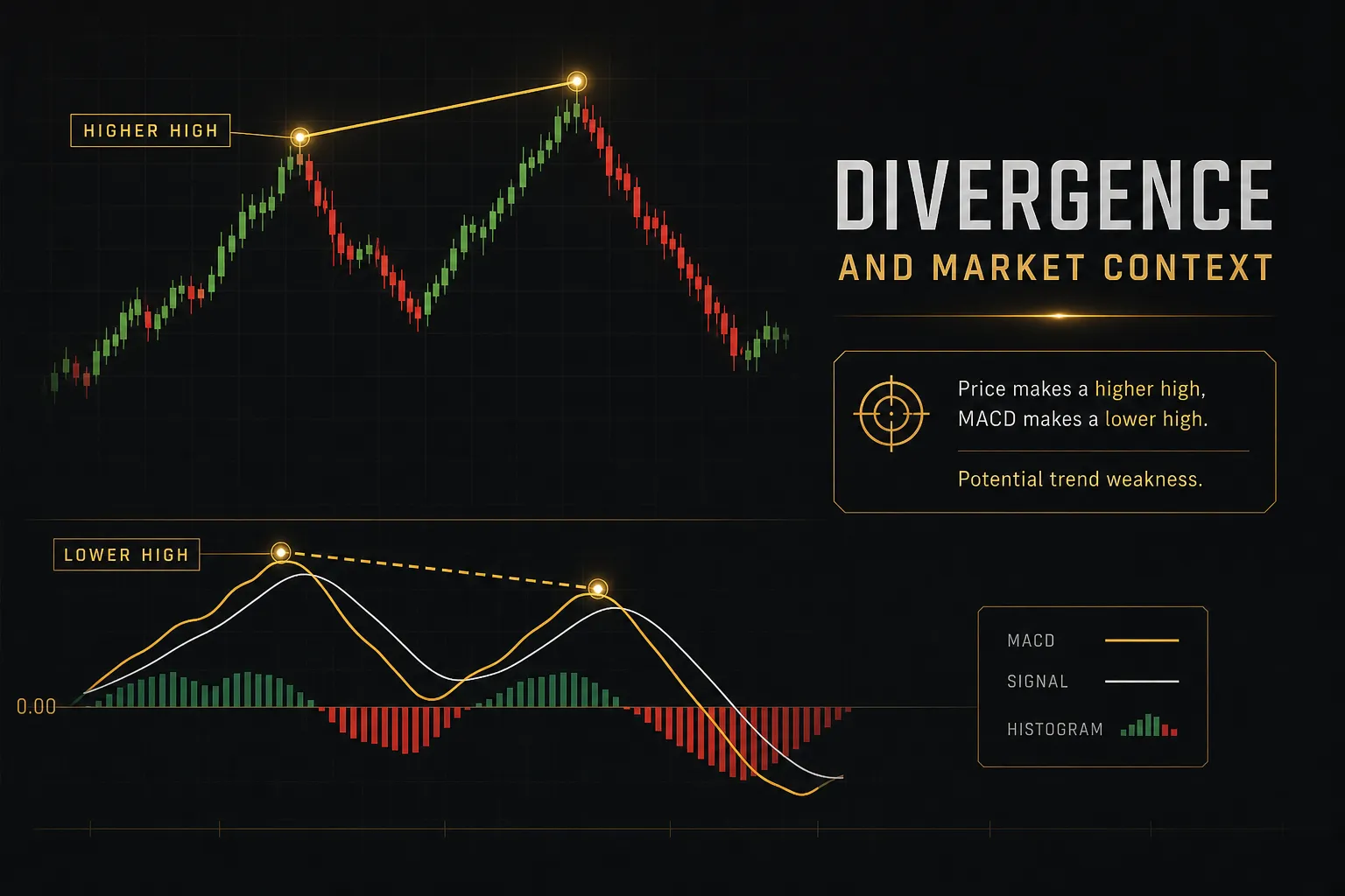
Regular divergence happens when price and momentum disagree.
Price prints a higher high while MACD prints a lower high: bearish divergence. Price prints a lower low while MACD prints a higher low: bullish divergence.
The interpretation is straightforward.
The move is still happening, but with less force behind it than the previous leg.
Hidden divergence works the opposite way and signals continuation rather than reversal. Price makes a higher low while MACD makes a lower low in an uptrend, which often marks the end of a healthy pullback.
Here’s the part every guide undersells: divergence can persist for weeks.
A strongly trending market will produce three or four divergences on the way up, and shorting each one is a reliable way to donate capital.
Divergence is a reason to start watching. It is never, by itself, a reason to enter.
Treat it as a flag that raises your attention level. Then wait for something structural to confirm it, a broken trendline, a failed retest of support and resistance, a clear reversal candle with volume confirmation.
MACD Across Market Regimes
MACD’s performance swings wildly depending on market regime, and this is not a small effect.
In a sustained trend, MACD is excellent.
It keeps you positioned, it flags pullback exhaustion, and the histogram gives an honest read on whether the trend is accelerating or tiring.
In a range-bound market, it falls apart.
Price oscillates around a mean, the two EMAs keep converging and separating, and you get crossover after crossover, most of them reversing within a few bars.
Thin liquidity makes it worse.
Wide spreads and gappy price action produce EMA jumps that have more to do with the order book than with actual momentum.
Volatility is the other variable.
When average true range expands, histogram swings widen and crossovers trigger on moves that would have been noise a month earlier.
The practical adjustment: in high-volatility conditions, require more confirmation before acting, and widen your stop-loss placement to match ATR rather than a fixed point value. Then reduce position sizing so the wider stop doesn’t increase your dollar risk.
Timeframe and Multi-Timeframe Conflicts
Drop from a daily chart to a 15-minute chart and your MACD signal count multiplies roughly tenfold.
The indicator hasn’t gotten better or worse.
You’ve just changed the resolution.
Faster timeframes give earlier entries and far more false starts. Slower timeframes give cleaner signals and worse entry prices.
One rule cuts false signals meaningfully without costing much: wait for the candle to close. A crossover that exists mid-bar and vanishes by the close was never a signal, and intrabar reversals are common enough that this habit alone filters a meaningful chunk of noise.
Then there’s the conflict problem.
Your 4-hour MACD is bullish, your 1-hour MACD just turned bearish.
Which one wins?
The higher timeframe sets the context.
Always.
In multi-timeframe analysis, a lower-timeframe bearish crossover inside a higher-timeframe uptrend is usually a pullback, and the correct response is to look for a long entry, not to flip short.
Flip that logic and you’ll spend your career fighting the dominant trend with the smallest timeframe on your screen.
Turning Signals Into a Trade Plan
Everything above is diagnosis.
This is where it becomes a process you can actually run.
A Complete Decision Framework
Run these six checks in order, every time.
If a step fails, stop.
Don’t proceed to the next one hoping it saves the trade.
- Identify the market regime and higher-timeframe trend. Pull up a timeframe four to six times higher than your trading chart and answer one question: trending or ranging? If it’s ranging, MACD crossovers on your entry timeframe are low-value and you should size down or skip.
- Confirm price structure first. Before you look at the indicator panel, mark the recent swing highs and lows plus the nearest support and resistance. A long setup into overhead resistance three points away is a bad trade regardless of what MACD says.
- Check MACD alignment across both components. You want the MACD line positioned on the correct side of the zero line for your direction, and the histogram expanding rather than contracting. Alignment between the centerline context and the signal-line event is what separates a real setup from a random cross.
- Wait for entry confirmation on the close. Let the candle finish. Ideally you also want a price action trigger, a break of the prior bar’s high for a long, or a rejection wick off a level you already marked.
- Set stop placement from structure, not from the indicator. Place the stop beyond the swing point that would invalidate your read, then check it against 1 to 1.5 times ATR so you’re not sitting inside normal noise. Size the position so the distance to that stop equals your fixed risk per trade.
- Define exit rules before you enter. Decide in advance whether you exit on an opposing signal-line crossover, on a fixed reward multiple, on a trailing stop below each swing low, or on the histogram contracting for three consecutive bars. Writing it down beforehand is what stops you improvising at the worst moment.
Five setups worth recognizing, including one where the answer is to do nothing:
- Trend-following entry: Higher timeframe trending up, MACD line above zero, bullish signal-line crossover, price holding above a rising 50-period EMA. Highest-probability configuration of the group.
- Pullback entry: Established uptrend, price retraces to a prior support zone, histogram bars shrink toward zero then flip positive again while the MACD line never crosses below zero. Better entry price, requires more patience.
- Zero-line continuation: Price consolidates, MACD line drifts toward zero from above, holds without crossing, then expands upward again. A cleaner continuation read than the classic centerline crossover because it confirms the trend never actually broke.
- Divergence-based alert: Bearish regular divergence forms over three or more swings. You do not short here. You move to a lower timeframe, watch for a broken trendline or failed high, and only then consider an entry.
- The no-trade scenario: Price is compressed inside a 2% range, the MACD line is hugging zero, and the histogram is alternating between tiny positive and negative bars. Every crossover here is noise. Sit out.
Pairing MACD With Confirmation Tools
Adding a second indicator only helps if it measures something different.
Most traders fail this test immediately.
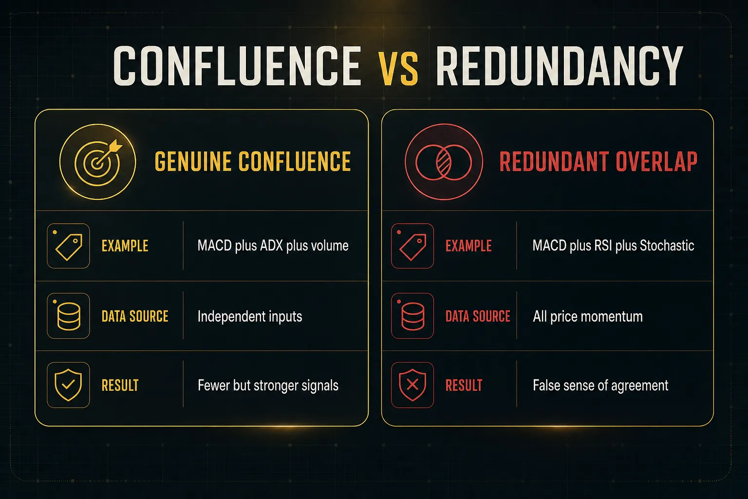
Stacking MACD with RSI feels like confirmation but often isn’t. Both are derived from the same closing prices, both measure momentum, and both will typically turn at roughly the same time.
Agreement between them is close to guaranteed, which makes it nearly worthless as independent evidence.
Real confluence requires a different input.
A 200-period moving average adds a trend filter. Average directional index adds a measure of trend strength, telling you whether a trend exists at all before you trade a MACD signal within it.
Volume adds a genuinely independent dimension since it’s not derived from price at all. So does market structure: higher highs and higher lows either exist or they don’t.
Systems built around layered validation apply this principle structurally. PipTrend’s multi-timeframe confirmation table and fakeout filter, for instance, illustrate the approach: momentum reads get cross-checked against independent trend and structural data across several timeframes before a signal is treated as actionable.
The underlying idea is portable whether or not you use any particular platform.
One indicator agreeing with itself across three variants is not confirmation.
Backtesting Pitfalls to Avoid
A MACD strategy that returned 340% in backtest and loses money live isn’t unlucky.
It’s usually broken in one of five predictable ways.
- Ignoring transaction costs. MACD crossover systems trade frequently, so spread, slippage, and commissions compound fast. A strategy averaging 0.4% per trade before costs can be flat or negative after a 0.1% round-trip cost across 200 trades.
- Survivorship bias. Testing on the current index constituents quietly excludes every company that was delisted or went bankrupt. Your results describe a universe of winners that nobody could have identified in advance.
- Look-ahead bias. Using the closing price of a bar to enter at that same bar’s close is impossible in practice, since the close isn’t known until it’s gone. Entries must occur on the next bar’s open.
- Curve-fitting the settings. Testing 400 combinations of fast, slow, and signal periods and keeping the best one produces a number optimized for one specific sample of history. Validate on out-of-sample data or the result means nothing.
- Regime blindness. A system tested only across 2020 to 2021 learned one market. Test across trending years, ranging years, and at least one high-volatility shock before trusting the equity curve.
The honest check: if your backtest requires the exact settings you found to work, it will break. Robust rules survive small parameter changes with degraded but positive results.
MACD Indicator FAQs
How do you use the MACD indicator?
Use MACD to confirm momentum direction within an already-identified trend, not to generate standalone entries.
Read it in three layers.
First, check which side of the zero line the MACD line sits on, which tells you the broader trend relationship between the fast and slow EMAs.
Second, watch for signal-line crossovers as short-term momentum shifts.
Third, use the histogram to judge whether the current move is accelerating or fading.
Then combine all three with price structure and a higher-timeframe read before acting.
What is the best MACD setting?
The default 12-26-9 remains a reasonable starting point for most traders and timeframes.
There is no universally optimal setting.
Day traders often shorten to something like 5-13-5 or 8-17-9 for faster response on intraday charts, accepting more false signals as the trade-off. Swing and position traders sometimes lengthen to 19-39-9 to filter noise on daily and weekly charts.
Match the setting to your holding period and the asset’s volatility, then test it out-of-sample rather than optimizing it to fit past data.
Is MACD a good indicator for beginners?
Yes, conceptually, because the underlying math is transparent and the visual read is intuitive.
But beginners routinely misuse it.
The two things to understand before relying on MACD are lag and false-signal risk. Every value comes from past prices, so the indicator confirms moves rather than anticipating them.
Learn to identify whether the market is trending or ranging first.
That single skill improves MACD results more than any settings adjustment.
What does MACD tell you about a stock?
MACD tells you the direction and strength of momentum relative to the stock’s own recent trend. It says nothing about price targets, valuation, or whether a reversal is guaranteed.
A rising MACD line above zero indicates short-term momentum is outpacing the longer-term baseline. An expanding histogram indicates that gap is widening.
Because MACD is unbounded and price-dependent, a reading of +1.80 on one stock cannot be compared to +1.80 on another.
Compare each stock only to its own history.
Which is better, MACD or RSI?
Neither is better; they answer different questions.
MACD identifies trend direction and momentum shifts, while RSI identifies overbought and oversold conditions on a bounded 0 to 100 scale.
MACD is more useful in trending markets where you want to stay positioned and time pullback entries. RSI is more useful in range-bound markets where price reverts between defined boundaries.
Using both together adds less than most traders assume, since both derive from the same closing prices and often turn simultaneously. Pair MACD with a trend filter like ADX or volume for genuinely independent confirmation.
How accurate is the MACD indicator?
No fixed accuracy percentage exists for MACD, and any source quoting one is selling something. Results depend entirely on market regime, timeframe, asset, and the confirmation rules applied alongside it.
The same crossover rule can produce strong results in a trending year and consistent losses in a choppy one. Win rate also shifts with your exit rules, which have as much impact on profitability as entries do.
A better question than accuracy: does this setup have a positive expectancy after realistic costs, across multiple market conditions?
The Bottom Line on MACD
MACD earns its place on charts because it does one thing well: it describes how momentum is behaving relative to trend, in a form you can read at a glance.
What it will never do is predict.
It’s built from prices that already printed, which makes it a confirmation tool by construction.
The single rule worth carrying away: never act on a crossover alone. Require the higher-timeframe trend, the price structure, and the MACD read to agree before you commit capital, and walk away when they don’t.
That last part is the hard bit.
Skipping trades feels like doing nothing, but filtering out the setups where MACD is just describing noise is where the edge actually lives.
Treat it as one input among several.
The traders who last aren’t the ones with the best indicator settings, they’re the ones with the discipline to demand confluence before they click.
Risk Disclaimer: Trading involves risk. Past performance doesn't guarantee future results. Only trade with money you can afford to lose. PipTrend is a tool to assist your trading decisions, not financial advice.