How to Read a EUR/USD Chart Like a Trader
On this page
What the EUR/USD Chart Actually Shows
A EUR/USD chart is a live ledger. Every tick on it answers one question: how many US dollars does one euro buy right now?
That price comes from interbank feeds, streamed from banks and liquidity providers who quote each other continuously across the trading week. Your broker takes that stream, adds a spread, and paints it on your screen as candles or bars.
This guide teaches you to read that picture. It will not tell you today’s rate, and it will not predict where the euro dollar currency pair is headed next week. Those things go stale within hours.
Chart-reading skill does not.
The EUR/USD exchange rate is the most heavily traded price in the world, accounting for roughly a fifth of all daily foreign exchange turnover. That liquidity is exactly why it rewards structured reading.
Tight spreads, clean levels, and fewer erratic gaps than exotic pairs.
Reading a chart well is less about prediction and more about knowing what the market has already told you.
Here is the path.
First, decode the quote itself: base and quote currency, what a single candle is saying, and how to translate a move into pips and percentages. Then structure, which is where most traders either build an edge or lose one.
After that, indicators. Not as magic signals, but as condition-matched tools.
Then the fundamentals that produce those long, violent candles on ECB and Fed days.
Finally, a repeatable pre-trade checklist you can run in under two minutes.
One more thing worth settling early.
It does not matter whether your chart lives on TradingView, MetaTrader 5, cTrader, or your broker’s web platform.
The candles mean the same thing everywhere.
The tools have different names and the colors differ, but the underlying logic of open, high, low, close and market structure is universal.
Learn it once. Apply it anywhere.
Decoding the Price on Your Screen
What 1.1500 Actually Means
Every currency pair has two halves. The first currency listed is the base currency, and the second is the quote currency.
In EUR/USD, the euro is the base and the US dollar is the quote. So a price of 1.1500 means one euro buys 1.1500 US dollars.
Nothing more complicated than that.
When the chart rises, the euro is strengthening against the dollar. When it falls, the dollar is winning.
Traders shorthand this as “the euro is bid” or “the dollar is bid,” but the arithmetic is always the same: the base currency is what you are buying or selling, priced in the quote currency.
Your broker will actually show you two prices.
The bid is what you can sell at, the ask is what you can buy at, and the gap between them is the spread. On EUR/USD during liquid hours that spread is often 0.1 to 1.0 pips, which is about as tight as retail forex gets.
Reading a Single Candlestick
A candle on a forex candlestick chart compresses a slice of time into four numbers: open, high, low, close.
The body spans open to close. The thin lines above and below, the wicks, mark the extremes price reached but did not hold.
Take a concrete example.
A one-hour candle opens at 1.1480, runs up to 1.1512, dips to 1.1465, and closes at 1.1505.
What does that tell you?
The body runs from 1.1480 to 1.1505, so it is bullish, 25 pips of net buying. The lower wick stretches 15 pips below the open, meaning sellers pushed price to 1.1465 and buyers absorbed all of it.
The upper wick is only 7 pips.
Price closed near its high, well above its midpoint.
That wick-to-body ratio matters.
A long lower wick with a small upper wick and a close in the top third of the range is a rejection candle.
Sellers tried, failed, and buyers finished the hour in control.
Flip it around and the story inverts.
Same range, but a close at 1.1470 with a long upper wick would signal sellers stepping in aggressively at higher prices.
Single candles are hints, not commands.
Context, meaning where the candle sits relative to structure, decides whether the hint is worth acting on.
Pips, Pipettes, and Percentage Moves
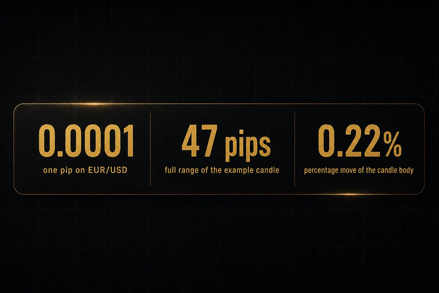
A pip is the fourth decimal place on EUR/USD.
One pip is 0.0001.
Most modern feeds now quote five decimals, and that fifth digit is a pipette, or one tenth of a pip. So a price displayed as 1.15043 is 1.1504 plus 3 pipettes.
New traders regularly misread this and think they are up 30 pips when they are up 3.
Back to our example candle.
High 1.1512, low 1.1465. That is a total range of 47 pipettes… no, 47 pips. The body alone, 1.1480 to 1.1505, is 25 pips.
Now convert to percentage.
A 25-pip move from 1.1480 is 0.0025 divided by 1.1480, or roughly 0.22%. The full 47-pip range is about 0.41% of price.
That reframing is useful.
Forex moves feel dramatic in pips and modest in percentage terms, which is precisely why leverage exists in this market and precisely why it destroys undisciplined accounts.
Finding Structure in the Noise
Start Wide, Then Zoom In
The single most common mistake in retail forex is opening a 5-minute chart and forming an opinion. You are looking at a snapshot of a movie and guessing the plot.
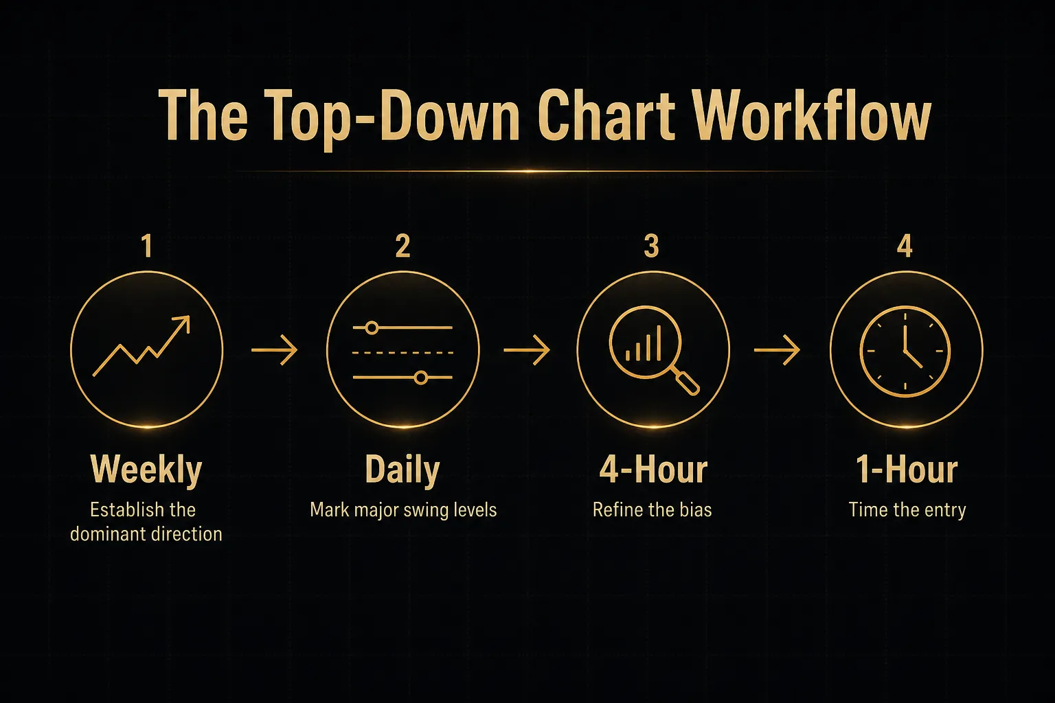
Multi-timeframe analysis fixes this with a top-down workflow.
Start on the Weekly chart to see the dominant direction of the last several months. Then the Daily, where most institutional positioning is visible and where the major swing highs and lows live.
Only then drop to the 4-hour and 1-hour charts for timing.
The logic is simple.
Higher timeframes set the bias, lower timeframes set the entry.
If the Daily shows a clear uptrend and your 15-minute chart flashes a sell signal, you are fighting the tide for a 20-pip puddle.
Run the sequence in that order every time. It takes about ninety seconds once it becomes habit.
Support and Resistance as Zones
Draw a support line at exactly 1.1450 and the market will test 1.1447, stop you out, then rally.
Markets do not respect single-pixel precision.
Treat support and resistance zones as bands, typically 10 to 20 pips wide on EUR/USD. Build the band from the cluster of wicks and bodies that repeatedly turned price, not from one perfect touch.
A zone earns its relevance from two things: how many times price reacted there, and how much time passed between reactions. A level defended three times over four months on the Daily chart carries far more weight than a level touched twice yesterday afternoon.
Timeframe changes relevance too.
A 15-pip zone that dominates the 1-hour chart may be invisible on the Weekly, where price swings 300 pips between meaningful levels.
Match your zones to the timeframe you are trading.
Fibonacci retracement levels, especially the 38.2%, 50%, and 61.8% pullbacks of a prior swing, often overlap with these zones. When a Fib level and a horizontal zone coincide, the confluence is worth noting.
When Fib sits alone in empty space, it is a line on a screen.
Spotting a Real Trend
A trend has a definition, and it is not “the chart looks like it is going up.”
An uptrend is a sequence of higher highs and higher lows. Each rally exceeds the previous peak, and each pullback holds above the previous trough.
A downtrend is the mirror: lower highs and lower lows.
Everything else is a range.
And ranges are where trend-following strategies quietly bleed accounts dry.
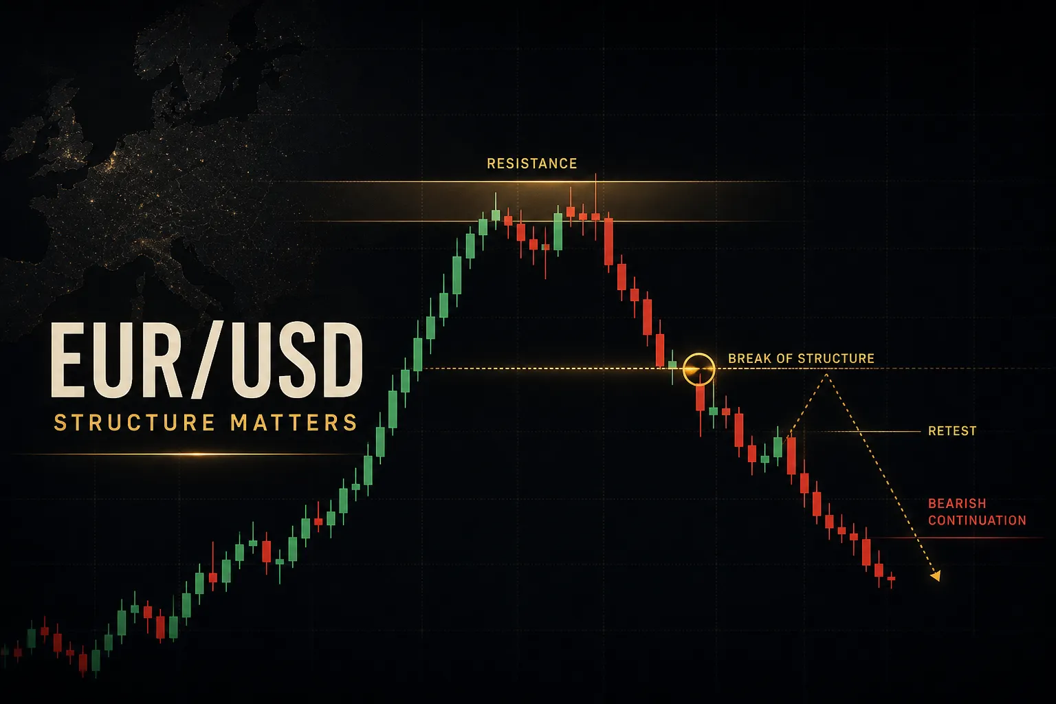
The moment an uptrend fails to make a higher high, or breaks below its most recent higher low, structure has shifted. That break is your objective signal that the trend is in question, and it doubles as a natural invalidation level for any long position.
So what is the best timeframe?
There isn’t one.
A scalper working the London-New York session overlap lives on the 1-minute and 5-minute charts. A swing trader holding for three to ten days works the 4-hour and Daily. A position trader tracking central bank cycles may only check the Weekly.
The right timeframe is the one that matches how long you can realistically hold a position and how often you can look at a screen.
Using Indicators Without Guessing
Matching Tools to Market Conditions
Indicators do not have a quality ranking.
They have a condition they are built for, and using them outside it produces noise dressed up as signal.
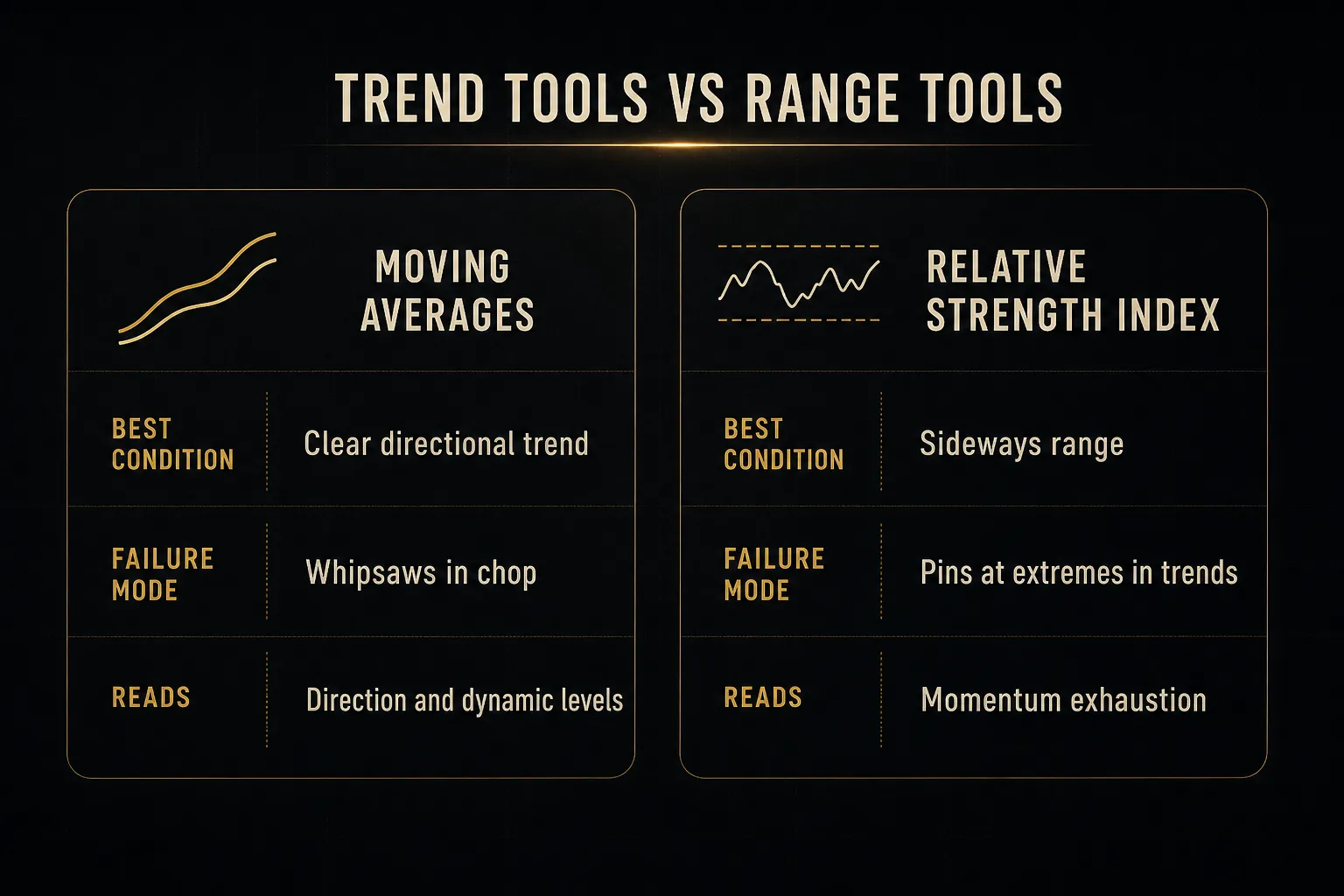
A moving average is a trend tool.
The 50-period and 200-period MAs on the Daily EUR/USD chart act as dynamic support and resistance and define the medium-term bias. In a range, price whipsaws across them constantly and every crossover is a fake.
The relative strength index is a momentum oscillator, and it shines in ranges. RSI above 70 or below 30 flags stretched conditions where mean reversion is likely.
But in a strong trend, RSI can pin above 70 for days while price keeps climbing, and traders who short “overbought” get run over.
MACD sits in between, reading momentum shifts within a trend, useful for spotting when a move is losing steam before price confirms it.
Bollinger Bands measure volatility expansion and contraction; a squeeze often precedes a breakout, though it says nothing about direction.
Average true range is the quiet workhorse.
It measures typical movement over a period, which is what you use to size stops sensibly rather than picking a round number.
And VWAP, volume-weighted average price, gives intraday session context. Institutional desks reference it constantly, which is part of why it works as an intraday magnet.
When Signals Conflict
No indicator predicts direction with certainty.
Every one of them is a probability-weighted confirmation of something price has already begun doing.
Three traps deserve naming.
Repainting indicators redraw their historical signals after the fact, so a backtest looks flawless and live trading looks nothing like it.
Overfitting means tuning parameters until they perfectly explain past data and explain nothing about the future.
Hindsight bias is scrolling a chart, seeing the obvious entry, and forgetting you would never have taken it in real time.
When your tools disagree, use a hierarchy rather than a coin flip.
Higher timeframe structure outranks lower timeframe signals.
Always.
If the Daily trend is up and your 15-minute MACD turns bearish, the Daily wins and the MACD is describing a pullback, not a reversal.
If disagreement persists across three or more timeframes, skip the trade.
That is not indecision, that is the correct read of a market that has not made up its mind.
Cash is a position.
A Multi-Timeframe Confirmation Example
Confirmation-based systems make this discipline mechanical instead of emotional. PipTrend’s approach is a useful illustration: it runs a 12-timeframe confirmation table, scoring conditions from the 1-minute up to the Monthly, so agreement or conflict is visible at a glance rather than buried in a mental tally.
The design point is the separation.
The directional signal is one output.
The entry level is a separate output.
That distinction matters more than it sounds.
A bullish read across ten of twelve timeframes tells you the bias. It does not tell you to buy at whatever price happens to be on screen, which is exactly how traders end up entering 60 pips into a move with a stop that no longer makes sense.
A signal tells you which direction deserves attention. Structure tells you where that direction is worth paying for.
Read any confirmation table the same way: as evidence supporting a plan you already built from structure, never as a standalone buy or sell command.
False Breakouts, News, and Risk Control
Why ECB and Fed Announcements Move the Chart
Those 80-pip candles that appear out of nowhere at 2:15pm? They almost always have a name on the economic calendar.
EUR/USD is fundamentally a bet on policy divergence.
When the Federal Reserve interest rates path is tightening while ECB monetary policy stays accommodative, capital flows toward dollar assets and the pair falls.
Reverse the divergence and the euro strengthens.
The cleanest real-time proxy for this is the bond-yield differential, typically the 10-year US Treasury yield minus the 10-year German Bund yield. When that spread widens in the dollar’s favor, EUR/USD tends to grind lower.
It is not a perfect correlation, but it explains far more of the pair’s medium-term direction than any oscillator.
The high-impact releases to circle: US CPI, US non-farm payrolls, ECB and Fed rate decisions and press conferences, and Eurozone flash CPI. Add the U.S. dollar index as a cross-check, since EUR makes up roughly 57% of that index and the two move nearly inversely.
Spreads widen sharply in the seconds around these releases. A pair that normally costs 0.3 pips to trade can cost 5 or more during an NFP print.
Confirming Breakouts Before Acting
Most breakouts fail.
That is not pessimism, it is the structural reality of a market where stop orders cluster just beyond obvious levels and larger participants have every incentive to trigger them.
Four filters cut down false signals materially:
- Require a candle close beyond the zone, not just a wick through it. A 1-hour candle that pierces resistance by 8 pips and closes back inside has confirmed the resistance, not broken it.
- Wait for the retest. Genuine breakouts frequently return to the broken zone, which now acts as support in reverse. The breakout retest gives you a tighter stop and a cleaner invalidation point than chasing the initial thrust.
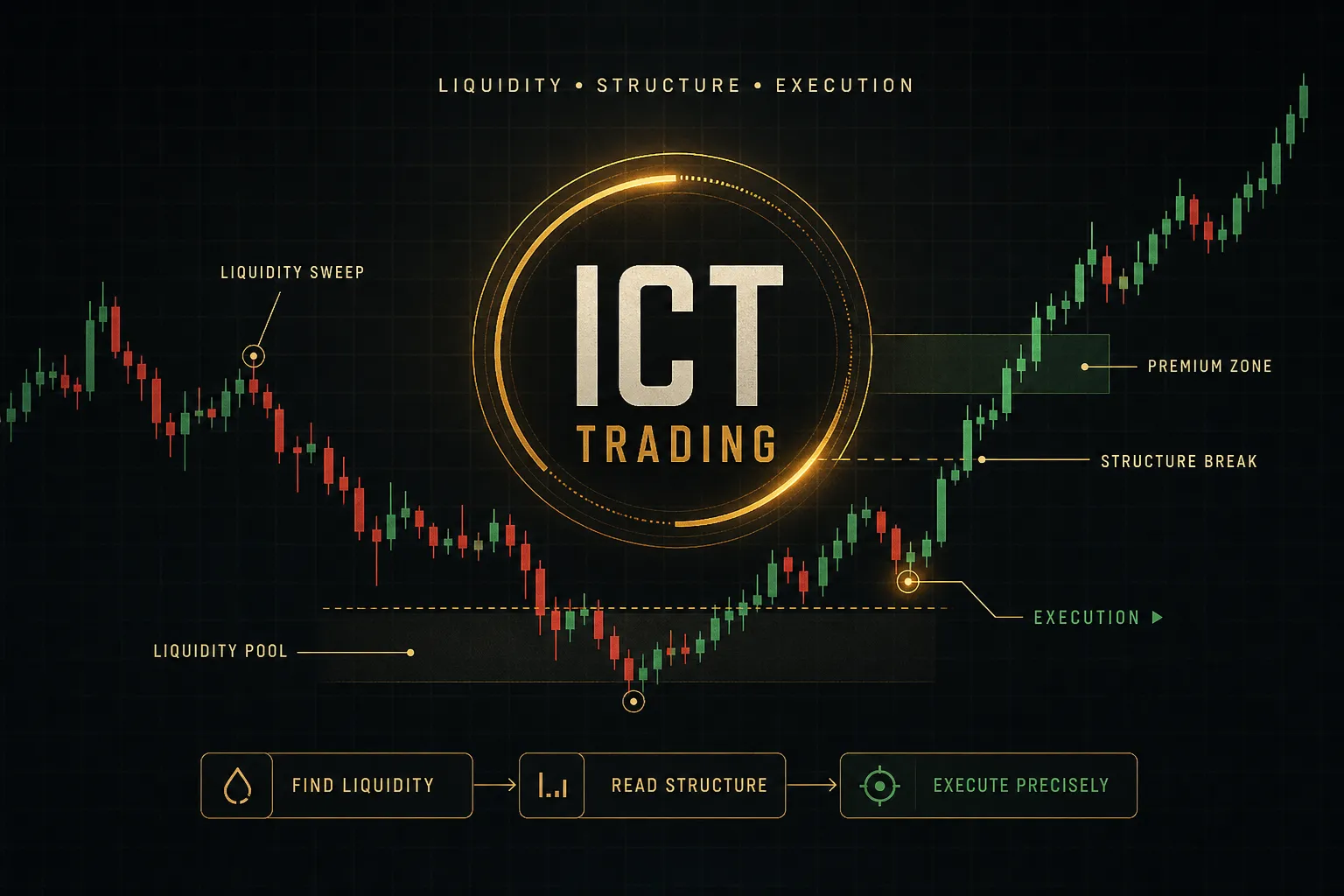
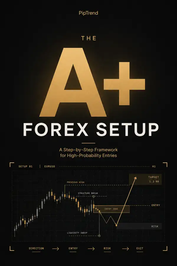
- Check for a liquidity sweep. If price spiked through an obvious swing high, reversed sharply within one or two candles, and closed back inside the range, that was a stop hunt rather than a directional break.
- Apply a volatility filter. Use ATR to confirm the breakout candle is meaningfully larger than the recent average. A 12-pip break when ATR is 45 pips is barely a move at all.
Time of day matters here too.
Breakouts during the London-New York overlap, roughly 8am to noon Eastern, have real volume behind them. Breakouts during the thin Asian session on EUR/USD frequently reverse by the London open.
Turning Chart Levels Into Position Size
Your chart tells you where you are wrong. Your position size decides how much being wrong costs.
Work through it with numbers.
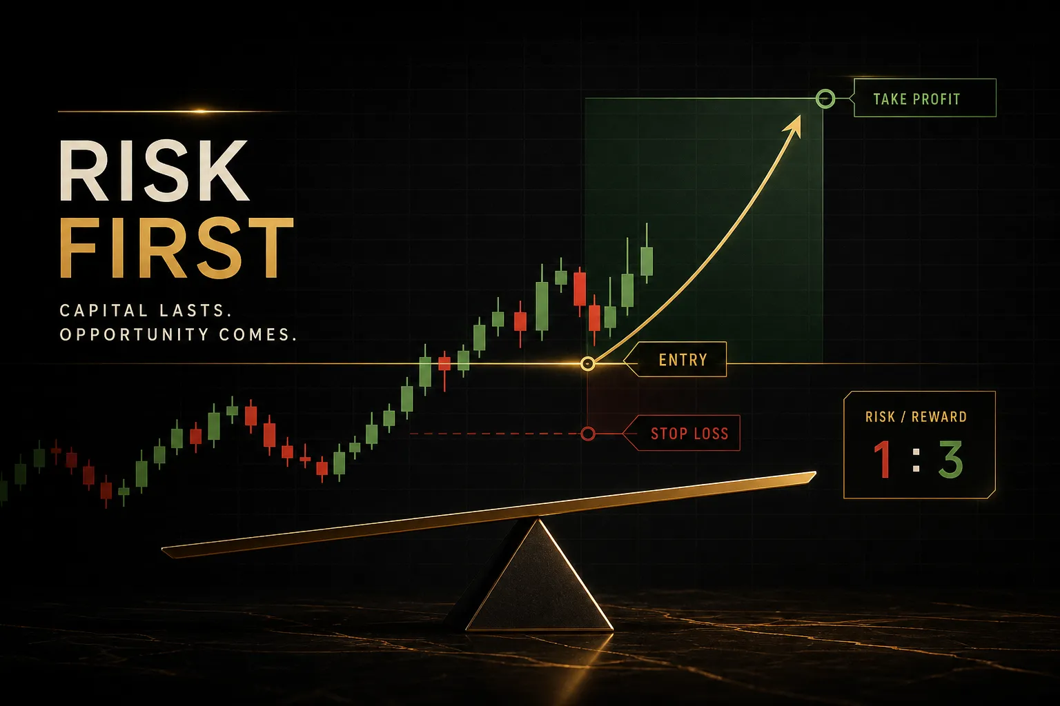
Say you have a $50,000 account and you risk 1% per trade, so $500 is the maximum loss on this position.
Structure puts your invalidation level 30 pips away, just below the swing low that defines the trend. That is your stop-loss distance, and it comes from the chart, not from convenience.
Now solve for size.
$500 risk divided by 30 pips gives you $16.67 per pip. On EUR/USD, a standard lot moves about $10 per pip, so that is roughly 1.67 standard lots.
If your target sits 90 pips away at the next Daily resistance zone, the risk-to-reward ratio is 3:1.
You risk $500 to make $1,500.
At 3:1, you can be wrong 60% of the time and still finish profitable. That is the entire mathematical argument for stop-loss and position sizing discipline, and it works regardless of how good your chart reading is.
Spot, Futures, and Why Prices Differ Slightly
Open EUR/USD on two brokers at once and you will see slightly different numbers.
Nothing is broken.
Spot forex is decentralized.
There is no single exchange printing one official price. Each broker aggregates quotes from its own pool of liquidity providers, so prices typically agree within a pip or two but rarely match to the pipette.
EUR FX futures on the CME are different.
They trade on a central exchange with a published price and real reported volume, and they are quoted inverted relative to convention in some contract specs. Futures prices also embed the interest rate differential over the contract’s life, so they sit slightly away from spot and converge at expiry.
| Feature | Spot Forex | Broker CFD Feed | EUR FX Futures (CME) |
|---|---|---|---|
| Price source | Interbank aggregate | Broker’s liquidity pool | Central exchange order book |
| Volume data | Not centrally reported | Broker-only, partial | Real reported volume |
| Typical spread | 0.1 to 0.5 pips | 0.6 to 1.5 pips | Tick-based, often 0.5 pip equivalent |
| Overnight cost | Swap or rollover | Swap or rollover | Priced into the contract |
| Best used for | Execution | Retail access | Volume and positioning analysis |
Practical takeaway: your support zone drawn on one platform will land within a pip or two on another. Use zones instead of exact lines and the discrepancy stops mattering.
Common EUR/USD Chart Questions
What is the current EUR/USD exchange rate?
The rate changes every second, so any number printed here would be wrong before you finished reading it. Check a live quote source: your broker platform, TradingView, or a major financial data provider.
What matters more than the exact figure is where that figure sits relative to structure. Is it at a Daily resistance zone? Mid-range?
That context turns a number into information.
How do I read the EUR/USD chart?
Three steps, in this order.
First, identify trend direction on the Weekly and Daily using higher highs and higher lows, or lower highs and lower lows.
Second, mark your structure zones as 10 to 20 pip bands where price has reacted repeatedly. Third, confirm with one or two indicators matched to the current condition, a moving average in a trend or RSI in a range.
Structure first, indicators second.
Reversing that order is the most common reason chart reading fails.
What is the best indicator for EUR/USD?
There is no single best indicator, only tools matched to market conditions. Moving averages work in trends, RSI works in ranges, ATR sizes your stops, and VWAP gives intraday context.
Confirmation-based systems handle this by combining multiple readings rather than betting on one. PipTrend’s 12-timeframe table is an example of that approach, showing agreement across timeframes instead of a single indicator’s opinion.
The value is in the confluence, not in any one line.
Is EUR/USD bullish or bearish today?
That depends entirely on the day you are reading this and what is on the economic calendar. Bias shifts with each session, each CPI print, and each central bank comment.
Build your own answer instead of borrowing one.
Check the Daily structure for the dominant direction, check today’s calendar for high-impact releases, and note whether the London-New York overlap has confirmed or rejected the Asian session move.
What is the best timeframe to trade EUR/USD?
The best timeframe is the one matching your trading style and your available screen time. Day traders typically work the 5-minute and 15-minute charts during the London-New York overlap.
Swing traders holding two to ten days use the 4-hour and Daily. Position traders following central bank cycles work primarily from the Weekly.
Trading a 5-minute chart while checking your phone twice an hour is the mismatch that quietly costs people money.
How many pips does EUR/USD move in a day?
Roughly 50 to 90 pips in normal conditions, based on typical average true range readings on the Daily chart. That figure expands considerably during high-impact events.
An NFP or Fed decision day can produce 120 to 200 pips of range.
Quiet mid-August sessions can deliver under 40.
Treat these as general reference points and read current ATR on your own chart for a live figure.
Your Next Step at the Chart
Here is one thing to do before your next trade, and it takes about two minutes.
Open a note.
Write down three things before you load a single indicator: the higher-timeframe trend direction, the nearest support or resistance zone, and the exact price at which your idea is proven wrong.
That last one is the invalidation level, and writing it down before you have a position changes how you behave when price moves against you. It becomes a decision you already made rather than one you make under pressure.
Only after those three lines exist should you add a moving average, an RSI, or a confirmation table. Tools like PipTrend’s signal engine and multi-timeframe confirmation exist to validate a plan you built from structure.
They are not a substitute for having built one.
The traders who last are not the ones who found a perfect setup. They are the ones who run the same process on Monday morning that they ran on Friday afternoon, whether the last trade won or lost.
Consistency is the edge. The chart is just where it shows up.
Sources
Risk Disclaimer: Trading involves risk. Past performance doesn't guarantee future results. Only trade with money you can afford to lose. PipTrend is a tool to assist your trading decisions, not financial advice.