Supply Demand Indicator: A Trader's Complete Guide
On this page
What a Supply Demand Indicator Really Shows You
Most traders load a supply demand indicator expecting it to reveal where the big money is sitting.
It doesn’t.
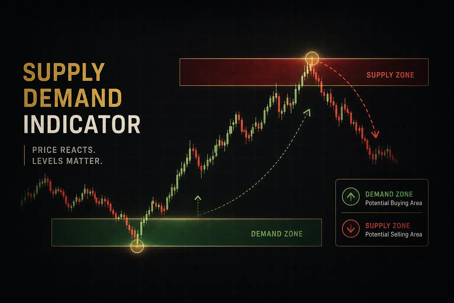
What it actually does is scan historical price action and draw rectangles around the areas where an order imbalance was violent enough to launch price away in one direction.
A supply demand indicator is an algorithmic tool that identifies zones on a chart where aggressive buying (demand) or aggressive selling (supply) caused a sharp departure from a consolidation area. The zone marks the origin point of that move, not the destination.
That distinction matters more than anything else in this article.
The rectangle on your screen is a probability zone derived from past candles. It is not a live feed of resting orders, not a Level 2 book, and not a guarantee that institutions will defend the same price again.
A zone tells you where imbalance existed once. Whether it exists now is a question only the next few candles can answer.
Used properly, these zones give you something genuinely useful: pre-planned levels where risk is tightly defined and reward is measurable before you click anything.
Used poorly, they become an excuse to catch falling knives.
The rest of this guide builds a complete workflow around that idea. You will learn how the algorithms construct zones, how to rank zone quality objectively, how to establish directional bias before you look at a single rectangle, how to confirm and place entries with defined invalidation, and how repainting and thin backtests quietly destroy strategies that looked flawless in hindsight.
How These Indicators Actually Build a Zone
Every supply demand indicator, regardless of platform or price tag, runs on the same skeleton: find quiet price, find violent price, draw a box where the quiet turned violent.
The differences are in the thresholds.
The Base Candle and Impulse Move
The base and impulse move is the foundational pattern. A base is a short cluster of candles with small bodies and overlapping ranges, where buyers and sellers are roughly balanced and price goes nowhere.
Then something breaks.
One or two candles print with large bodies, minimal wicks, and a range several times the recent average. That is price displacement, and it is the algorithm’s evidence that one side overwhelmed the other.
The indicator marks the base as the zone origin. Logic: unfilled orders were left behind when price ran, so a return to that area may attract the same participants.
In practice, the zone is usually drawn from the open or high of the last opposing candle to the extreme of the base.
You will see the same structure named differently across trading communities. An order block is essentially the last down candle before an up-impulse (or vice versa). A fair value gap is the unfilled space between wicks inside the impulse itself.
Different labels, same underlying imbalance.
Displacement, Lookback, and Volume Filters
Open the settings panel of any decent indicator and you will find four or five inputs that determine everything the tool plots.
- Displacement threshold. How large the impulse candle must be relative to the average true range, commonly 1.5x to 3x. Raise it and you get fewer, stronger zones. Lower it and your chart fills with noise.
- Base candle count. The maximum number of consolidation candles allowed before the impulse, usually one to five. A tight base of one to three candles implies a decisive imbalance.
- Swing structure. Some tools only mark zones that sit at a confirmed swing high or low, filtering out mid-trend clusters that rarely hold.
- Volume filter. Optional confirmation that the impulse carried above-average volume. Reliable on futures and stocks, far shakier on spot forex.
- Lookback period. How far back the scan runs. A 500-candle lookback on H4 covers months of structure; a 100-candle lookback keeps only recent, arguably more relevant zones.
Two traders using the same indicator on the same chart can see completely different zones.
The settings are the strategy.
Zones vs Support and Resistance
Classic support and resistance is built from repetition. You draw a line where price has reversed three or four times, and the more touches it has, the more traders consider it significant.
Supply and demand inverts that logic entirely. A demand zone or supply zone is drawn from a single origin event, and it is considered strongest when it has never been tested.
Every touch consumes the resting orders that made the zone work.
So a level with five touches is a strong support line and a weak demand zone.
Same chart, opposite conclusions.
Understanding which framework you are trading prevents a lot of contradictory analysis.
The practical difference shows up in entries too. Support and resistance traders wait for the level to prove itself.
Zone traders enter into an area that has, by definition, no recent proof at all.
Why Forex Data Complicates the Picture
Here is the part most zone tutorials skip.
Spot forex is decentralized. There is no central exchange, no consolidated tape, and no aggregated order book.
Your broker’s feed is a stitched-together view of the liquidity providers it deals with. Another broker’s chart of the same pair can show different wicks, different candle extremes, and therefore different zone boundaries.
Volume on a forex chart is tick volume, a count of price updates, not contracts traded.
That means a forex supply zone reflects visible price history on one feed. It is a reasonable proxy for order flow, not a measurement of it.
Futures and equities, with genuine centralized volume data, give you a cleaner signal. Trade forex zones with that limitation in mind and you will size positions more honestly.
Ranking Zone Quality Before You Trust It
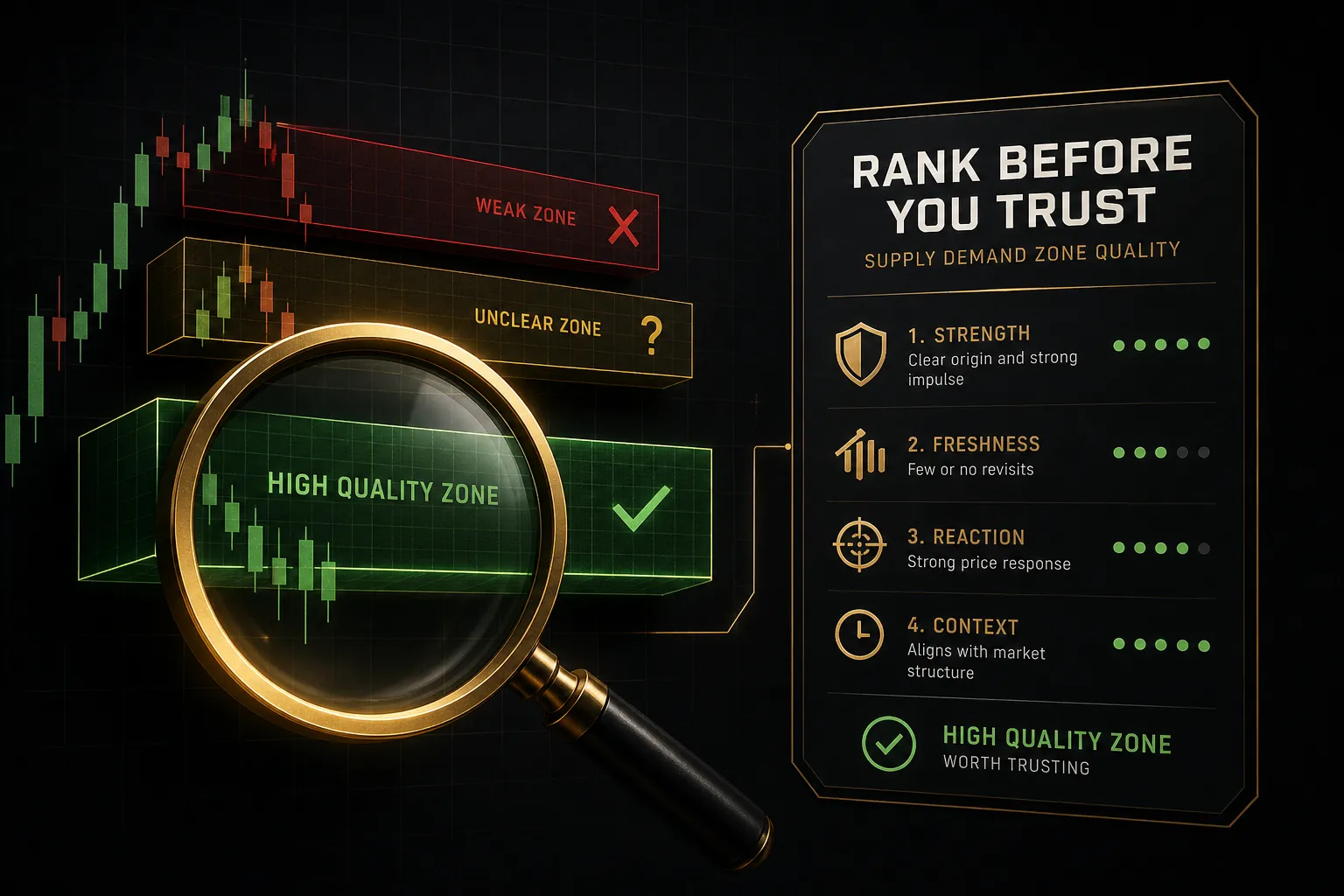
Not all zones deserve your capital.
On any given daily chart, an indicator might plot fifteen rectangles, and maybe three of them are worth a trade. Grading them takes about ten seconds once you know the criteria.
Freshness and Touch Count
Zone freshness is the single strongest quality filter. A fresh zone has never been revisited since the impulse that created it, meaning any resting orders left behind are theoretically intact.
Each retest consumes liquidity.
This process is called zone mitigation: price returns, fills the orders that were sitting there, and the imbalance that made the zone meaningful gets neutralized.
First touch carries the highest probability.
Second touch is materially weaker.
Third touch and beyond, you are usually trading a level that is about to break.
Departure Strength and Time in Base
Measure the impulse candle against the average range of the last twenty candles. A departure of three or more times the average signals genuine urgency.
A departure of 1.2x signals drift.
Time in base works the same way but inverted.
Two or three candles of consolidation before an explosive move implies participants were positioned and waiting. Fifteen candles of chop implies indecision, and indecisive areas rarely produce clean reactions on return.
Distance matters too.
A zone sitting 40 pips away gives price little room to build momentum into it. A zone 300 pips away may never get tested at all, or may get tested only after market structure has completely changed.
| Criterion | High-Quality Zone | Low-Quality Zone | Why It Matters |
|---|---|---|---|
| Touch count | Zero (fresh, untested) | Two or more prior touches | Each test mitigates resting liquidity |
| Departure strength | Impulse 3x+ average range | Impulse under 1.5x average range | Strong displacement proves real imbalance |
| Time in base | 1 to 3 candles | 8+ candles of overlapping chop | Tight bases signal decisive positioning |
| HTF alignment | Daily and H4 agree on direction | Zone fights the higher-timeframe trend | Counter-trend zones fail more often |
| Distance from price | 1 to 3 ATR away | Adjacent to price or 10+ ATR away | Needs room to build approach momentum |
| Structural location | At a confirmed swing extreme | Mid-range with no structural context | Swing zones attract stop clusters and reversals |
What Weakens or Invalidates a Zone
A zone does not die politely.
It degrades through a sequence of warning signs, and knowing them keeps you from arguing with a chart that has already made its decision.
- Partial fill. Price enters the zone, reacts weakly, and leaves without reaching the far boundary. The zone survives but has lost strength.
- Deep penetration. Price pushes 70% or more through the zone before reacting. Treat the remaining edge as fragile.
- Candle close beyond the boundary. A full-body close on the zone’s own timeframe is the cleanest invalidation signal available. Not a wick. A close.
- Structural break. If price breaks the swing low that a demand zone was supposed to protect, the zone’s context has changed even if the rectangle is still on your chart.
Then there is the messy case: the liquidity sweep. Price wicks straight through your demand zone, triggers every stop clustered beneath it, then snaps back and rallies hard.
In real time, that looks like a failed zone and a losing trade. On the chart three hours later, it looks like a textbook reversal.
This is why stops need a buffer beyond the boundary rather than sitting exactly on it, and why zone traders who survive long term expect sweeps rather than being shocked by them.
A Repeatable Workflow for Trading Zones
The difference between traders who profit from zones and traders who collect losses is almost never the indicator.
It is whether there is a process.
Here is one that works across instruments.
Establish Bias With Multi-Timeframe Trend
- Start on the Daily, not the zone. Before you look at a single rectangle, determine whether the Daily chart is making higher highs and higher lows, lower highs and lower lows, or ranging. This is your directional filter for everything that follows.
- Confirm on H4. Drop one timeframe and check whether it agrees. When Daily and H4 point the same way, demand zones in an uptrend and supply zones in a downtrend become high-probability continuation trades rather than counter-trend gambles.
- Mark only zones that align with bias. If the Daily is bullish, you hunt fresh demand. You ignore supply zones entirely, or treat them as profit targets rather than entries. This one rule eliminates a large share of avoidable losses.
- Note conflict explicitly. When timeframes disagree, write it down and stand aside or halve your size. Mixed signals are information, not an obstacle to push through.
Multi-timeframe analysis done this way takes about ninety seconds per instrument and reframes every zone you look at afterward.
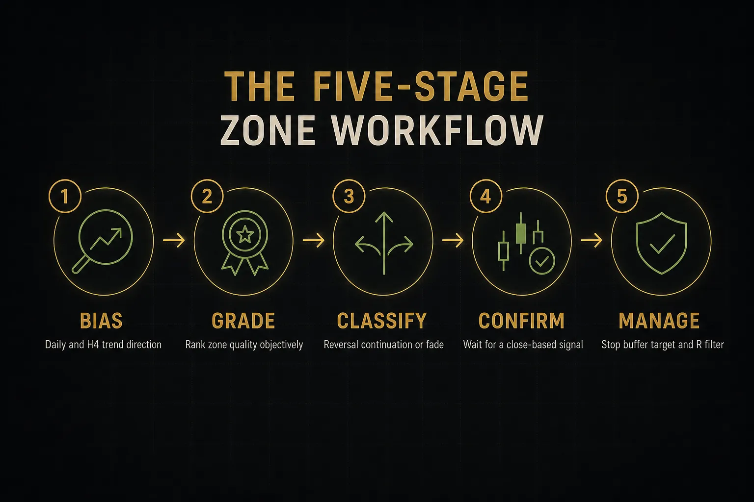
Separate Reversal, Continuation, and Failed-Zone Setups
- Reversal at a fresh zone. Price arrives at an untested Daily or H4 zone that sits at a major swing extreme, against an extended move. Highest reward, lowest hit rate. Requires the strictest confirmation and the smallest position size.
- Continuation pullback in a trend. Price retraces into a fresh demand zone inside an established uptrend. This is the bread-and-butter setup: you are trading with dominant flow, so a mediocre entry still often works out.
- Breakout retest. A supply zone breaks decisively, price runs, then returns to the broken zone from above. The old supply now acts as demand. The breakout retest gives you a defined structure with a tight stop below the retest low.
- Failed-zone fade after a liquidity sweep. Price blows through a well-known zone, takes out obvious stops, then reclaims the level within one or two candles. You trade the reclaim, not the break, with a stop beyond the sweep wick.
Naming the setup before you enter forces you to justify the trade.
If you cannot classify it, you do not have one.
Confirm, Then Set Entry, Stop, and Target
- Use confirmation that does not conflict. Stacking five oscillators produces contradiction, not confluence. Pick one non-repainting directional signal that evaluates at candle close, add VWAP position for context (price above VWAP favors longs), and use a multi-timeframe alignment view such as PipTrend’s 12-timeframe dashboard to verify that shorter and longer horizons agree.
- Treat confluence as a filter, not a trigger. The alignment table tells you whether to take the setup. The zone reaction tells you when. Reversing those roles produces late entries and wide stops.
- Wait for the close. Enter on the close of a rejection candle inside the zone, or on a lower-timeframe structure shift (M15 higher low inside an H4 demand zone). Never enter on an unclosed candle touching the edge.
- Place the stop beyond the zone plus a buffer. Take the far boundary, then add a buffer equal to roughly 20% of the zone height or 0.3 ATR, whichever is larger. Add the spread. This is the difference between being swept out and staying in.
- Target the next opposing zone. For a long from demand, the first target is the nearest untested supply zone or prior swing high. Alternatively, use a fixed multiple such as 2R and trail the remainder.
- Apply a minimum risk-reward filter. If the distance to the first realistic target does not offer at least 2:1 after spread, skip it. A 45% win rate at 2.5R is profitable; a 60% win rate at 0.8R is not.
- Cap risk per trade. One percent of account equity or less, calculated from the stop distance, not from a fixed lot size. Position size adjusts to the zone, never the reverse.
Repainting, Backtesting, and Cross-Market Differences
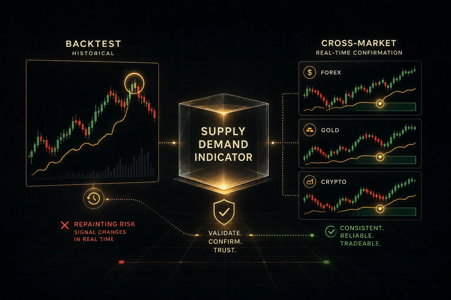
Every zone strategy looks brilliant on a chart of the past.
That is precisely the problem.
Why Zones Can Repaint or Redraw
Repainting happens when an indicator alters, moves, or deletes zones after subsequent price action reveals the outcome. Some tools delete any zone that price closes through, so your historical chart shows only the zones that worked.
The result is a hindsight illusion.
You scroll back and see eight zones, seven of which produced clean reversals, and conclude the tool has an 87% hit rate. What you cannot see are the twenty-three zones that were plotted in real time and then quietly erased.
Test for it directly.
Load the indicator on a chart, screenshot the zones, come back a week later and compare.
If rectangles have vanished or shifted, every backtest you run on that tool is fiction.
Some redrawing is legitimate.
A zone that extends its right edge as time passes, or one that changes color once mitigated, is updating presentation rather than rewriting history. The test is whether the origin coordinates ever change.
A Realistic Backtesting Protocol
A usable backtest of a zone strategy needs guardrails that most spreadsheet exercises ignore.
- Record signals only at candle close. Bar-by-bar replay with the chart’s right edge hidden. No scrolling ahead, ever.
- Prevent future-zone leakage. A zone that the indicator plotted retroactively must not be tradeable in your log. Only zones visible before the entry candle count.
- Include realistic costs. Add typical spread, plus one to two pips of slippage on stops, plus swap for positions held overnight. On a 2R system, ignoring costs can overstate returns by 15% to 25%.
- Log at least 100 trades across two market regimes. One trending period and one ranging period, minimum.
- Measure expectancy and drawdown, not win rate. Expectancy per trade in R, maximum consecutive losses, and peak-to-trough drawdown tell you whether the system is survivable. Win rate alone tells you almost nothing.
One more variable that no backtest captures cleanly: scheduled events. A pristine H4 demand zone means very little thirty seconds into a CPI release.
Session opens, rollover, and month-end flows all move price for reasons unrelated to your rectangle.
Check the calendar before you place the order.
Forex, Crypto, Stocks, and Futures Compared
Zone reliability is not a constant across markets. It changes with liquidity, session structure, and whether real volume data exists.
| Market | Volume Data | Gap Risk | Zone Reliability Notes |
|---|---|---|---|
| Spot forex | Tick volume only (proxy) | Weekend gaps only | Broker-dependent wicks; zones vary slightly by feed |
| Crypto | Real exchange volume, fragmented | Rare, trades 24/7 | Frequent liquidity sweeps; wide stop buffers required |
| Stocks | Consolidated real volume | High: overnight and earnings gaps | Zones often skipped entirely by gap opens |
| Indices (CFD) | Synthetic or proxy volume | Moderate, session-driven | Cash-session zones behave differently from futures hours |
| Futures | Centralized, highest quality | Low, near-continuous trading | Cleanest environment for volume-filtered zones |
If you want the most honest read on whether zone trading suits you, test it on futures first.
Real volume, continuous sessions, one consolidated tape.
Then port the rules elsewhere knowing which edges came from the method and which came from the data.
Frequently Asked Questions
Does the supply and demand indicator really work?
Yes, but only as a component within a complete process. A supply demand indicator reliably identifies where past order imbalance occurred, and fresh zones aligned with the higher-timeframe trend do produce measurable reactions.
The indicator itself has no edge. The edge comes from filtering for zone quality, waiting for close-based confirmation, and controlling risk so that a 40% to 50% hit rate at 2R or better stays profitable.
What is the best indicator for supply and demand?
The best tool is the one that does not repaint and lets you control displacement thresholds, base candle count, and lookback period. Fixed-setting indicators force someone else’s definition of a valid zone onto your chart.
Prioritize three features: transparent zone-drawing logic, a mitigation marker that shows touch count, and multi-timeframe visibility so you can see Daily zones while working on H4. Volume filtering adds real value on futures and stocks, less on spot forex.
How do you find supply and demand zones in forex?
Look for a tight consolidation of one to three candles followed by an impulse candle at least twice the recent average range. Draw the zone from the base extreme to the open of the last opposing candle.
Start on the Daily chart, mark only untested zones at swing extremes, then refine boundaries on H4. Because forex feeds differ by broker, verify important zones on a second data source before committing size.
What is the difference between supply and demand and support and resistance?
Support and resistance levels gain strength from repeated touches, while supply and demand zones lose strength with every touch.
That is the core inversion.
Support and resistance is drawn as a line where price reversed multiple times. A supply or demand zone is an area drawn at the origin of a single strong move, often never retested, and it is graded on freshness, departure strength, and base tightness rather than on repetition.
How do you trade supply and demand zones?
Establish higher-timeframe bias first, then trade only zones that align with it. Classify the setup as a reversal, continuation pullback, breakout retest, or failed-zone fade before entering.
Wait for a rejection candle to close inside the zone or a lower-timeframe structure shift, place the stop beyond the far boundary plus a volatility and spread buffer, and target the next opposing zone. Skip anything offering less than 2:1.
What is the best timeframe for supply and demand trading?
The Daily and H4 charts produce the most reliable zones because they filter out intraday noise and reflect larger participant activity. Zones on M1 to M15 form and break constantly.
The practical approach is layered: identify zones on Daily and H4, then drop to M15 or M5 purely to refine entry timing and tighten the stop.
Higher timeframes decide where; lower timeframes decide when.
Turn Zones Into a Process, Not a Guess
A rectangle on a chart is not a prediction. It is a location where you can define risk precisely and let the market either confirm or refuse your thesis within a few candles.
That reframing changes everything about how you use a supply demand indicator.
The zone stops being the reason for the trade and becomes one input alongside trend bias, confirmation, event risk, and position sizing. Traders who make this shift stop asking “will this zone hold?” and start asking “if it holds, what do I make, and if it fails, what do I lose?”
Here is your next step, and it is deliberately narrow. Pick one instrument. Mark only fresh, high-quality zones on the Daily and H4, using the grading table in this guide as your filter.
Then paper-trade the confirmation and stop rules for thirty trades before risking a cent. Log every entry, every invalidation, every skipped setup. You will learn more from that log than from any indicator you install.
Risk Disclaimer: Trading involves risk. Past performance doesn't guarantee future results. Only trade with money you can afford to lose. PipTrend is a tool to assist your trading decisions, not financial advice.