How Support and Resistance Indicators Actually Work
On this page
Reading Price Zones Without Guesswork
A support and resistance indicator does not tell you when to buy or sell. It tells you where price has a higher-than-random chance of reacting, and that distinction changes everything about how you use it.
Think of it as a weather forecast rather than a promise. The forecast narrows the range of likely outcomes.
It does not stop the rain.
Most traders lose money at levels not because the level was wrong, but because they treated a thin horizontal line as a hard boundary.
Markets do not respect single ticks.
They react across support and resistance zones, shaped by clusters of resting orders, and the quality of a level matters far more than which tool drew it on your chart.
Two traders can use the same indicator on the same chart and get opposite results. The difference is almost never the indicator. It is how they judge level quality and where they place invalidation.
This guide covers four things in order.
How these levels actually get calculated, both statically and dynamically. How to judge whether a level is strong enough to trade. How to build entries and stops around a zone using objective rules instead of feel. And how level behavior shifts between forex, stocks, crypto, and futures, because a round number in EUR/USD and a pre-market high in a small-cap stock are not the same animal.
What a Support and Resistance Indicator Does
Every support and resistance tool is doing one of two jobs: marking a fixed price where something happened before, or tracking a moving reference that adapts as price develops.
Confusing the two is where charts start to fall apart.
Static vs Dynamic Levels
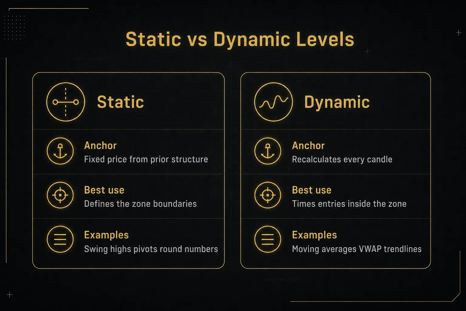
Static levels are anchored to a specific price and stay there. Previous swing highs and swing lows, prior day or week highs and lows, round numbers, and classic pivot points all belong to this category. They are useful because a large number of market participants can see the exact same number.
Dynamic levels move with price.
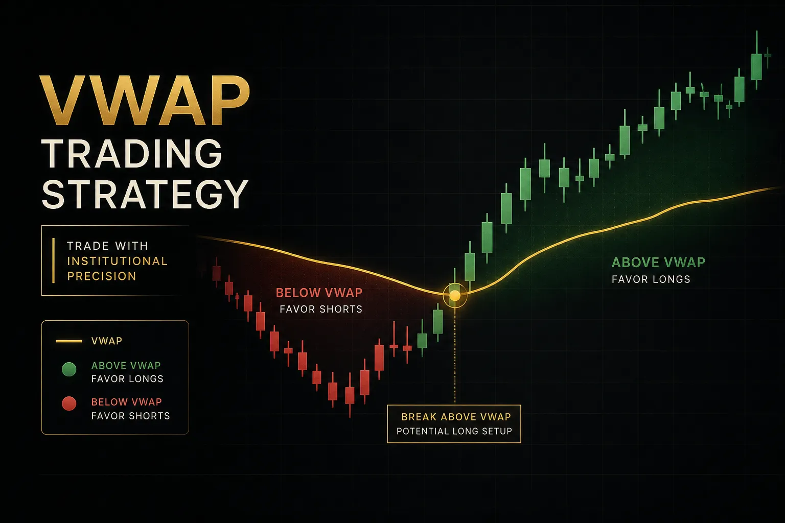
Moving averages, rising or falling trendlines, VWAP, and volatility bands adjust every candle. In a trending market they often catch pullbacks that static horizontal support and resistance misses entirely.
Here is where traders get into trouble.
Stacking both types without a hierarchy does not create confluence, it creates noise. When a 50-period moving average sits four pips above a prior swing low, which one is the level?
If you cannot answer that before the trade, you will improvise during it.
A workable rule: let static levels define your zone, and use dynamic levels as timing confirmation inside it. The horizontal zone decides where. The moving average or VWAP helps decide when.
Zones, Not Exact Lines
Price rarely reverses at the exact tick where it reversed last time.
It reverses somewhere near it.
The reason is mechanical.
Resting limit orders, stop clusters, and algorithmic execution do not sit at one price, they spread across a band. A large institutional order gets worked over a range to reduce market impact, which means the reaction is smeared across several ticks or pips rather than concentrated at one.
So how wide should a zone be? Two objective methods work well:
Use the average true range.
Take ATR(14) on your trading timeframe and set the zone width to roughly 25 to 50 percent of that value on each side of the level. On a pair with a 60-pip daily ATR, a daily zone of 15 to 30 pips wide is reasonable. On a 5-minute chart with a 6-pip ATR, you are talking about 1.5 to 3 pips.
Or use recent candle bodies.
Look at the last 10 to 20 candles, find the high and low of the wicks that formed the level, and let the zone span that cluster. If a swing formed with three candles whose wicks range from 1.0850 to 1.0857, that seven-pip band is your zone.
Both approaches scale with market volatility, which is the point. A fixed 10-pip buffer is too tight during a news release and absurdly wide at 3am Tokyo time.
How the Levels Get Calculated
Automated detection sounds sophisticated.
The underlying logic is usually simple.
Most indicators start with swing point identification using a lookback period. A candle qualifies as a swing high if its high exceeds the highs of the N candles on either side, where N is commonly 5, 10, or 20.
Larger lookbacks produce fewer, more significant levels. Smaller lookbacks produce dozens of minor pivots that clutter the chart.
Next comes clustering.
If three swing highs form within a small price distance, a decent indicator merges them into one zone rather than drawing three separate lines. The clustering threshold is often a percentage of price or an ATR multiple.
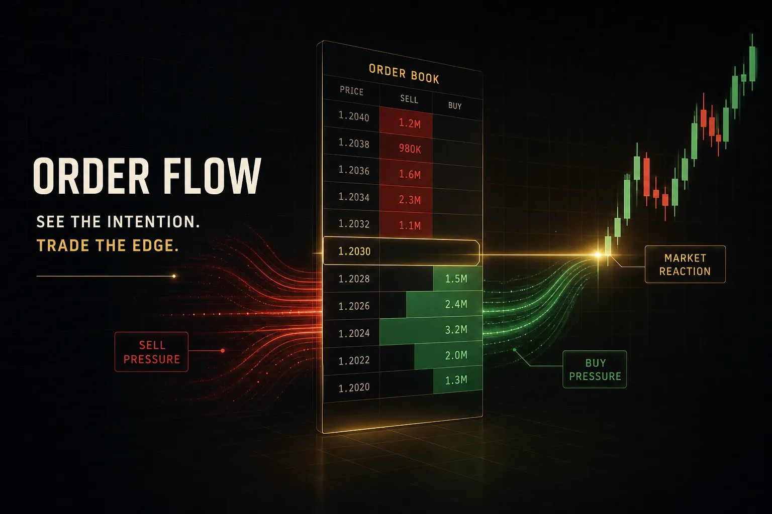
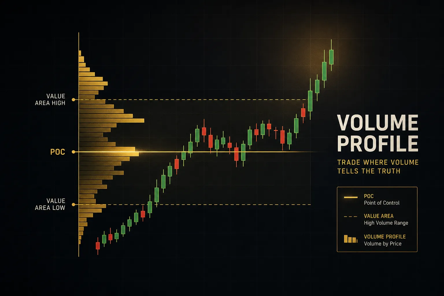
Volume-based tools take a different route. Instead of asking where price turned, they ask where the most contracts or shares changed hands. Volume profile levels like the point of control mark liquidity zones where the market spent significant activity, and these often act as magnets and barriers even when no obvious swing exists.
Then there are the formula-driven pivots, which need no swing detection at all:
| Pivot Type | Core Formula | Level Spacing | Best Suited For |
|---|---|---|---|
| Classic (Floor) | P = (H + L + C) / 3 | Widest, evenly spread | Daily bias and range trading |
| Fibonacci | P ± (H − L) Ã, 0.382 / 0.618 / 1.000 | Moderate, ratio-based | Trending markets with pullbacks |
| Camarilla | C ± (H − L) Ã, 1.1 / 12, /6, /4, /2 | Tightest around close | Intraday mean reversion |
| Woodie | P = (H + L + 2C) / 4 | Close-weighted | Markets with strong closing bias |
Camarilla levels sit closest to the previous close, which is why scalpers favor them on 5- and 15-minute charts. Classic pivots spread wider and suit swing traders working the daily.
Neither is more accurate.
They are calibrated for different holding periods.
Judging Level Strength and Confirmation
The most common piece of advice about support and resistance is also the most misleading: “the more times a level is tested, the stronger it is.”
In practice, the opposite is often true.
Each test consumes resting orders, and eventually there is nothing left to defend the price.
What Makes a Level Strong
Touch count is the weakest signal available.
These four factors carry far more information, and you can assess all of them in under a minute.
- Touch quality. A sharp rejection with a long wick and an immediate reversal tells you real orders sat there. A slow grind where price hovers at the level for eight candles before drifting away tells you the level is being absorbed, not defended. Look at the shape of the reaction, not the fact that one occurred.
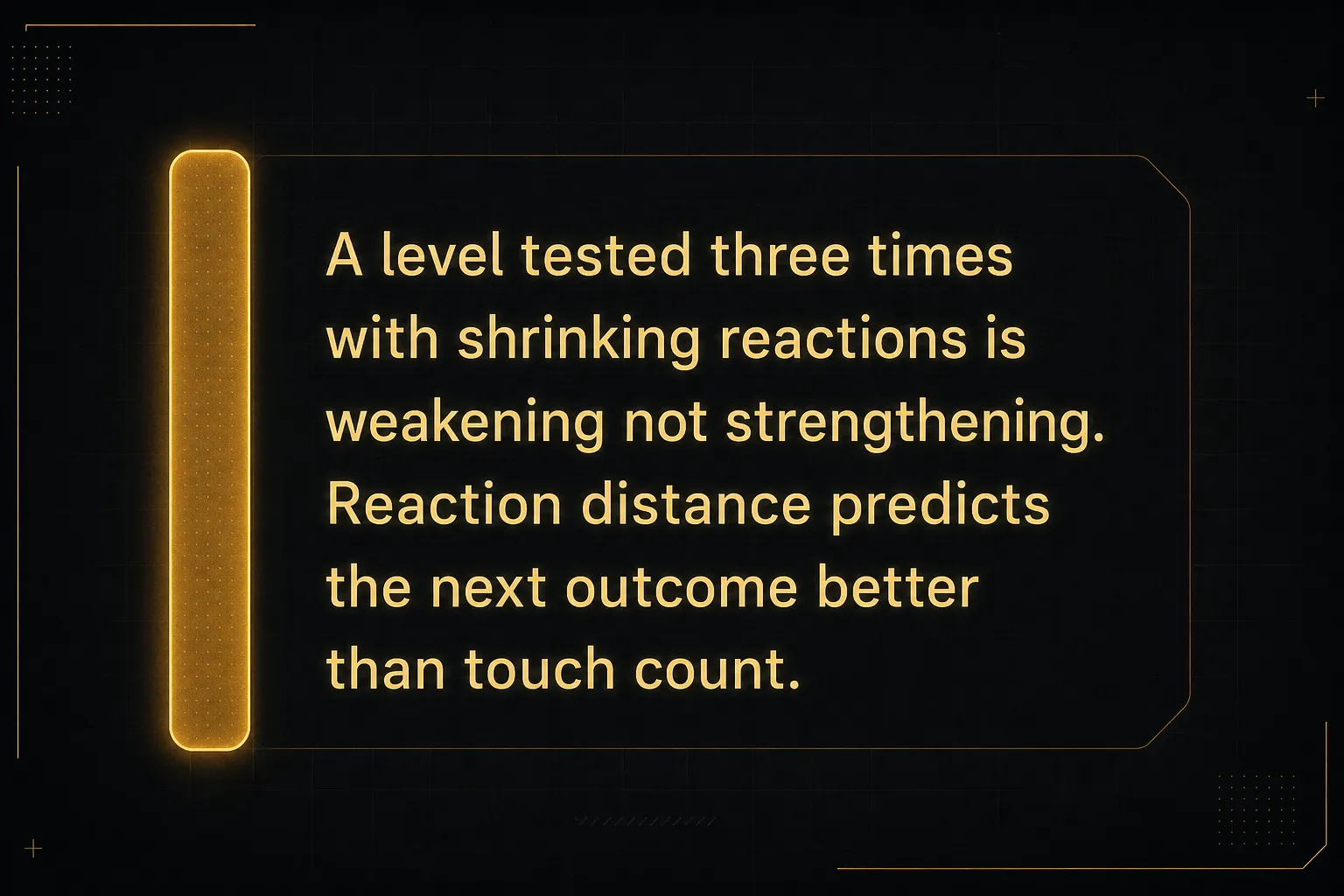
- Reaction distance. Measure how far price traveled after each prior test, ideally in ATR multiples. A level that produced a 3x ATR move twice is meaningfully different from one that produced 0.4x ATR bounces. If the last three reactions have been shrinking, the level is losing power and a break is more likely than another bounce.
- Time spent at the level. Consolidation directly on a level is a warning, not a confirmation. When price sits inside a zone for an extended period, sellers or buyers are being filled and the imbalance that created the level is being neutralized. Quick in-and-out reactions signal a healthier level.
- Recency. A level formed three weeks ago on the 4-hour chart carries more weight than one from eight months ago, because the participants who created it are more likely to still hold positions there. Older levels are not useless, but they need supporting evidence from current market structure.
- Volume behavior. High volume on the rejection candle adds confidence that real participation defended the zone. Rising volume as price approaches, followed by a break, suggests the opposite: the level is being attacked with conviction rather than defended.
Add one more layer if you want context: RSI divergence at a level. When price makes a lower low into support but RSI makes a higher low, the selling pressure driving the move is weakening.
That does not make the bounce certain.
It makes it more probable.
The Bounce or Break Decision Tree
Every approach to a level resolves into one of four outcomes. Knowing which one you are watching, and what confirms it, removes most of the improvisation from your execution.
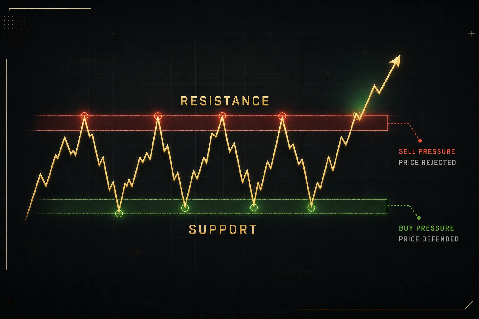
- Clean rejection. Price enters the zone, prints a candlestick rejection pattern (pin bar, engulfing candle, long wick), and closes back outside the zone in the opposite direction. Confirmation is the candle close outside the zone, ideally with above-average volume on the rejection bar. This is the highest-probability continuation-of-range setup.
- Clean breakout. Price closes decisively beyond the zone with an expanded range candle and a volume confirmation spike, typically 1.5x or more the recent average. The key word is closes. A wick through the zone that closes back inside is not a breakout, it is a test.
- False breakout. Price pushes beyond the zone, triggers stops, then reverses back inside within one to three candles. The false breakout is confirmed when price closes back inside the zone on rising volume. These often produce the strongest moves in the opposite direction, because the breakout traders are now trapped.
- Breakout and retest. Price breaks the zone, moves away, then returns to test the zone from the other side. Confirmation is a hold: price touches the old level, rejects, and continues in the breakout direction. This breakout and retest sequence offers a better risk-to-reward ratio than chasing the initial break, because your invalidation sits just on the other side of a defined zone.
Confluence between methods improves your read.
A daily pivot sitting on a Fibonacci retracement level that also aligns with a prior swing low is a more interesting zone than any of those alone.
But stacking evidence does not eliminate risk.
It shifts probability.
Any level can fail on the next candle, and every position needs a defined loss before it needs a target.
Trading Support and Resistance With a Plan
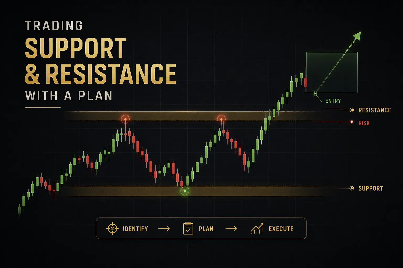
An indicator that identifies levels perfectly is worthless without rules for what happens next. Entry logic, stop placement, and timeframe hierarchy are where the actual edge lives.
Entries and Stop Placement
Placing a stop directly below the obvious low is the single most expensive habit in retail trading. That price is visible to everyone, which is exactly why price often trades through it before reversing.
Place stops outside the zone, not on the level. If your zone spans 1.0845 to 1.0855 and you are long, the stop belongs below 1.0845, not at 1.0850.
Then add a noise buffer.
The buffer should be an ATR multiple, typically 0.5x to 1.0x ATR on your entry timeframe. On a 15-minute chart with a 4-pip ATR, that means 2 to 4 pips beyond the zone edge. This filters ordinary oscillation from a genuine invalidation, and it scales automatically when volatility expands.
Stop-loss placement defines your position size, not the other way around.
Once the stop distance is set by structure, size the position so the loss equals your fixed risk percentage. If that produces a trade too small to be worth taking, the setup is not for you at that timeframe.
Then account for execution friction.
Spread widens dramatically around the New York close and during major news, sometimes tripling on exotic pairs. Slippage on a breakout entry can cost more than the edge you are trying to capture.
Session timing matters too.
The London open and the New York overlap produce the majority of daily range in most forex pairs, which means levels that held quietly during the Asian session get tested violently at 8am London. A level “holding” at 4am tells you very little about how it performs at 14:30 GMT when US data drops.
Multi-Timeframe Confluence Without Clutter
The fix for a messy chart is not fewer levels.
It is a hierarchy.
Use a two-tier rule.
Higher timeframes (Daily and H4) define which zones you are allowed to trade. Lower timeframes (15-minute and 5-minute) define when you enter within those zones.
Nothing from the lower timeframe gets to create a new zone on its own.
In practice: mark no more than three or four zones from the Daily and H4 charts. Then drop to the 15-minute only when price is actually approaching one of them. Your execution chart stays clean because it holds one zone at a time, and multi-timeframe analysis becomes a filter rather than a source of contradiction.
The bias check comes first.
If the Daily structure is making higher highs and higher lows, you are looking for long entries at support and ignoring short setups at resistance, even when they look tempting on the 5-minute.
Where PipTrend Fits the Process
PipTrend’s Confidence Band is a practical example of a dynamic support and resistance zone built for pullback entries rather than exact-line prediction. Instead of drawing one horizontal line, it plots a band around the prevailing trend that adapts to current volatility.
The band gives you a defined area to look for entries during a retracement, with the upper and lower edges functioning as the zone boundaries that stops sit outside of. When price pulls back into the band in an uptrend and shows rejection, you have a structural reason for the entry and a structural reason for the invalidation.
Alignment is handled separately.
PipTrend’s multi-timeframe table reads trend direction across 12 timeframes simultaneously, from short intraday periods up to the higher structural ones. Rather than eyeballing three charts and hoping they agree, you see at a glance whether the shorter timeframes have flipped in line with the higher ones.
That matters for level trading specifically.
A pullback into support with 10 of 12 timeframes still pointing up is a very different proposition from the same pullback with the higher timeframes already rolling over.
Why Levels Fail (and How Markets Differ)
Some indicators look extraordinary on historical charts and mediocre in live trading. The gap between the two is usually not bad luck.
It is a structural flaw in how the levels are detected.
Repainting and Lookahead Bias
Swing highs and swing lows can only be confirmed after the candles to their right have formed. If your indicator uses a 10-candle lookback on both sides, a swing high is not confirmed until 10 candles later.
Which means that on a historical chart, the level appears to have been there all along.
In live trading, it did not exist yet when price first reacted to it.
This is lookahead bias, and it is the reason a repainting indicator produces beautiful backtesting results that never materialize in a live account.
The check takes two minutes.
Open a bar-by-bar replay of the same chart and step forward candle by candle, noting when each level actually appears. Compare that to how the completed historical chart looks now.
If levels appear on the historical chart that were not visible in replay at the moment price reacted to them, the tool repaints.
That does not make it useless, but every backtest result from it should be treated as fiction.
False Signals and Market Noise
Levels also fail for entirely honest reasons.
Liquidity thins out, a scheduled release hits, or a large participant simply decides to push through.
Stop hunts are not a conspiracy.
They are a liquidity event.
Clusters of stops sitting just beyond an obvious level are the easiest available fills for a large order, so price is drawn toward them before resuming its actual direction.
This is why the buffer beyond the zone matters, and why a candle close beyond a level is a more reliable break signal than a wick.
Wicks are where the noise lives.
Forex, Stocks, Crypto, and Futures Differences
The same indicator behaves differently across asset classes, and ignoring that is a fast way to misread a chart.
Forex runs on round-number psychology and session liquidity. Levels at 1.1000, 1.2500, or 150.00 in USD/JPY attract option barriers and clustered orders far beyond what technical structure alone would justify. Levels break at the London and New York opens far more often than during the Asian session, so the time of the test matters as much as the level.
Stocks add opening gaps.
A level that held at yesterday’s close is irrelevant if the stock gaps 4 percent past it on an earnings release. Pre-market highs and lows become the operative levels for the first hour, and prior gap edges frequently act as support and resistance for weeks.
Crypto trades 24/7, so there are no session gaps and no clean daily open. But liquidity is fragmented across exchanges, and large liquidation clusters function as levels in their own right. When price approaches a heavy liquidation zone, moves accelerate rather than stall, which inverts the usual expectation of a reaction.
Futures combine both problems.
Overnight electronic sessions produce thin, unreliable levels, then the regular session open frequently gaps past them. The prior day’s regular trading hours high, low, and value area tend to be far more reliable references than anything formed overnight on low volume.
Frequently Asked Questions
What is the most accurate support and resistance indicator?
There is no single most accurate indicator, because accuracy depends on your trading style, timeframe, and the instrument’s volatility. Camarilla pivots outperform on intraday mean-reversion setups in liquid futures. Volume profile levels tend to work better in equities where volume data is centralized and reliable.
The bigger factor is how you filter the levels a tool produces. A basic swing-high indicator used with strict quality criteria will beat a sophisticated tool used indiscriminately.
How do you identify strong support and resistance levels?
Judge four things: touch quality, reaction distance, volume at the level, and recency. A strong level produces sharp rejections with long wicks, moves of at least 2x ATR away from the zone, elevated volume on the reaction candle, and formed within the recent trading range rather than months ago.
Ignore touch count as a primary measure.
Repeated tests consume the resting orders that made the level work in the first place, which is why the third or fourth test often breaks.
Which indicator is best for support and resistance in TradingView?
For most traders, a combination of the built-in Pivot Points Standard indicator and Volume Profile covers the majority of useful levels without adding chart clutter. Pivot points give you formula-based static levels that reset daily, and volume profile shows where actual participation occurred.
If you add a community script for automatic swing detection, check it for repainting first using bar replay. Many popular free scripts confirm swings using future candles and will look far better in review than in live trading.
How do you trade when support becomes resistance?
The polarity switch requires a retest and rejection to be confirmed, not just a single close beyond the level. When price breaks below support, wait for it to return to the old zone and fail from underneath before treating it as resistance.
Entry comes on the rejection candle at the retest, with the stop placed above the zone plus an ATR buffer. Entering immediately on the break, before the retest, means you are trading without confirmation and with a wider invalidation.
What is the difference between support and resistance and supply and demand?
Supply and demand zones mark the origin of a strong impulsive move, while support and resistance marks areas where price has repeatedly reacted. They overlap often but are not the same concept.
A demand zone is typically the base or consolidation a rally launched from, and it is considered most powerful on its first retest.
Traditional support gains context from multiple reactions.
That difference in logic changes how you treat repeated tests: supply and demand traders often skip a zone after one use, while support and resistance traders may still trade a second or third test with supporting evidence.
How do you confirm a breakout above resistance?
Require a candle close beyond the zone, not a wick, accompanied by a volume expansion of roughly 1.5x the recent average. An expanded-range candle that closes near its high adds further confidence.
The strongest confirmation comes afterward, on the retest. If price returns to the broken zone and holds it as support, the breakout has been validated by actual order flow rather than a single candle. Entering on that retest usually offers a tighter stop and a better risk-to-reward ratio than chasing the initial break.
Precision Over Prediction
A support and resistance indicator narrows your search area. That is its entire job, and it is a valuable one.
What determines whether you make money is what happens after the level is drawn: the confirmation you demand before entering, where you define invalidation, and how much you risk on the position. Those three decisions carry more weight than any setting on any indicator.
So here is the takeaway to act on. Before your next trade, write a five-line pre-trade checklist and refuse to enter without completing it: higher-timeframe bias, level quality score, confirmation signal, invalidation point, position size.
Five lines.
Thirty seconds.
It will eliminate more bad trades than any indicator you install this year.
Sources
Risk Disclaimer: Trading involves risk. Past performance doesn't guarantee future results. Only trade with money you can afford to lose. PipTrend is a tool to assist your trading decisions, not financial advice.