On this page
Why Most Chart Reading Falls Short
Open any trading chart and you are looking at the same thing, whether the market is Apple stock, EUR/USD, Bitcoin, crude oil futures, or the S&P 500: a visual record of price over time. Every wick, body, and gap is a record of what buyers and sellers actually agreed on.
That part is simple.
The problem is what comes next.
Most chart guides hand you a catalogue. Twenty candlestick patterns, ten indicators, six trendline rules. What they almost never give you is the sequence: how context leads to a signal, how a signal earns confirmation, and how confirmation turns into a position with a defined risk.
Pattern recognition without a workflow is just expensive pattern matching.
There is a second thing worth saying plainly, before any of the mechanics.
Charts do not predict.
Technical analysis measures probability based on how price has behaved in similar conditions before. A textbook bullish engulfing candle at a major support zone might work 6 times out of 10 in a trending market and 3 times out of 10 in chop.
The pattern did not change. The context did.
A chart tells you where risk is cheap and where it is expensive. It does not tell you what happens next.
So this guide is built as a process, not a glossary.
First, the raw building blocks: chart types, OHLC data, and timeframe selection. Then market structure, trend, and support and resistance zones. Then indicators used as confirmation rather than prophecy.
Then the part most beginners skip entirely: converting an observation into an entry, an invalidation point, a position size, and a target.
Guessing is what happens when any one of those steps is missing.
The Building Blocks of a Chart
Before you can read structure, you need to know exactly what a single unit of the chart is telling you.
Most traders skip this and spend years misreading their own screens.
Chart Types Compared
Four chart types dominate retail platforms. Each shows the same underlying data with a different amount of detail, and each strips away something in exchange for clarity.
| Chart Type | Data Shown | Best Used For | Main Weakness |
|---|---|---|---|
| Line chart | Closing price only | Long-term trend clarity, spotting broad structure without noise | Hides intrabar volatility, highs, lows, and rejection wicks entirely |
| Bar chart (OHLC) | Open, high, low, close | Full OHLC data in a compact form, popular with futures and equities desks | Harder to read at a glance; direction is less visually obvious |
| Candlestick chart | Open, high, low, close with colour-coded bodies | Price action reading, rejection wicks, pattern recognition across all markets | Can encourage over-reading of single candles in isolation |
| Heikin Ashi | Averaged OHLC values across candles | Smoothing trend direction and filtering minor noise on trending pairs | Prices shown are not real; entries and stops must come from a standard chart |
The candlestick chart is the default for most retail traders for one reason: it delivers complete OHLC data with instant visual direction.
A red body means sellers won that period. A long lower wick means buyers rejected lower prices.
You get all of that in under a second of looking.
Heikin Ashi deserves a warning.
Because it averages values, the “open” and “close” you see never actually traded.
It is a trend filter, not an execution chart.
Candlesticks and OHLC Explained
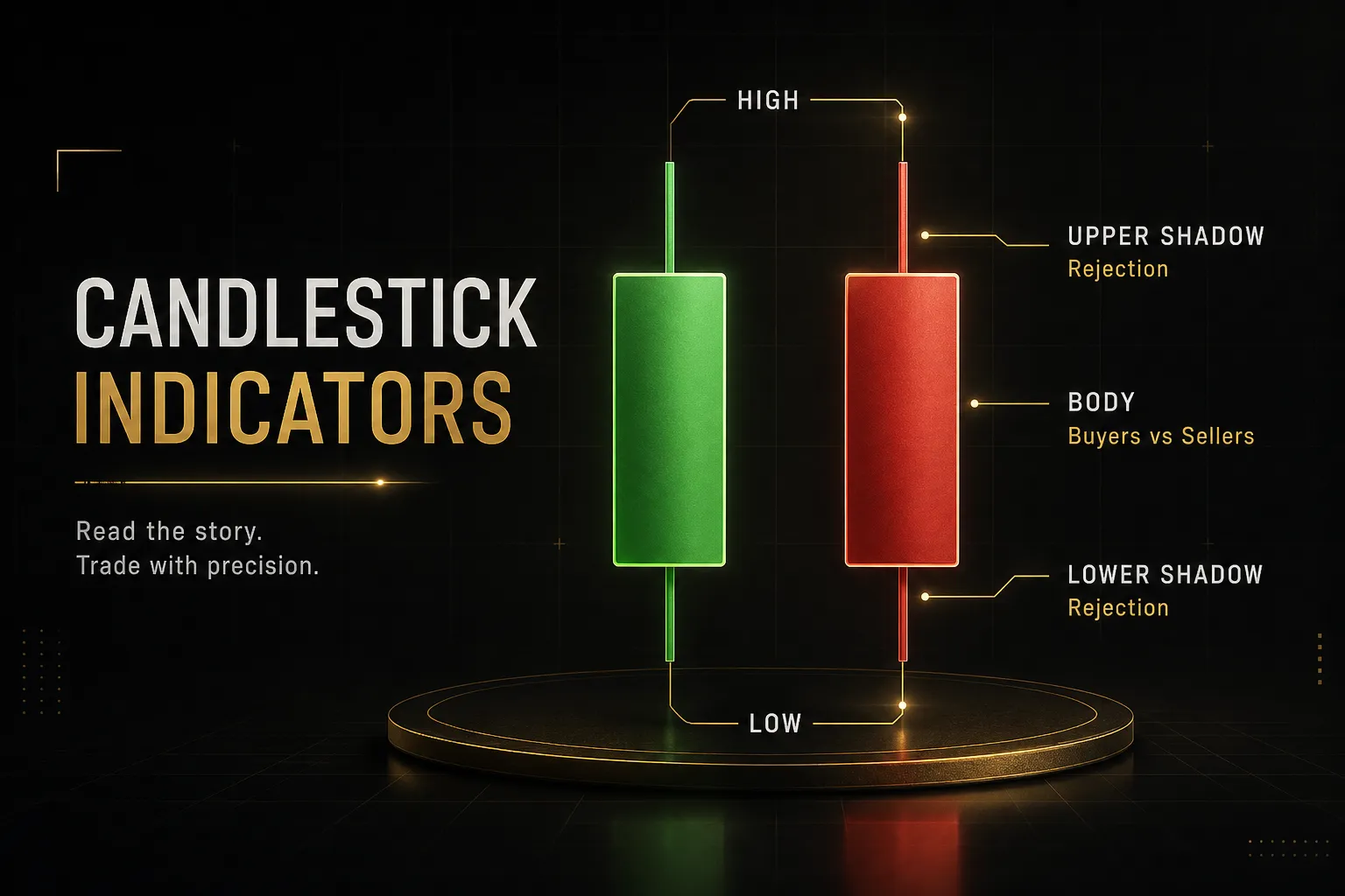
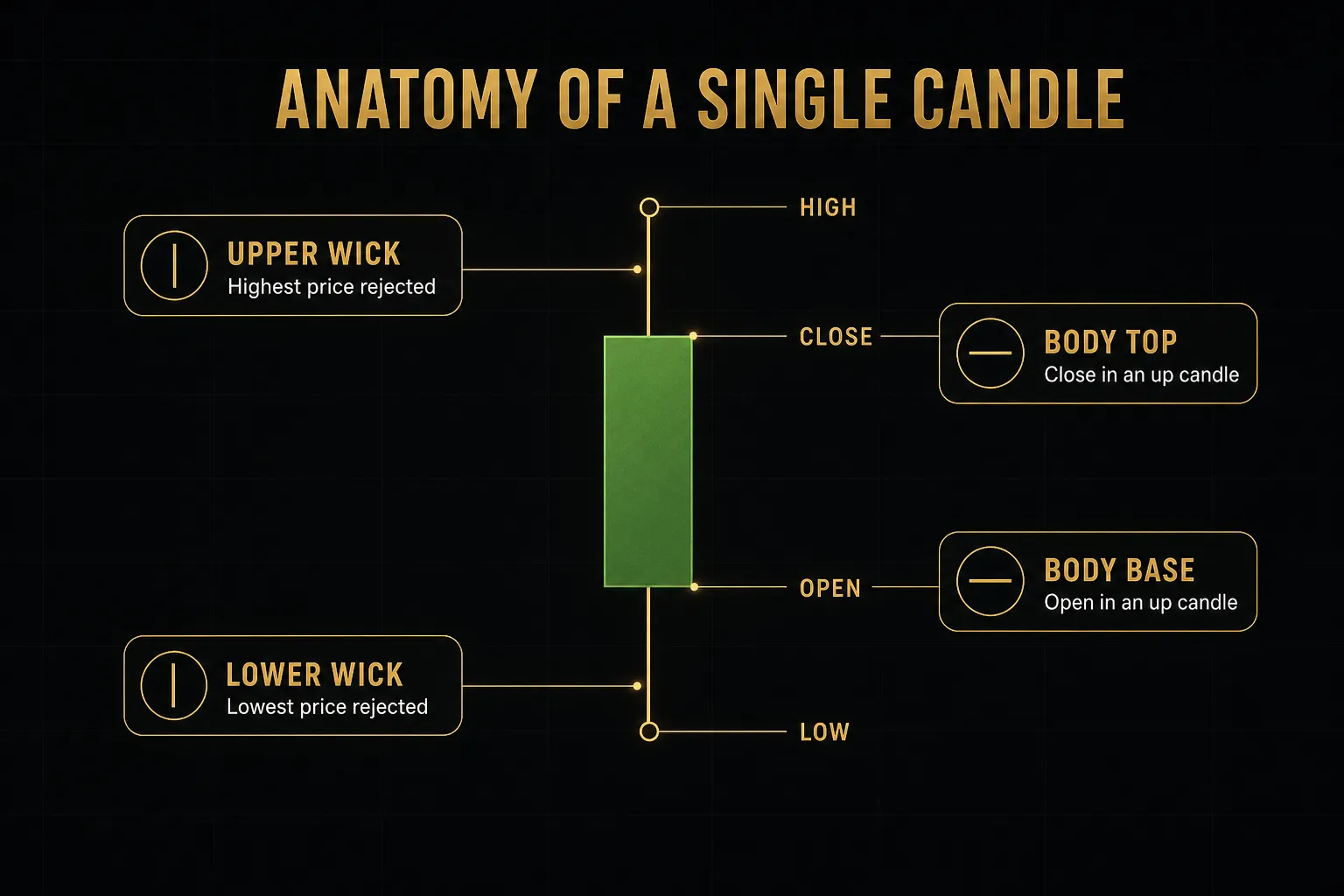
Every candle contains exactly four numbers.
The open is the first traded price of the period, the close is the last, and the high and low mark the extremes reached in between.
The body spans open to close.
The wicks span the rest.
Read together, those four points tell a story about control.
A candle that opens near its low and closes near its high with a small upper wick means buyers dominated from start to finish.
A candle with a long upper wick and a tiny body means buyers pushed, failed, and got pushed back.
Here is where most false signals come from.
A candle only means something once it closes.
During formation, a candle can look like a perfect hammer for forty minutes of a one-hour bar and finish as a bearish marubozu.
Intrabar shapes are not signals; they are noise in progress.
Waiting for the close costs you a few pips of entry.
It saves you from a large share of fake setups.
That trade is almost always worth making.
Choosing Your Timeframe
Timeframe is not a preference.
It is a function of how long you intend to hold and how much screen time you actually have.
- Scalping (1 to 5 minute): Holding seconds to minutes. Requires tight spreads, high liquidity sessions, and constant attention. Noise is extreme.
- Day trading (5 to 15 minute): Holding minutes to hours, flat by the close. Structure is readable but news events can invalidate setups instantly.
- Swing trading (H4 to Daily): Holding days to weeks. Fewer signals, cleaner market structure, far more forgiving of imperfect entries.
- Investing (Weekly to Monthly): Holding months to years. Charts serve as timing and context tools alongside fundamentals.
A common mistake: trading a 5-minute chart with a swing trader’s stop loss, or a daily chart with a scalper’s patience.
Match the timeframe to the holding period, then leave it alone.
Reading Structure, Trend, and Zones
Indicators change.
Market structure does not.
Price either makes progressively higher levels, progressively lower levels, or oscillates between two boundaries, and every strategy in existence is a bet on one of those three states continuing or ending.
Spotting a Trend
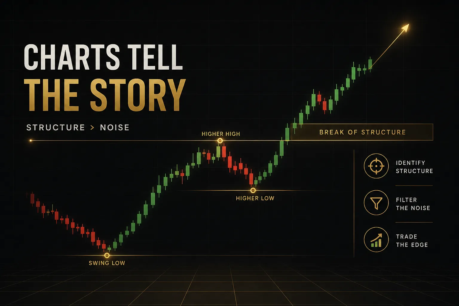
An uptrend is a sequence of higher highs and higher lows.
Each rally pushes past the previous peak, and each pullback stops above the previous trough.
A downtrend inverts that: lower highs and lower lows.
Simple to define.
Harder to apply, because you have to pick which swings count.
The practical fix is to only mark swings that are visible when you zoom out.
If a pivot disappears when you shrink the chart, it was noise.
Serious structural points survive a change in scale.
A ranging market is structurally different, not just quieter.
Highs cluster around a similar ceiling, lows cluster around a similar floor, and neither side establishes control.
Trend-following tools like moving averages produce their worst results here, because they are designed to catch continuation that a range refuses to deliver.
A trend ends when the sequence breaks.
In an uptrend, price failing to make a new high and then closing below the prior swing low is the structural signal.
Not a feeling.
A specific, marked, observable break.
Support and Resistance as Zones
Ask five traders to draw support on the same chart and you will get five slightly different lines.
That disagreement is the point.
Support and resistance are zones, not prices.
They represent areas where orders clustered, and orders do not sit at a single decimal.
Draw them from wick to body across multiple touches and you get a band, typically covering several pips on forex or a percentage point or two on equities.
This reframing solves the most common frustration in chart reading: the stop that gets hit by two pips before price reverses exactly as expected.
That was never a failed analysis.
It was a zone treated as a line.
Wicks matter enormously here.
A candle that pierces a level and closes back inside it is a rejection, and it strengthens the zone.
A candle that closes decisively beyond it is a break.
The difference between those two outcomes is the close, which is why candle-close confirmation keeps appearing in every part of this process.
Retests deserve attention too.
When a broken resistance zone is revisited from above and holds as support, that flip is one of the more reliable behaviours in technical analysis, because it shows the order flow at that level genuinely changed hands.
Why Multiple Timeframes Matter
Trading a single timeframe is like reading one paragraph of a contract.
You will get something, and it may well be the wrong thing.
Multi-timeframe analysis assigns each chart a job.
The higher timeframe (Daily or H8 for swing traders, H1 for day traders) defines directional bias and marks the significant support and resistance zones.
The lower timeframe (H1 or M15, M5 for intraday) handles entry timing inside those zones.
The higher timeframe answers “which direction and where.”
The lower timeframe answers “when.”
Conflict between them is information, not a problem.
A bullish daily structure with a bearish H1 pullback into a daily support zone is a textbook continuation opportunity.
A bullish daily structure with a bearish daily close and a bearish H4 is a reason to stand aside.
One caution: the same structure behaves differently depending on conditions.
A support zone in a strong trend usually holds on first touch.
The same zone in a low-liquidity session, such as the Asian hours on a European pair, may be sliced through on thin order flow and mean very little.
And during scheduled news, structure is temporarily suspended altogether.
Price gaps, spreads widen, and levels get overshot by amounts no chart could have anticipated.
Indicators: Confirmation, Not Prediction
Here is an uncomfortable truth about indicators: nearly all of them are mathematical transformations of the same OHLC data already sitting on your chart.
They cannot know anything price does not already show.
What they can do is make certain conditions easier to see and harder to rationalise away.
Volume as a Confirmation Tool
Volume is the most misunderstood data point in retail trading, largely because it means something different in every market.
- Futures: True contract volume, reported by a centralised exchange. This is the cleanest volume data available to retail traders.
- Stocks: Real share volume, though fragmented across exchanges and dark pools, so retail feeds show a partial picture.
- Forex: No central exchange exists, so platforms display tick volume, which counts price changes rather than contracts. It is a proxy, and it correlates reasonably well with real activity, but it is not volume.
- Crypto: Volume varies enormously by exchange and can include wash trading on smaller venues. Always check which exchange the data comes from.
Once you know what you are looking at, volume does one job exceptionally well: it confirms or questions a move.
A breakout above resistance on rising volume suggests genuine participation.
Buyers are stepping up in size to take price through the level.
That is volume confirmation.
A new high on declining volume tells the opposite story.
Price moved, but fewer participants pushed it there, which often precedes a failed breakout or a sharp mean reversion.
Divergence between price direction and volume is one of the earliest available warnings that a move lacks conviction.
Choosing Indicators Without Redundancy
Six indicators on a chart usually means one indicator, repeated six times.
Running relative strength index alongside Stochastic is the classic example.
Both measure momentum from recent price closes.
When they agree, you have not gained a second opinion; you have received the same opinion twice with different formatting.
That creates false confidence, which is worse than no confirmation at all.
A cleaner approach is one tool from each category:
- Trend: A moving average (the 50 and 200 EMA are common defaults) or the MACD indicator for directional bias and momentum shifts.
- Momentum: The relative strength index for overextension and divergence, read in the context of trend rather than as a standalone buy or sell trigger.
- Volatility or volume: Average true range to size stops against actual market movement, or a volume study for participation.
Three tools measuring three different things.
That is a confirmation stack.
Six momentum oscillators is a decision-avoidance system.
Average true range is quietly the most useful of the three for risk.
If ATR on the daily chart is 90 pips, a 20-pip stop is not tight risk management.
It is a near-guaranteed stop-out that has nothing to do with whether your analysis was correct.
Why Signals Need Price Action
Some indicators repaint.
They recalculate historical values as new data arrives, so the arrow that appears perfectly placed in backtest hindsight was not there in real time, or appeared and then vanished.
This is why an indicator can look 90% accurate on a historical chart and produce entirely different behaviour live.
Anything that redraws or confirms only after several bars have passed needs to be tested forward, on a demo account, before it earns a place in a strategy.
The safeguard is the same as everywhere else: act on closed candles, at levels you marked in advance.
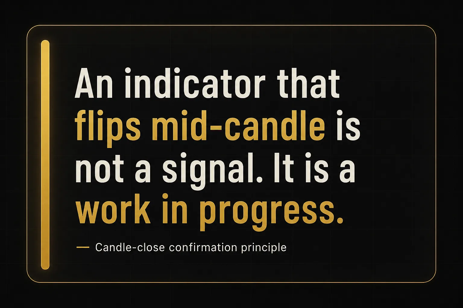
An indicator flipping mid-bar is not a signal.
An indicator flipping on the close of a candle that also rejected a marked support zone is a confluence.
Tools that separate these functions cleanly are easier to use well.
PipTrend, for instance, splits the job in two: a colour-coded trend signal with a whipsaw filter handles direction, while separate layers such as session highs and lows, VWAP, and supply and demand zones handle entry location.
Direction and timing are different questions, and combining them into one arrow is exactly how traders end up following signals blindly.
The principle transfers to any toolkit you build.
Know which question each tool answers.
If two tools answer the same question, drop one.
Turning Chart Signals Into Trades
Analysis that does not end in a defined risk is a hobby.
This is the part that converts a chart observation into something measurable, repeatable, and survivable.
Entry, Stop-Loss, and Targets
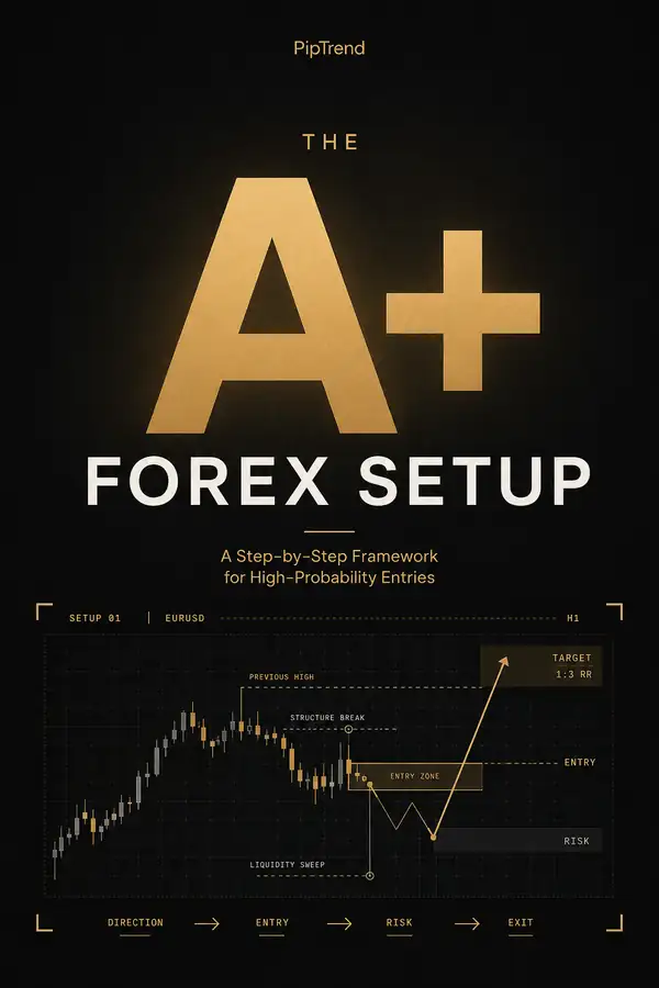
- Define the context first. Mark the higher timeframe trend and the zone you care about before looking for any entry. If you cannot describe the market as trending up, trending down, or ranging in one sentence, there is no trade.
- Set the entry trigger. Decide the exact condition that puts you in: a candle closing back inside a support zone, a break-and-retest of resistance, or a momentum cross confirmed at a marked level. Write it before price arrives.
- Place the stop at the invalidation point. The stop goes where your idea is proven wrong, typically beyond the swing low or high that defines the structure, plus a buffer sized from average true range. Never place it at a round number where everyone else’s stops sit.
- Account for spread and slippage. Your broker’s spread widens around news and session opens, and a 1.2 pip spread can become 8 pips in seconds. Add that reality into the stop buffer rather than discovering it at execution.
- Set the target from structure. The next opposing zone, prior swing high, or measured move gives a target grounded in the chart. A 3:1 risk-to-reward ratio is only useful if the market can realistically reach it; forcing 3:1 into a range that only travels 1.5R is arithmetic, not planning.
- Check the resulting ratio last. If the honest structural target gives you 0.8:1, skip the trade. Do not move the stop closer to manufacture a better number.
Position Sizing and Risk Per Trade
Position size is arithmetic, not intuition.
Most account damage comes from getting this backwards: picking a lot size first, then hoping the stop is far enough away.
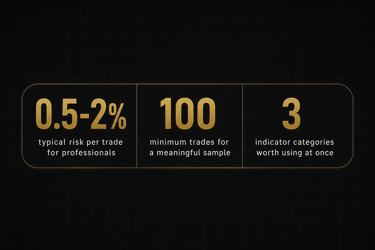
- Fix your risk percentage. Most professionals risk 0.5% to 2% of account equity per trade. On a $10,000 account at 1%, that is $100 at risk, every time, regardless of how confident the setup feels.
- Measure the stop distance. Take the distance in pips, points, or percent between your entry and your invalidation level. This number is set by the chart, not by your preference.
- Divide risk by stop distance. A $100 risk with a 40 pip stop on a pair where one standard lot equals $10 per pip means 0.25 lots. Same risk, wider stop, smaller size. That is the whole mechanism.
- Never scale size to conviction. The setups that feel most obvious have no measurably higher win rate. Doubling size on a “sure thing” is how one trade erases a month.
Backtesting, Journaling, and Sitting Out
- Backtest with a real sample size. Twenty trades tell you nothing statistically. Aim for a minimum of 100 occurrences of the same setup across different market conditions before drawing any conclusion about edge.
- Forward test before funding. Historical testing lets you cheat unconsciously by knowing what happened next. Run the same rules live on demo for at least a month to see how they behave under real spreads and real hesitation.
- Track expectancy, not win rate. Expectancy is (win rate multiplied by average win) minus (loss rate multiplied by average loss). A 40% win rate with 3:1 payoffs beats a 70% win rate with 0.4:1 payoffs, comfortably.
- Journal every outcome including break-evens. Log the setup, the timeframe, the zone, the confirmation, the emotional state, and the result. Break-even trades and skipped trades belong in the record; they reveal whether your rules or your discipline is the weak point.
- Recognise the no-trade conditions. Sit out when structure is unclear and swings overlap, when a major news release lands within 30 minutes, when spreads are abnormally wide at a session rollover, or when your higher and lower timeframes disagree outright.
That last item is the one that saves accounts.
No trade is a valid position.
A chart that does not offer a clear zone, a clear trigger, and a clear invalidation point is telling you something specific: wait.
Trading Chart FAQs
How do you read a trading chart?
Read a trading chart in a fixed order: timeframe, trend, zones, confirmation, invalidation.
Start by confirming which timeframe you are on, then identify whether price is making higher highs and higher lows, lower highs and lower lows, or ranging.
Mark the support and resistance zones on a higher timeframe, then drop down to look for a closed candle showing rejection or a break at one of those zones.
Only then consider indicators, and only as confirmation of what price already showed.
What is the best chart for day trading?
A candlestick chart on the 5-minute or 15-minute timeframe is the standard choice for day trading.
Candlesticks show complete OHLC data with instant visual direction, and those timeframes generate enough setups per session without drowning you in noise.
Pair the execution chart with an H1 or H4 chart for directional bias, since intraday setups aligned with the higher timeframe trend hold up considerably better than those fighting it.
What are the 3 most important indicators in trading?
The most useful combination is one trend tool, one momentum tool, and one volatility or volume tool.
In practice that usually means a moving average or the MACD indicator for direction, the relative strength index for momentum and divergence, and average true range or volume for context on how far price realistically travels.
The specific choices matter far less than avoiding redundancy; three indicators measuring momentum give you one opinion, not three.
How do you know if a stock is going up or down from a chart?
Look at the sequence of swing highs and swing lows, not the last candle.
A stock is in an uptrend while it keeps posting higher highs and higher lows, and in a downtrend while it posts lower highs and lower lows.
Confirm with a longer-term moving average: price consistently holding above a rising 200-day average indicates an established uptrend.
Note that this describes the current state, not a forecast, since trends persist until they break and the break is only visible after it happens.
What is the most accurate chart pattern?
No chart pattern is reliably accurate on its own, and any source quoting a fixed success percentage is oversimplifying.
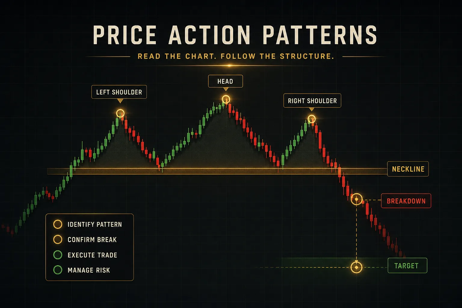
Reliability depends almost entirely on context: the same head and shoulders pattern behaves very differently at a major weekly resistance zone with rising volume than it does mid-range on a 5-minute chart during thin liquidity.
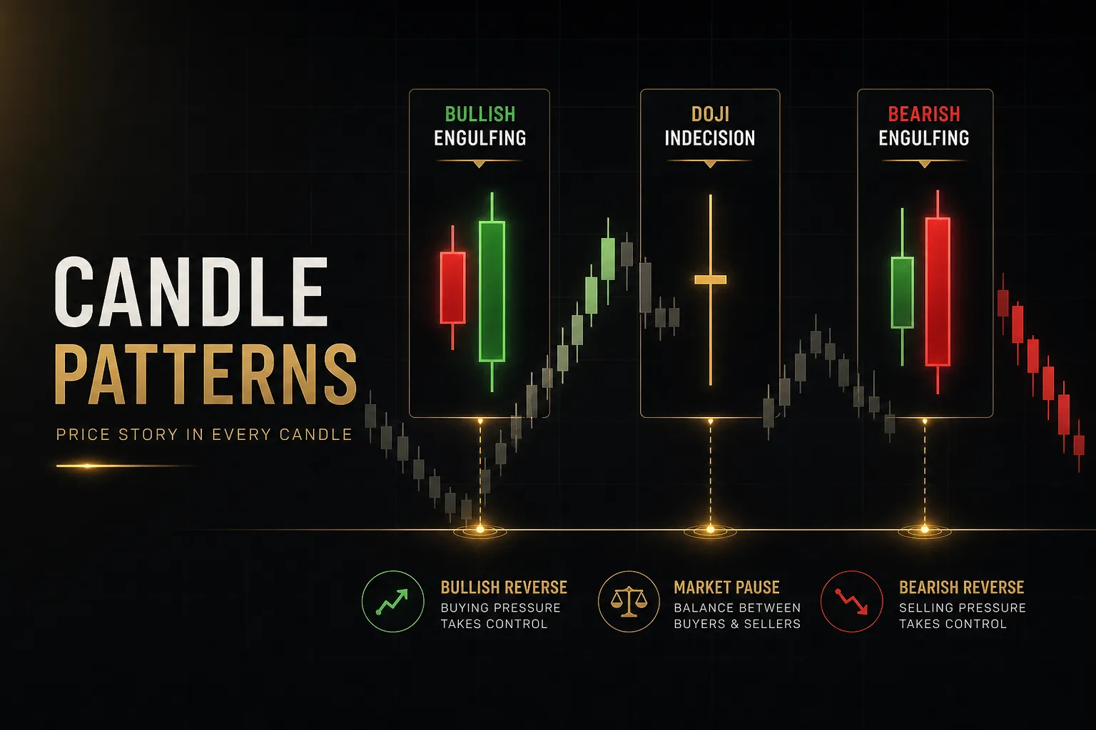
Patterns with the best reputations, such as break-and-retest continuations and engulfing candles at established zones, earn that reputation from the confluence around them.
Judge the location and the volume confirmation before you judge the shape.
Is technical analysis actually useful for trading?
Technical analysis is genuinely useful for timing, risk placement, and defining invalidation, and genuinely limited as a predictive tool.
Its real value is structural: it gives you objective levels for stops and targets, a framework for position sizing, and a repeatable process that removes improvisation from decisions.
What it cannot do is anticipate earnings surprises, central bank policy shifts, or liquidity shocks, which is why many consistent traders combine chart reading with fundamental awareness of what is scheduled and what is driving flow.
The Real Edge Is Consistency
Chart reading is a probability tool.
Nothing on your screen guarantees the next candle, and the traders who last longest are the ones who stopped expecting it to.
What separates them is process.
The same questions, asked in the same order, on every single setup.
Here is the one takeaway worth acting on immediately.
Before your next trade, write down four things: the trend, the zone, the confirmation, and the invalidation point.
Four lines, written before entry, not after.
If you cannot fill in all four, the setup is not ready and neither are you.
The goal was never a flawless pattern or a perfect indicator.
Those do not exist, and searching for them is how years disappear.
The goal is to reduce the number of decisions you make on impulse, replacing each one with a rule you tested and a level you marked in advance.
Less guessing.
That is the whole edge.
Sources
Risk Disclaimer: Trading involves risk. Past performance doesn't guarantee future results. Only trade with money you can afford to lose. PipTrend is a tool to assist your trading decisions, not financial advice.