Bollinger Bands Strategy: A Context-Based Trading Playbook
On this page
When a Band Touch Isn’t What It Seems
Price tags the lower band, so you buy. Price tags the upper band, so you sell.
This is the most repeated Bollinger Bands strategy on the internet, and it is also one of the fastest ways to lose money in a trending market.
The logic sounds reasonable. If the bands contain most price action, then a touch should mean price is stretched and ready to snap back.
But markets don’t follow that script.
In a strong uptrend, price can hug the upper band for ten, fifteen, even twenty consecutive candles while every “sell” signal gets steamrolled.
Here’s the real lesson.
The same band touch can signal mean reversion, trend continuation, or a failed breakout, depending on three things: the current volatility state, the trend structure, and whether confirmation shows up afterward. The geometry on the chart looks identical in all three cases.
The correct trade is completely different.
A band touch is a question, not an answer. Context tells you which answer applies.
This playbook builds a framework around that idea.
First, you learn what the bands actually measure (and the two numbers most traders ignore). Then you learn to read the market regime before reacting to any touch. Finally, you put Bollinger Bands inside a full trade plan with defined entries, stops, targets, and position sizing, where the bands are one input rather than a standalone trigger.
What Bollinger Bands Actually Measure
John Bollinger designed the bands in the early 1980s to answer one question: is price high or low relative to its own recent behavior?
That’s it.
They measure relative price and volatility, not direction, and misunderstanding this is where most strategies go wrong.
How the Bands Are Built
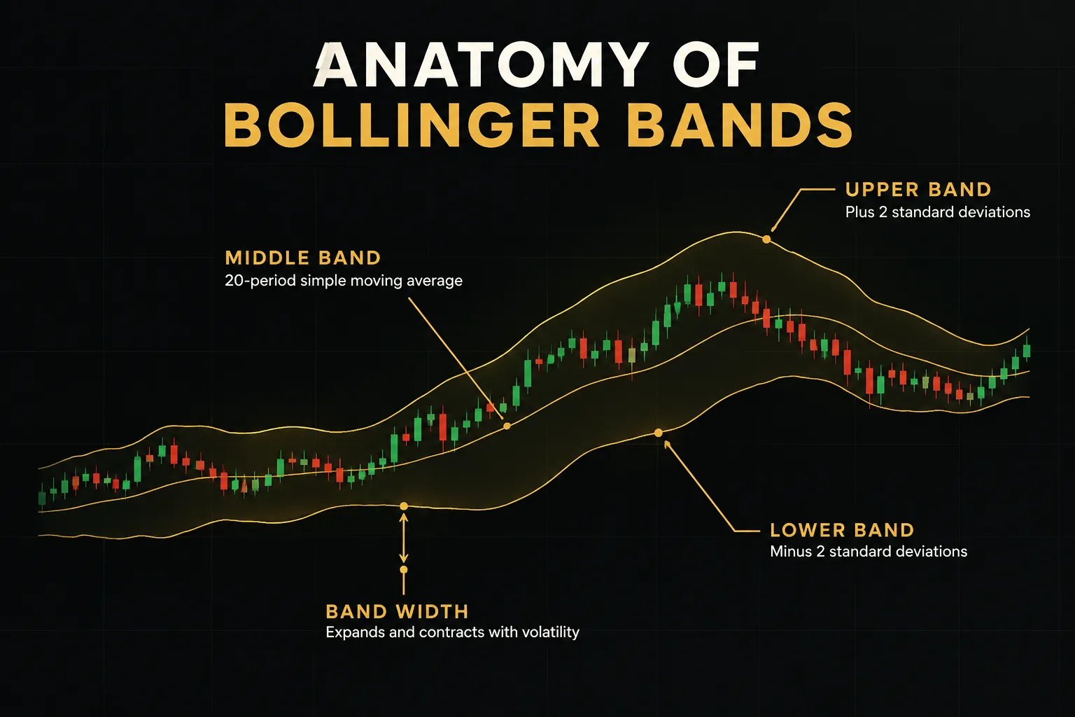
The standard setup has three lines.
The middle band is a 20-period simple moving average. The upper and lower bands sit 2 standard deviations above and below that average.
That’s the answer to the popular “20 2 rule” question.
The 20 refers to the lookback period, and the 2 refers to the standard deviation multiplier. Because standard deviation rises when price swings get larger, the bands automatically widen during volatility expansion and tighten during volatility contraction.
A common assumption is that 95% of prices stay inside the bands, borrowed from normal distribution math.
In practice, market returns have fat tails.
Bollinger himself has noted that closer to 88 to 89% of closes fall inside 20-period, 2-standard-deviation bands, which means outside closes happen more often than textbook statistics suggest.
Changing the lookback period changes the statistical sample.
A 10-period band reacts quickly to new price action but produces more signals, many of them noise. A 50-period band smooths things out but lags, so signals arrive later and less often.
Bollinger’s own guidance is to adjust the multiplier with the period: roughly 1.9 standard deviations for a 10-period setting and 2.1 for a 50-period setting. This keeps the proportion of price inside the bands roughly consistent.
Pick your settings based on your holding period, then leave them alone long enough to test them properly.
%B and BandWidth: The Numbers Behind the Chart
Looking at bands and saying “price looks stretched” is subjective.
Two derived indicators fix that.
Bollinger %B tells you exactly where price sits relative to the bands. The formula is (Price minus Lower Band) divided by (Upper Band minus Lower Band).
A reading of 0 means price is on the lower band, 1 means it’s on the upper band, and 0.5 means it’s at the middle. Values above 1 or below 0 mean price has closed outside the bands.
Bollinger BandWidth measures how wide the bands are relative to the middle line: (Upper minus Lower) divided by Middle. This quantifies expansion and contraction directly.
Your eyes can be fooled by chart scaling.
A number can’t.
Why does this matter?
Because once you plot %B and BandWidth under your chart, “stretched” becomes “%B above 1.0 for two closes,” and “tight” becomes “BandWidth at its lowest level in 120 bars.” Those are rules you can write down, backtest, and apply the same way every time.
Objective numbers turn a visual hunch into a testable hypothesis. That’s the difference between a strategy and a habit.
The Same Touch, Three Different Meanings
The upper band does not mean overbought. The lower band does not mean oversold.
They mean price is high or low relative to the last 20 bars, which is a very different statement.
In strong trends, price regularly performs what traders call walking the bands: riding along the upper band in an uptrend or the lower band in a downtrend for many consecutive candles.
Each touch confirms strength rather than exhaustion.
So the first job is identifying the market regime.
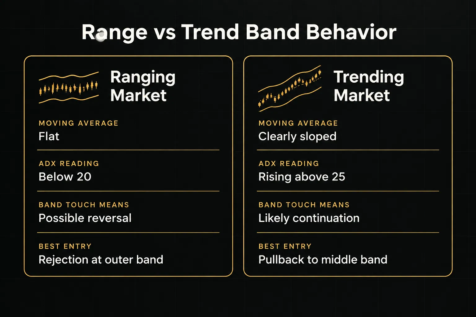
Ranging Markets: Mean Reversion Works Here
Mean reversion works best when the market has no clear direction. Your checklist for a range: the 20-period moving average is flat, the average directional index (ADX) is below roughly 20, and price has been bouncing between identifiable support and resistance levels.
In this environment, a lower band tag followed by a rejection candle (a hammer, a bullish engulfing, or a long lower wick) favors a long trade back toward the middle band. An upper band tag with a bearish rejection favors the opposite.
Example: a large-cap utility stock has traded between $62 and $68 for six weeks. The moving average is flat and ADX reads 16.
Price drops to the lower band near $62.30, prints a hammer, and closes back inside.
That’s a textbook mean reversion setup, with the middle band around $65 as a logical first target.
Trending Markets: Why Price Rides the Band
Now flip the regime.
The moving average slopes clearly, ADX is rising above 25, and price is making higher highs and higher lows (or lower lows and lower highs in a downtrend).
Here, a band tag favors continuation. Pullbacks toward the middle band become buying opportunities in uptrends, and upper band touches are simply evidence the trend is healthy.
Shorting them is fighting the tape.
Example: EUR/USD has rallied for three weeks on a daily chart. ADX has climbed from 22 to 34. Price closes on or near the upper band for seven of the last nine sessions.
A trader following the “sell the upper band” rule shorts four times and gets stopped out four times.
A trend following trader waits for a dip to the 20-period average, sees it hold, and buys.
Wick, Close, or Confirmed Follow-Through?
Not all band breaches are equal.
Most traders lump three very different events together.
A wick poking outside the band that closes back inside is often noise, a brief liquidity grab or a stop hunt.
A candle closing outside the band is a stronger signal because buyers or sellers held control through the entire bar.
A confirmed follow-through candle that closes further in the same direction on the next bar is the highest-quality signal, since it shows the move had real participation.
Example: Bitcoin spikes 6% in minutes on a regulatory headline, wicking far above the upper band on a 1-hour chart. The candle closes back inside the band, and the next candle is red.
That’s a failed breakout, not a trend.
Same geometry as the EUR/USD case above, completely opposite correct action.
Three markets. Three identical-looking band touches. Three different trades.
The Squeeze, Breakouts, and False-Breakout Filters
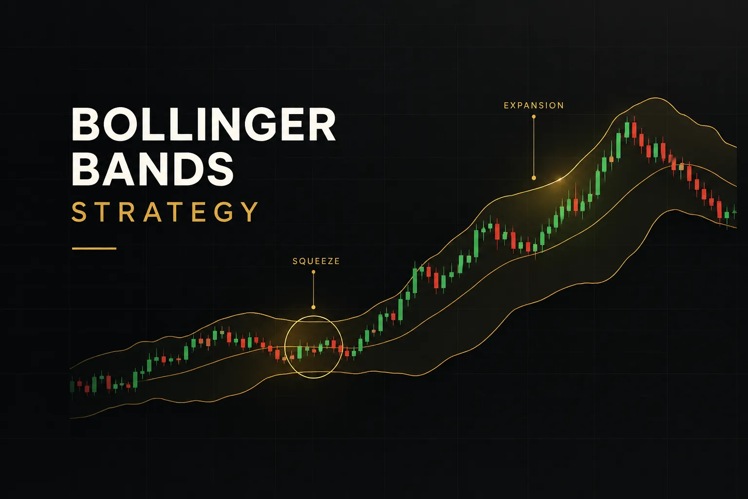
The Bollinger Band Squeeze is probably the most famous setup in the toolkit. It’s also the most misread, because traders treat it as a directional signal when it isn’t one.
Trading the Bollinger Band Squeeze
A squeeze happens when BandWidth contracts to an unusually low level, often measured as the lowest reading in the past 120 or 125 bars.
It tells you volatility is compressed. Volatility tends to cycle, so low volatility periods are usually followed by high volatility periods.
What the squeeze does not tell you is direction.
Tight bands can break up or down with roughly equal likelihood unless other evidence tilts the odds. Many traders pre-position long during a squeeze because the chart “looks ready,” only to watch price break the other way.
Bollinger described a pattern he called the head fake: price pokes outside one band as the squeeze resolves, traps breakout traders, then reverses hard in the other direction. It’s common enough that you should expect it rather than be surprised by it.
The squeeze tells you a move is coming. It doesn’t tell you where. Direction has to come from somewhere else.
Filtering Real Breakouts from Fake Ones
So where does direction come from? A practical breakout confirmation filter combines several independent pieces of evidence:
- Market structure: the breakout candle closes beyond a prior swing high or swing low, not just beyond the band.
- Trend strength: ADX rises above roughly 20 to 25 as the breakout develops, showing a trend is actually forming.
- Volume confirmation: volume on the breakout candle is meaningfully above its recent average, often 1.5x or more.
- Higher-timeframe agreement: the breakout direction matches the trend on the next timeframe up (daily for a 4-hour setup, for example).
- Retest that holds: price pulls back to the broken level or band and holds it as new support or resistance before continuing.
You don’t need all five every time.
But a breakout with two or three of these is far more trustworthy than a naked band close.
Now, a common trap.
Many traders “confirm” Bollinger signals by stacking the relative strength index, moving average convergence divergence, and Stochastic together. When all three agree, it feels like overwhelming evidence.
It isn’t.
All three are derived from the same closing prices and measure essentially the same thing: momentum. When one flashes overbought, the others usually do too.
That’s one piece of evidence counted three times.
A better approach pairs Bollinger Bands with one independent category of evidence. Good options include trend and structure (swing highs, swing lows, ADX), volume (raw volume or on-balance volume), or multi-timeframe confirmation.
Tools that organize this cleanly can help. PipTrend, for instance, uses a multi-timeframe confirmation table that shows trend direction across several timeframes at once, along with color-coded trend candles on the main chart.
Paired with Bollinger Bands, that gives you a volatility read plus an independent trend read, rather than three versions of the same momentum signal.
Whatever tool you use, the principle is the same.
Different questions, different data sources, one decision.
Building One Complete Trade Plan
A band setup without a plan is just an opinion.
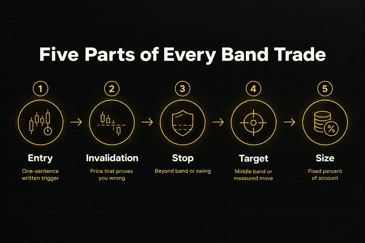
Every valid trade needs the same five components defined before entry, followed by an honest look at costs and conditions.
- Define the entry trigger. Write down the exact event that puts you in the trade, such as “close back inside the lower band with a bullish rejection candle in a range where ADX is below 20.” If you can’t describe it in one sentence, you can’t test it.
- Set the invalidation point. Identify the price that proves your idea wrong. For a mean reversion long, that might be a close below the rejection candle’s low; for a breakout, it’s a close back inside the prior range.
- Place the stop-loss logically. Good stop-loss placement goes beyond the band extreme or the nearest structural swing point, not an arbitrary 20 pips or 2%. A stop based on structure gets hit because the setup failed, not because of random noise.
- Choose a target in advance. Mean reversion trades typically target the middle band first and the opposite band second. Breakouts can use a measured move (the height of the prior range projected from the breakout point) or a trailing stop along the middle band. Aim for a risk-to-reward ratio of at least 1:1.5 so you can stay profitable with a sub-50% win rate.
- Size the position from risk, not conviction. Proper position sizing means risking a fixed percentage of the account per trade, commonly 0.5% to 1%. Divide that dollar risk by the distance to your stop to get the position size, so a wider stop automatically means a smaller position.
- Account for real trading costs. Backtesting often ignores slippage and spread, commissions, and financing costs. On a 5-minute chart with tight bands, a 1-pip spread can consume a large share of the average target, and leverage magnifies every cost. A strategy that shows 15% annual returns in a clean backtest can easily turn negative live.
- Test on your own market and timeframe. Academic results are mixed. A 2007 study by Lento, Gradojevic, and Wright in Applied Financial Economics found that standard Bollinger Band rules generally failed to beat buy-and-hold across several major indices once transaction costs were included. Performance varies by market, rule definition, and test period, so no version is universally profitable. Run your exact rules on your exact instrument before risking real capital.
- Know when to stand aside. Skip band setups around major economic releases (central bank decisions, employment reports, CPI), during thin and illiquid sessions, after large opening gaps, and in abnormally volatile news windows. In these conditions, standard deviation jumps suddenly and bands stop reflecting normal behavior.
A Quick Pre-Trade Checklist
Run through this before every trade.
It takes thirty seconds and filters out most impulsive entries.
- Regime identified. Is the market ranging or trending, based on moving average slope and ADX?
- Setup matches regime. Mean reversion in a range, continuation in a trend, never the reverse.
- Independent confirmation present. Structure, volume, or higher-timeframe agreement, not just more momentum oscillators.
- Stop, target, and size written down. All three are defined before the order goes in.
- No major news in the window. Check the economic calendar for the next few hours.
Then keep a journal.
Track win rate, trade expectancy (average win times win rate, minus average loss times loss rate), average and maximum drawdown, and recurring failure patterns.
After 50 to 100 trades, you’ll know exactly which setups pay and which ones quietly bleed your account.
Bollinger Bands FAQ
What is the most effective Bollinger Band strategy?
The most effective Bollinger Bands strategy is one that matches the setup to the market regime. Mean reversion at the outer bands works in ranging markets with low ADX, while pullback entries toward the middle band work in trending markets.
No single rule set wins everywhere, so the best version is the one you’ve tested on your own instrument and timeframe, including costs.
How do you use Bollinger Bands to find entry points?
Use Bollinger Bands to locate potential entry zones, then wait for independent confirmation before entering.
Band location tells you where price sits relative to recent volatility. A rejection candle at a support level, a volume surge on a breakout, or higher-timeframe trend agreement tells you whether to act.
What is the 20 2 rule in Bollinger Bands?
The 20 2 rule refers to the default settings: a 20-period simple moving average with bands placed 2 standard deviations above and below it.
These settings work well for swing trading on daily charts. Shorter or longer periods are valid, but the multiplier should be adjusted slightly (around 1.9 for 10 periods, 2.1 for 50 periods).
Can Bollinger Bands predict price direction?
No, Bollinger Bands cannot predict price direction on their own.
They measure relative price level and volatility. A squeeze signals that a large move is likely, but direction must come from structure, trend analysis, or volume confirmation.
Is it better to buy at the lower band or sell at the upper band?
Neither is better by default, because the correct action depends on the trend.
In a range, buying the lower band and selling the upper band can work well. In a strong uptrend, selling the upper band is fighting the trend, and buying pullbacks to the middle band is usually the better trade.
What indicator works best with Bollinger Bands?
The best companion indicator is one that measures something the bands don’t.
ADX adds trend strength, volume adds participation, and multi-timeframe trend tools add directional context. Stacking several momentum oscillators like RSI, MACD, and Stochastic adds little because they are highly correlated.
How are Bollinger Bands different from Keltner Channels?
Keltner Channels use average true range to set band width, while Bollinger Bands use standard deviation.
ATR responds more gradually, so Keltner Channels are smoother and less reactive to sudden volatility spikes. Many traders combine the two, flagging a squeeze when Bollinger Bands contract inside the Keltner Channels.
Do Bollinger Bands work for forex and crypto trading?
Yes, Bollinger Bands work for forex and crypto, but session awareness matters.
Both markets trade around the clock, and low-liquidity periods (the late US session in forex, weekends in crypto) can produce tight bands and misleading breakouts. Filter signals by session and treat thin-market breakouts with extra skepticism.
Trade the Context, Not the Touch
Here’s the one habit that changes everything.
Before the next band touch on your chart, write down two things: whether the market is ranging or trending, and what independent confirmation would need to appear before you enter.
That’s it.
Two lines in a notebook. But those two lines force you to diagnose the market regime first and react second, which is exactly the order most losing traders reverse.
Bollinger Bands are a volatility lens. They show you when price is stretched, when volatility is compressed, and when it’s expanding.
They don’t generate trades on their own, and treating them that way is how the “buy the lower band” myth keeps claiming accounts in 2026, more than four decades after the indicator was introduced.
Consistency doesn’t come from better judgment calls candle by candle. It comes from a process you repeat until the decisions feel boring.
Define the regime. Match the setup. Confirm with independent evidence. Size from risk. Journal the result… and then do it again.
Sources
- Investor.gov: Investor Alert: Thinking About Investing in the Latest Hot Stock? Understand the Significant Risks of Short-Term Trading Based on Social...
- SAGE Journals: Optimizing Commodity Futures Trading in the Financial Market: Fine-tuning Bollinger Bands Strategy
- BollingerBands.com: Bollinger bands
- BollingerBands.com: Bollinger band rules
- Fidelity: Bollinger Band Width
Risk Disclaimer: Trading involves risk. Past performance doesn't guarantee future results. Only trade with money you can afford to lose. PipTrend is a tool to assist your trading decisions, not financial advice.